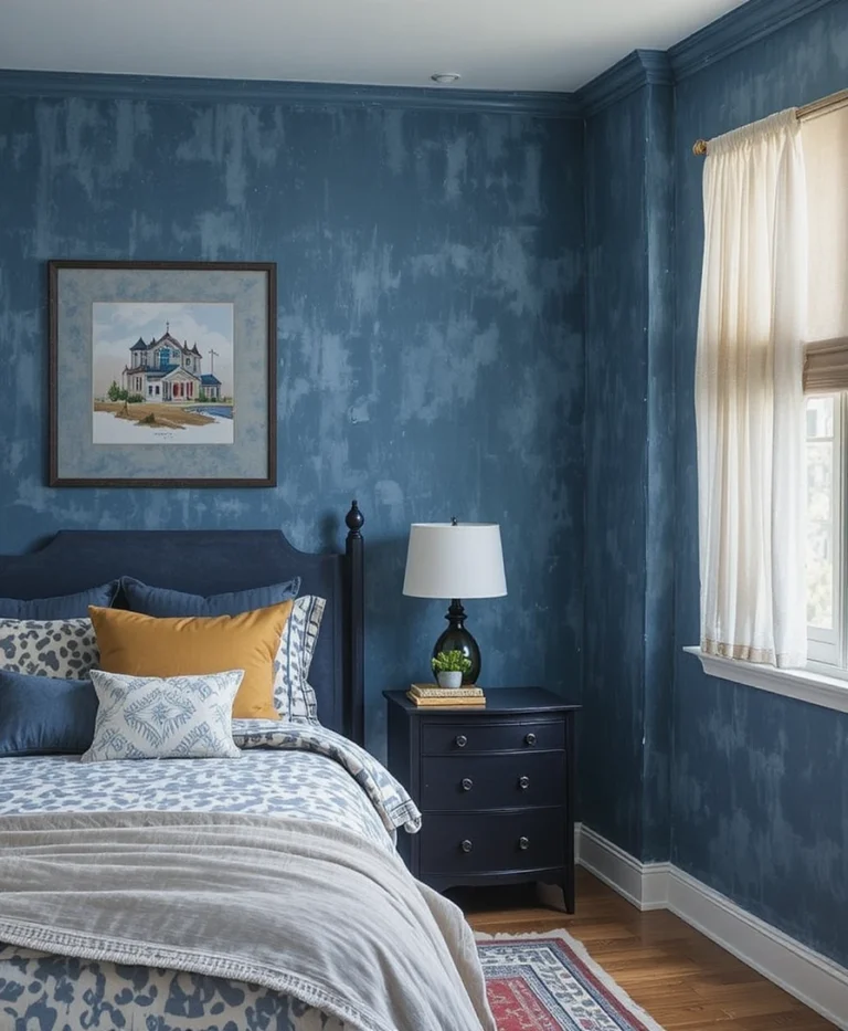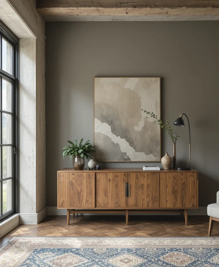

Choosing the right wall color can feel surprisingly overwhelming, but finding the ideal shade doesn’t have to turn into a high-stakes guessing game. Finding the perfect backdrop for your space comes down to understanding how light, undertones, and sheens interact in your unique rooms. In this comprehensive guide, we are sharing practical tips and quick solutions to help you confidently select, test, and style the most popular Sherwin-Williams neutral paint colors for a beautiful, cohesive home.
Quick Answer: Key Takeaways for Decorating with SW Neutrals
Check Light Reflectance Value (LRV): Aim for an LRV between 60 and 70 for main living spaces. This range reflects enough light to feel open while keeping sufficient pigment to prevent walls from looking washed out.
Match Undertones to Natural Light: Use warm whites like SW Greek Villa or SW Alabaster in cool, north-facing rooms. Save cooler greiges or balanced neutrals for south-facing spaces flooded with warm sunlight.
Sample Before Buying: Never buy gallons based on store swatches alone. Test peel-and-stick samples on different walls and observe how the shade shifts across 24 hours under both natural daylight and artificial bulbs.
Invest in High-Performance Sheens: Pair durable interior wall paint with specialized products like Sherwin-Williams Emerald Urethane Trim Enamel for doors, baseboards, and cabinetry to ensure long-lasting durability.
Understanding the Science: LRV & Undertones Made Simple
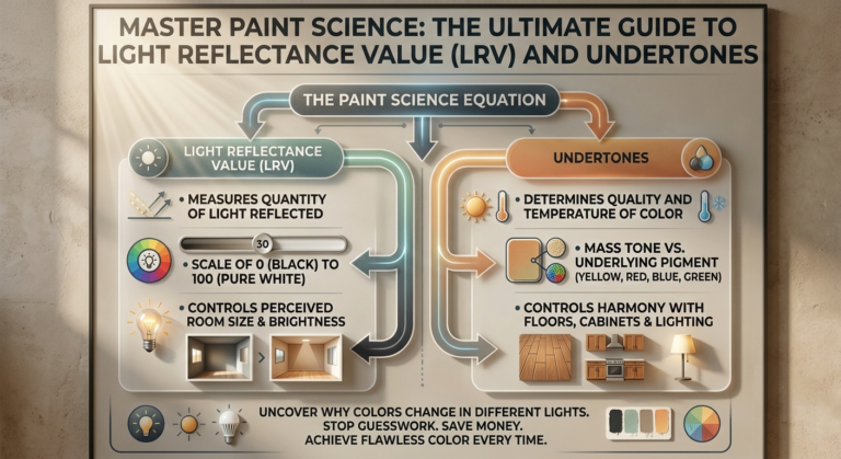
Have you ever picked a paint color from a store swatch, painted an entire wall, and wondered why it looked completely different from what you imagined? You are definitely not alone. Paint is dynamic—it reacts continuously to architecture, artificial light, and natural sunshine. Once you master two simple concepts—Light Reflectance Value (LRV) and undertones—you will never buy the wrong paint color again.
What is Light Reflectance Value (LRV) and Why Does It Matter?
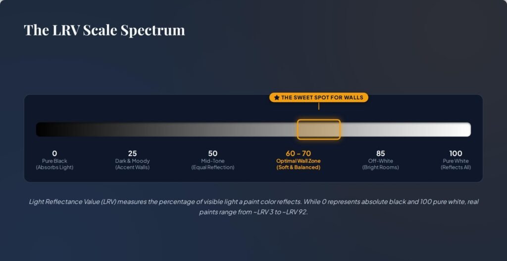
Light Reflectance Value (LRV) measures the percentage of light a paint color reflects on a scale from 0 (absolute black, absorbing all light) to 100 (pure white, reflecting all light).
Why does this number matter for your walls?
Dark shades (LRV under 50): Absorb light, creating cozy, moody, or dramatic spaces.
Light whites (LRV above 75): Reflect high amounts of light, making small spaces feel larger, though they can sometimes feel sterile or washed out in harsh light.
The Sweet Spot (LRV 60–70): This is the magic range for primary walls. Colors in this category offer enough depth to feel rich and cozy while reflecting plenty of light to keep your home feeling airy and open.
Decoding Undertones: Pink, Yellow, Green, and Gray
Neutrals are rarely just “plain white” or “pure gray.” Every neutral paint carries subtle undertones split into warm (yellow, pink, red, orange) and cool (blue, green, violet) categories.
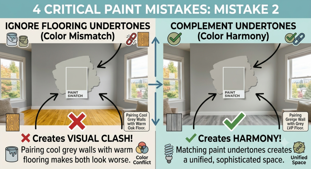
Ignoring undertones is the single fastest way to make a room feel off. For example, if you pair a warm yellow-based beige wall with cooler blue-toned gray flooring, both elements will visually clash. Always identify the fixed elements in your home—such as hardwood floors, quartz countertops, or stone fireplaces—and choose a neutral paint whose undertones harmonize with those existing materials.
The Golden Rule of Sampling Paint
Never skip testing samples in your actual home! Paint cards viewed under bright fluorescent retail lights look entirely different when applied in a residential setting.
Here is the best way to test colors effectively:
Use peel-and-stick color samples (such as Samplize) or paint large 2×2 foot poster boards with sample cans.
Move the sample to different walls throughout the room.
Observe the swatches at four key times: early morning, midday sun, late afternoon, and late evening under your artificial lamps.
PRO TIP: Do not paint samples directly onto bright white walls or colored surfaces. The existing background color will distort your perception of the new sample. Always leave a white border around your test swatch or stick it onto a removable white board.
Avoid Expensive Paint Mistakes: Read the Full LRV & Undertones Breakdown Here
Top 7 Sherwin-Williams Neutral Paint Colors (Deep Dive Breakdown)
Sherwin-Williams offers an extensive line of interior finishes, but seven neutral shades stand out as designer favorites for their versatility and balance. Here is a breakdown of these top-performing colors.
1. SW Alabaster (SW 7008) – The Icon of Soft, Warm Whites
LRV: 82
Undertones: Warm yellow-cream
Best Paired With: Medium-to-dark hardwood floors, matte black fixtures, and soft brass hardware.
SW Alabaster is easily one of the most recognizable off-white paint colors on the market. It strikes a balance between crisp white and soft cream, providing a cozy atmosphere without turning overly yellow. It serves as an exceptional color for open-concept main walls, transitional entryways, and kitchen cabinetry.
2. SW Accessible Beige (SW 7036) – The Perfect Warm Greige That Suits Every Room
LRV: 58
Undertones: Subtle gray-taupe with zero unwanted pink tones
Best Paired With: Crisp white trim, warm oak cabinetry, and linen textiles.
If you are worried about beige feeling dated, SW Accessible Beige is a reliable modern option. Classified as a classic “greige” (a blend of gray and beige), it retains the cozy comfort of traditional tan while adding enough gray to feel modern. It performs exceptionally well in open-plan spaces, living rooms, and master suites.
3. SW Greek Villa (SW 7551) – Cozy, Sun-Kissed White for North-Facing Rooms
LRV: 84
Undertones: Creamy yellowish-beige
Best Paired With: Soft green accent colors, natural rattan, and light ash furniture.
North-facing rooms receive cool, shadowy light that can make standard off-whites look dull or slightly blue. SW Greek Villa addresses this by introducing warm undertones that soften cool lighting. It leaves spaces feeling sun-lit, airy, and inviting without reading as overly warm.
4. SW Creamy (SW 7012) – Rich, Traditional Creamy Neutral for Cabinets & Walls
LRV: 81
Undertones: Soft yellow and buttery ivory
Best Paired With: Rich mahogany, deep navy accents, and traditional brushed gold accessories.
SW Creamy delivers a timeless look for traditional, transitional, and cottage-style interiors. It is noticeably richer than Alabaster or Greek Villa, making it an excellent candidate for trim work, interior doors, built-in bookshelf units, and kitchen cabinets that need to feel established and cozy.
5. SW Repose Gray (SW 7015) – The Versatile Cool-Warm Hybrid Gray
LRV: 58
Undertones: Gray with slight taupe and subtle blue-green undertones
Best Paired With: Slate grey tiles, marble countertops, and contemporary black accents.
Finding a gray color that doesn’t feel cold or clinical can be a challenge. SW Repose Gray solves this by balancing cool gray with a hint of warm taupe. In brightly lit rooms, it reads as a clean, soft gray; in darker rooms, its warm base comes through to keep the space inviting.
6. SW Balanced Beige (SW 7037) – Adding Depth and Warmth to Large Spaces
LRV: 46
Undertones: Warm taupe and deep beige
Best Paired With: Creamy white trims, rich cognac leather furniture, and stone features.
When you have a large living area with high ceilings, light neutral shades can sometimes feel thin. SW Balanced Beige offers deeper pigment and substance. Sitting one shade darker than Accessible Beige on the color swatch strip, it delivers cozy, grounding color that anchors open spaces.
7. SW Shoji White (SW 7042) – The Japandi & Minimalist Decor Favorite
LRV: 74
Undertones: Soft greige and warm cream
Best Paired With: Light oak floors, bouclé fabric, tactile natural fiber rugs, and minimalist decor.
SW Shoji White sits right on the border between an off-white and a light greige. It is a top choice for modern minimalist, Scandinavian, and Japandi interior aesthetics. It gives walls a soft visual feel without overwhelming the architectural features of the room.
How Lighting Completely Changes Neutral Paint Colors
Paint colors do not exist in a vacuum—they are constantly influenced by both natural daylight and indoor lighting choices.
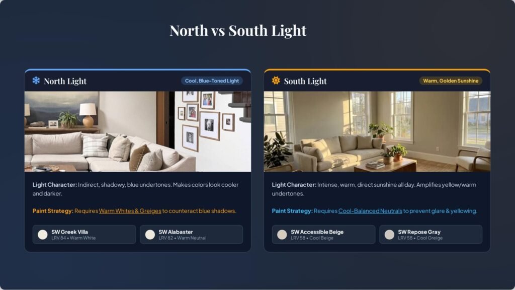
North-Facing Rooms: Handling Cold Blue Light
North-facing windows bring in cool, indirect light that tends to accentuate blue, gray, and green undertones.
The Challenge: Cool gray paints will feel chilly or shadowy here.
The Solution: Counter balance cool natural light with warm-toned neutrals like SW Greek Villa or SW Alabaster. The subtle yellow-cream undertones offset the blue cast, restoring warmth to the room.
South-Facing Rooms: Handling Intense Warm Light
South-facing rooms receive intense, golden light throughout most of the day.
The Challenge: High-LRV warm whites can occasionally look overly yellow or washed out under direct sun.
The Solution: Use greiges and balanced neutrals such as SW Accessible Beige or SW Repose Gray. The warm sunlight will soften the gray component naturally without making the room look overly warm.
East & West-Facing Rooms: Morning vs. Afternoon Light Shifts
East-Facing Rooms: Enjoy bright, warm light in the early morning that turns cooler by afternoon. Neutral colors with light greige bases maintain consistency as the sun shifts.
West-Facing Rooms: Start the morning with cooler light before receiving intense golden sunshine late in the afternoon. Keep in mind that warm creams can look very vibrant during sunset in these spaces.
Artificial Lighting Matters: Bulbs and Kelvin Ratings
Your choice of lighting hardware makes a massive difference in how paint appears after dark:
2700K (Warm White Bulbs): Emphasize yellow and orange tones. Ideal for cozy living areas, though they can make soft creams look slightly more yellow.
3000K (Soft White Bulbs): The ideal baseline for most home interiors. It renders neutral paint colors cleanly without shifting undertones too drastically.
4000K+ (Daylight LED Bulbs): Produce a cool blue tint. They work well in garage or utility spaces, but can make warm neutrals look dull in residential living rooms.
Room-by-Room Neutral Styling Guide
Now here’s where it gets interesting: applying these shades across your home to create a seamless, well-styled interior.
Living Room: Creating a Welcoming, Open-Concept Flow
To keep open-concept living spaces cohesive, use a primary wall color with an LRV around 60–70.
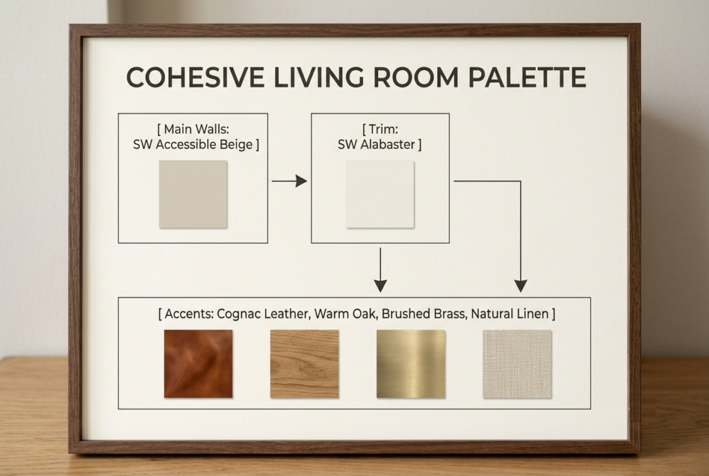
For an inviting living area, try painting your main walls with SW Accessible Beige ($65–$85 / £50–£65 per gallon). Pair it with soft linen drapery, warm oak coffee tables from stores like Wayfair, West Elm, or Dunelm, and plush cream throw blankets.
Kitchen & Dining: Coordinating Cabinet Colors with Surfaces
Kitchens feature multiple hard surfaces like backsplash tile, quartz counter tops, and flooring that interact with your paint.
Warm Countertops (Calacatta Gold / Warm Wood): Pair with SW Alabaster or SW Creamy for cabinetry.
Cool Countertops (Carrara Marble / Concrete): Pair with SW Repose Gray on cabinets to highlight gray veining.
Bedrooms & Bathrooms: Spa-Like Neutral Palettes
Transform your bedroom into a quiet retreat by using low-contrast color palettes. Try SW Shoji White on bedroom walls paired with tonal bed linens from stores like Target, H&M Home, or IKEA. The subtle greige backdrop promotes a calming, restful atmosphere.
Hallways & Entryways: Brightening Windowless Spaces
Hallways often lack direct window light. Brighten these transitional zones using high-LRV colors like SW Greek Villa or SW Alabaster. Combining these bright tones with crisp white trim helps reflect ambient light from adjacent rooms down dark corridors.
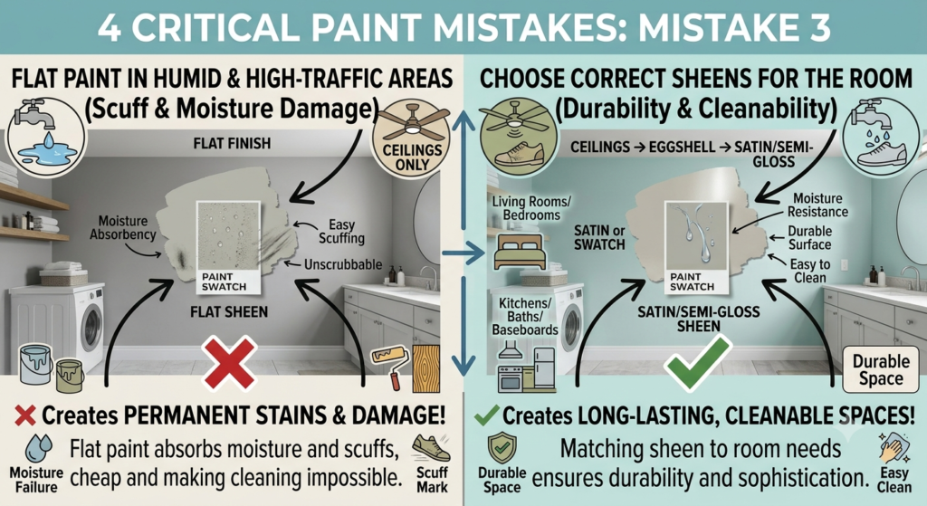
PRO TIP: When selecting finishes for hallways or kids’ rooms, opt for a Soft-Gloss or Satin finish over flat paint. Higher sheen levels make it significantly easier to wipe away scuffs and smudges.
Accent Walls, Trim, and Ceilings: How to Finish the Look
Painting your main walls is only half the project—selecting matching trim and ceiling finishes completes the room.
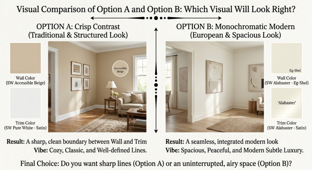
Choosing the Right Trim Color
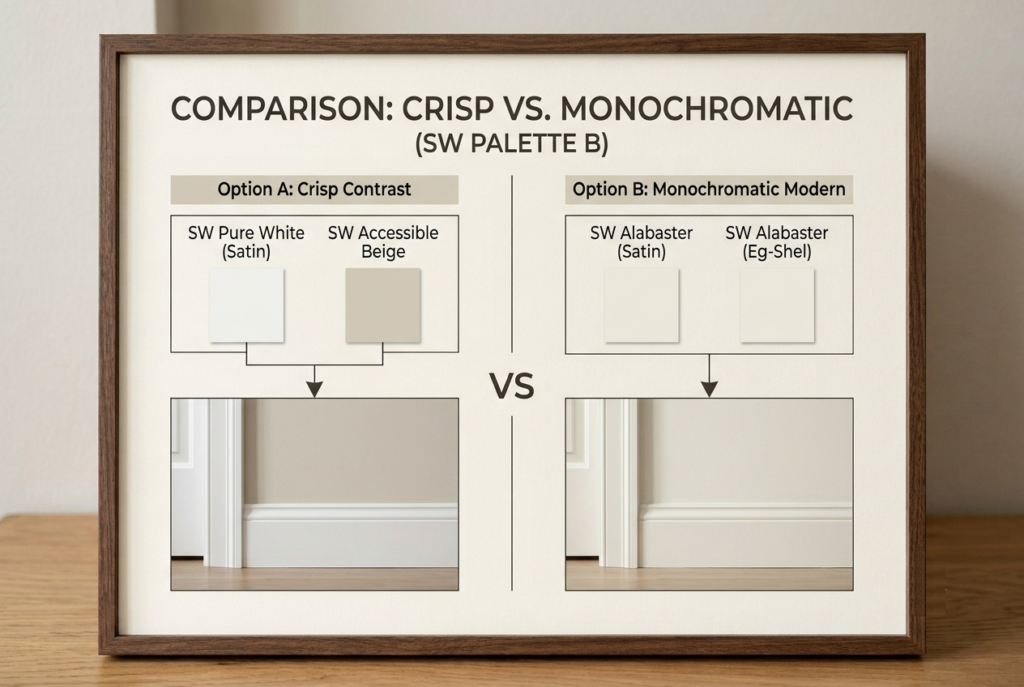
The Crisp Contrast Look: Combine a soft warm wall like Accessible Beige with a clean white trim color such as SW Pure White (SW 7005). This highlights architectural detailing and keeps baseboards looking sharp.
The Monochromatic Look (Color Drenching): Use the exact same neutral paint color on both walls and trim, but vary the sheen level (e.g., Eggshell finish on walls, Satin finish on baseboards). This creates a modern look that can make small spaces feel visually continuous.
Why Product Choice Matters: High-Performance Trim Paints
Interior doors, moldings, and window frames sustain daily wear and tear. For durable results on these surfaces, consider applying Sherwin-Williams Emerald Urethane Trim Enamel. This specialized finish cures into a smooth coating that resists yellowing, scuffs, and chipping over time.
Ceiling Colors: Pure White vs. Softened Tones
Using standard bright white ceiling paint straight out of the can can sometimes create an overly sharp contrast against warm neutral walls. For a softer transition overhead, consider tinting your ceiling paint with a small percentage of your main wall color, or use a versatile off-white tone like SW Bright White.
5 Designer-Approved Color Schemes Using SW Neutrals
Here are five practical color palettes built around Sherwin-Williams neutral paints to inspire your next room refresh:
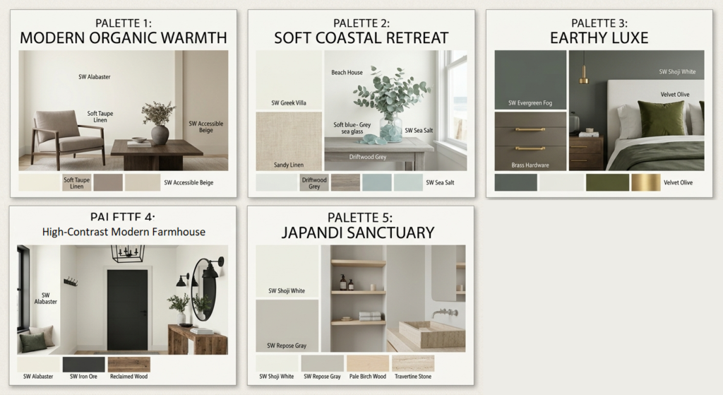
Palette 1: Modern Organic Warmth
Primary Wall: SW Accessible Beige
Trim & Ceiling: SW Alabaster
Decor Accents: Dark oak furniture, cognac leather chairs, and matte black lighting fixtures.
Palette 2: Soft Coastal Retreat
Primary Wall: SW Greek Villa
Accent Color: SW Sea Salt (SW 6204)
Decor Accents: Light driftwood finishes, woven jute rugs, and crisp white linen bedding.
Palette 3: Earthy Luxe
Primary Wall: SW Shoji White
Accent Wall/Cabinets: SW Evergreen Fog (SW 9130)
Decor Accents: Unlacquered brass hardware, velvet olive cushions, and warm walnut woodwork.
Palette 4: High-Contrast Modern Farmhouse
Primary Wall: SW Alabaster
Trim/Interior Doors: SW Iron Ore (SW 7069)
Decor Accents: Reclaimed barnwood, black iron accents, and textured cream upholstery.
Palette 5: The Japandi Sanctuary
Primary Wall: SW Shoji White
Secondary Neutral: SW Repose Gray (used on built-in furniture)
Decor Accents: Pale birch wood, travertine stone coffee tables, and tactile bouclé textiles.
4 Critical Paint Mistakes That Make Homes Look Cheap (And How to Avoid Them)
Avoiding common painting pitfalls saves both time and money. Here are four regular mistakes homeowners make alongside tips and quick solutions to fix them.

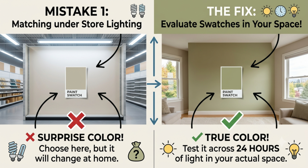
Mistake 1: Matching Wall Paint to Sample Cards Under Store Lighting
Selecting a paint color while standing under bright store lights can lead to surprises at home. Always evaluate swatches inside your actual space under real daily lighting conditions.
Mistake 2: Ignoring Flooring Undertones
Pairing cool gray paint with yellow-toned oak floors—or placing warm tan walls over gray luxury vinyl plank (LVP) flooring—creates a visual mismatch. Always choose a wall paint that complements the existing undertones in your flooring.
Mistake 3: Using Flat Paint in High-Traffic or Humid Areas
Flat or matte sheens show scuffs easily and absorb moisture, making them tough to scrub. Save flat paint for low-traffic ceilings. Use Eggshell for living rooms and bedrooms, and Satin or Semi-Gloss for kitchens, bathrooms, and baseboards.
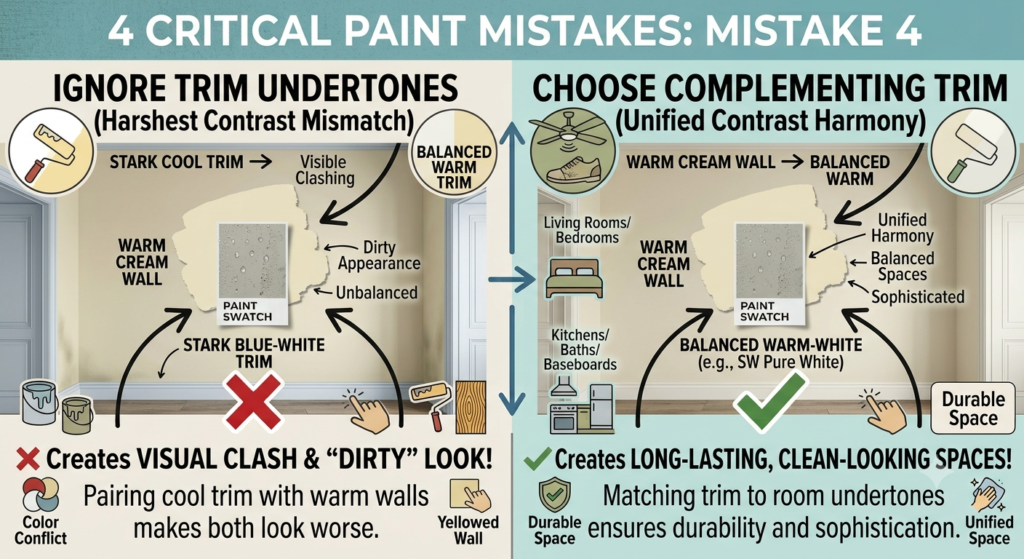
Mistake 4: Painting Trim the Wrong Shade of White
Applying a bright blue-white trim paint next to a warm cream wall can make the wall color appear dirty or yellowed by comparison. Pair warm wall colors with balanced trim shades like SW Pure White to preserve a clean contrast.
Frequently Asked Questions About Sherwin-Williams Neutrals
Here are answers to common questions about selecting and applying Sherwin-Williams neutral paints:
Q: What is the most popular Sherwin-Williams neutral color?
A: SW Alabaster (SW 7008) and SW Accessible Beige (SW 7036) consistently rank among the brand’s top-selling colors. Designers favor them for their versatile undertones that complement both modern and traditional home styles.
Q: Is Accessible Beige warm or cool?
A: SW Accessible Beige is a warm greige color. It combines warm beige tones with subtle gray undertones, making it significantly warmer than standard grays while remaining cooler than traditional tan.
Q: What white trim goes best with Alabaster walls?
A: SW Pure White (SW 7005) pairs well with SW Alabaster walls. It provides a subtle contrast without introducing cold blue undertones that might clash with Alabaster’s warmth.
Q: Can I mix cool gray furniture with warm neutral walls?
A: Yes, you can combine cool gray furniture with warm neutral walls by selecting a transitional greige paint like SW Repose Gray or SW Shoji White. Incorporating mixed accent pieces—such as natural wood, woven fabrics, and metal fixtures—helps tie cool and warm tones together.
Q: How do I choose between SW Alabaster and SW Greek Villa?
A: While both are warm off-whites, SW Greek Villa carries a slightly richer, creamier undertone compared to SW Alabaster. Greek Villa works well in cool, north-facing rooms, whereas Alabaster is a versatile option for open-concept areas.
Q: Should ceiling paint match the wall color in a neutral room?
A: Painting your ceiling the same color as your walls in a flat sheen creates a cozy feeling in rooms with high ceilings. However, in rooms with standard ceiling heights, choosing a soft white like SW Bright White helps maximize perceived room height.
Q: What paint sheen is best for neutral living room walls?
A: An Eggshell or Velvet finish works best for neutral living room walls. These sheens offer a soft appearance that hides minor wall imperfections while providing enough washability for regular household maintenance.
Q: How many coats of neutral paint are usually needed over dark walls?
A: Transitioning from a dark wall color to a light neutral generally requires one coat of quality stain-blocking primer followed by two coats of premium interior paint to ensure accurate color coverage.
Finding Your Perfect Neutral Shade
Choosing the right paint shade comes down to understanding your space’s lighting, undertones, and functional needs. By following these practical tips and quick solutions, you can avoid common sampling mistakes and pick a Sherwin-Williams neutral color that enhances your home’s natural light and architectural character.
Whether you choose the warm feel of SW Alabaster, the balance of SW Accessible Beige, or the minimalist look of SW Shoji White, testing your top choices at home is the best way to ensure success. Grab a few peel-and-stick samples, observe how they look throughout the day, and transform your living space with confidence!
What Sherwin-Williams neutral color are you planning to sample next? Explore our guide to [Comparing SW Creamy vs. SW Alabaster] and share your favorite combinations in the comments section below!