
Selecting the perfect backdrop for a home often feels like trying to hit a moving target under unpredictable lighting conditions. In my decade of design experience, I have witnessed countless homeowners fall into the trap of picking a gray that turns icy blue, or a beige that ends up looking like muddy yellow. The ultimate antidote to this common residential dilemma is mastering the selection of Sherwin-Williams Greige Paint Shades. By seamlessly blending the cool sophistication of gray with the enveloping warmth of beige, these specialized hybrid tones create an adaptable, structurally sound foundation for any style of architecture.
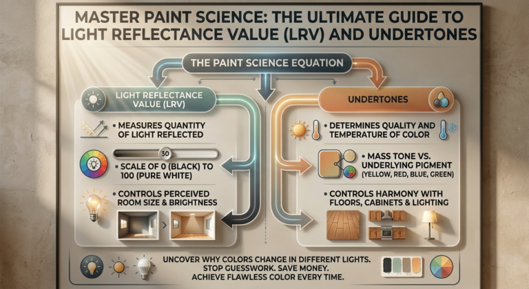
The core problem with choosing a greige is that these colors are extreme chameleons, heavily influenced by the direction of your windows and the color temperature of your lightbulbs. To fix this, I utilize a repeatable metric that balances Light Reflectance Values (LRV) against the specific chemical undertones of the paint formula. This intentional approach guarantees that your chosen backdrop stays completely elegant, clean, and balanced throughout the morning and night. In this field-tested blueprint, I am detailing my top 20 professional design concepts featuring Sherwin-Williams Greige Paint Shades to help you completely elevate your spatial layout.
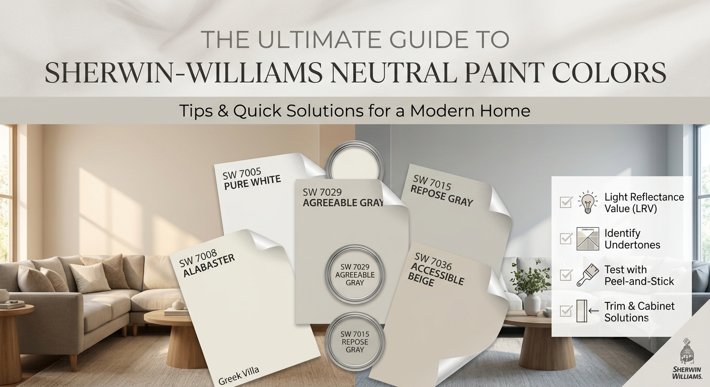
Quick Reference Comparison Table
| Shade Profile | Paint Name & Number | Light Reflectance Value (LRV) | Best Room Application | Dominant Underlying Tint |
| 1 to 5: Light & Airy | Agreeable Gray SW 7029 | 60 | Open-Concept Living Areas | Soft Taupe |
| 6 to 10: Deep & Anchored | Mega Greige SW 7031 | 37 | Media Rooms, Accent Walls | Earthy Silt |
| 11 to 15: Warm & Creamy | Accesssible Beige SW 7036 | 58 | North-Facing Lounges | Gray-Olive |
| 16 to 20: Cool & Tailored | Alpaca SW 7022 | 57 | Sunny South-Facing Rooms |
Pre-requisites Checklist & Tools You Need
Before you apply a single drop of paint to your drywall, you must compile the specific technical tools necessary to protect your home’s architectural lines. This is the exact setup I bring to every luxury styling consultation:
Samplize Peel-and-Stick Test Sheets (12″ x 12″ dimensions): Moveable real-paint swatches that let you track how colors change across walls without painting permanent patches.
Purdy ClearCut Elite 2.5-inch Angled Sash Brush: Crucial for executing perfectly straight, crisp lines against ceilings and baseboards.
3M ScotchBlue Professional Painter’s Tape (1.5-inch width): Formulated to prevent paint bleed-through along your wooden trim seams.
Wooster Pro Woven 9-inch Roller Cover (3/8-inch nap): The perfect nap depth to create a completely smooth, professional flat-matte finish on standard residential drywall.
High-CRI 2700K Warm White LED Light Bulbs: Standardizing your home’s artificial light source to this warmth prevents your neutrals from turning green or slate gray at night.
Detailed Structural Breakdown of the 20 Color Ideas
1. Agreeable Gray SW 7029
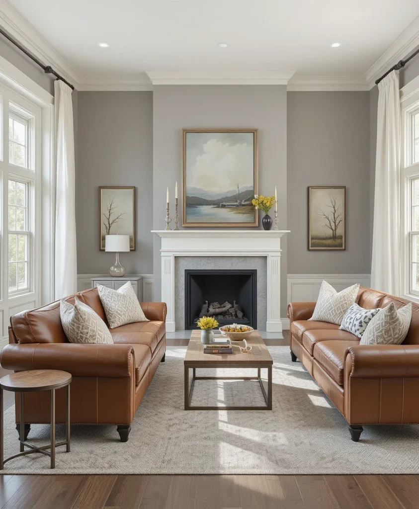
I always recommend this iconic tone when a client requests an effortless, universally flattering open-concept foundation that never clashes with existing woodwork. It stands as the absolute king of Sherwin-Williams Greige Paint Shades because its chemical composition perfectly balances a warm taupe baseline with a crisp gray overlay. I love running this color continuously from main seating lounges directly into kitchens to establish a massive sense of unbroken spatial flow. It acts as an exceptionally forgiving canvas that lets rich cognac leather furniture and crisp white linen drapery panels look instantly high-end and cohesive.
2. Repose Gray SW 7015
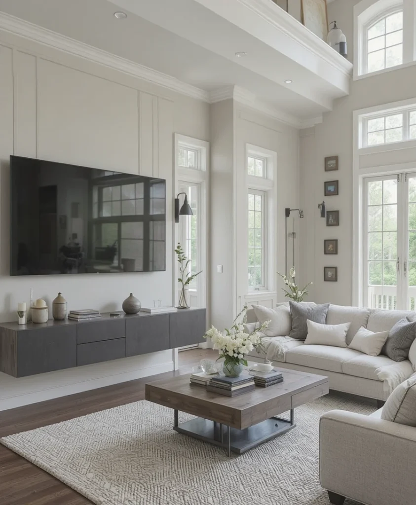
For modern properties featuring minimalist lines and sharp geometric windows, this slightly cooler greige provides an incredibly tailored aesthetic. It carries a tiny drop of brown pigment that prevents it from feeling clinical, though it leans just enough into the gray spectrum to feel beautifully current. I routinely use this shade on expansive multi-media walls to soften the visual impact of large television screens and matte black iron light fixtures. It creates an ultra-smooth, premium backdrop that elevates architectural angles while keeping the perimeter feeling unified, bright, and clean.
3. Accessible Beige SW 7036
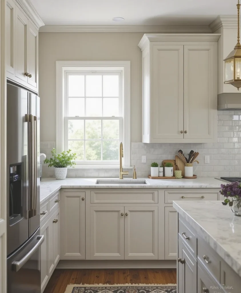
When a home suffers from cold, blue-toned northern light, a standard gray paint will instantly make the rooms look like damp commercial concrete. I counteract this environmental challenge by utilizing this beautiful beige-leaning greige, which introduces an immediate layer of organic warmth without turning orange. It features a faint gray-olive undertone that restrains the color from looking dated or yellowed under bright natural light streams. It is an extraordinary choice for kitchen cabinetry, providing a soft contrast against marble countertops and unlacquered brass hardware.
4. Anew Gray SW 7030
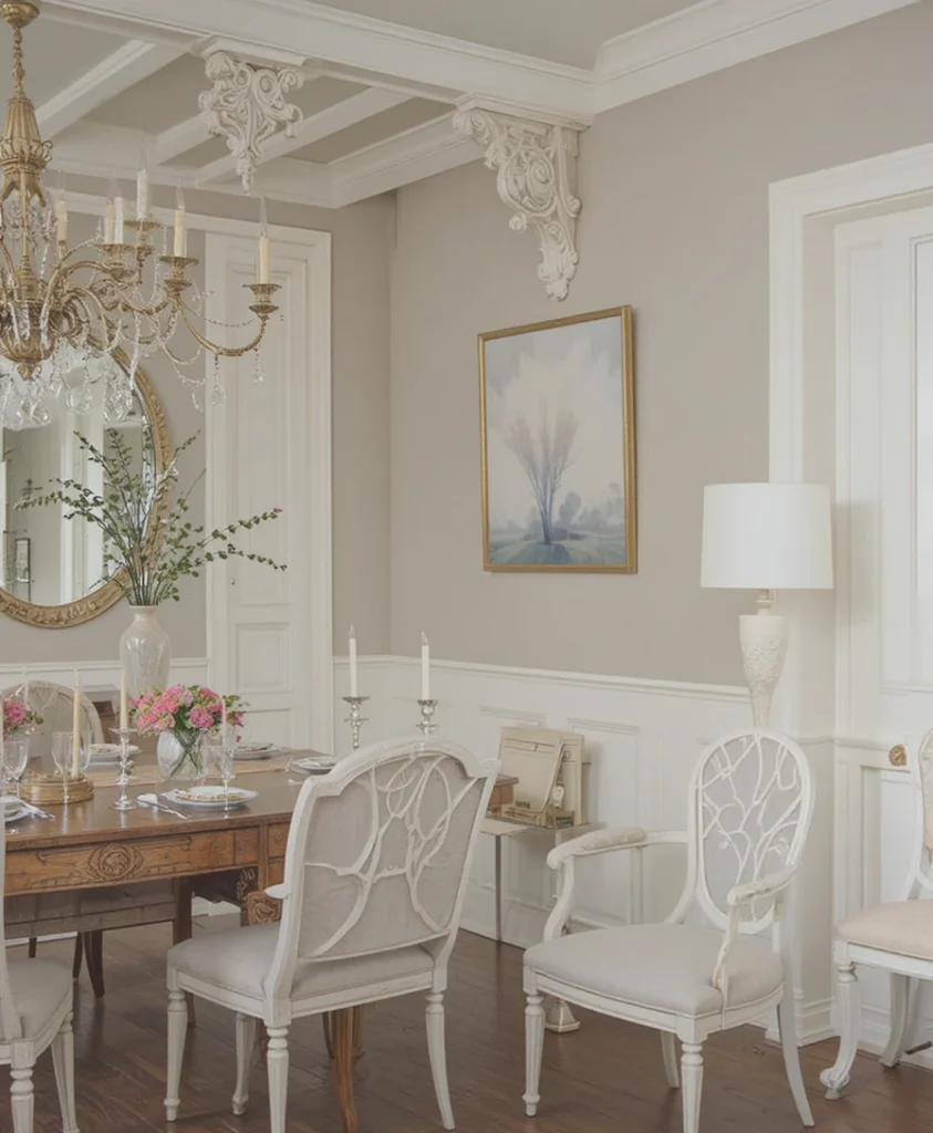
If you want your walls to showcase a bit more structural presence than a standard off-white, this mid-tone greige offers incredible decorative depth. It sits directly between light sand and rich stone, meaning it retains its body beautifully even when hit by blinding midday sun. I find it performs exceptionally well in formal dining rooms paired with traditional white wainscoting and rich walnut furniture pieces. The underlying warmth within the pigment creates an inviting, celebratory environment that feels completely optimized for long, relaxed evening gatherings.
5. Mega Greige SW 7031
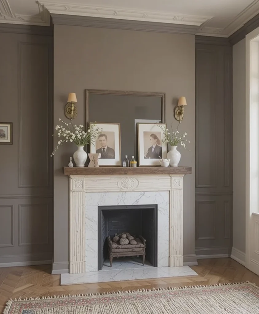
When I am tasked with designing a moody reading alcove or an anchor wall behind a fireplace, I look to this saturated, silt-rich hue. It provides a magnificent, high-contrast backdrop that makes floating timber mantles and brushed brass light fixtures appear incredibly dramatic and sculptural. The heavy brown baseline prevents it from looking industrial, ensuring it retains its comforting, soil-like warmth despite its depth. It acts as a powerful structural anchor that effortlessly unifies an expansive layout when paired with lighter companion greiges on the adjacent walls.
6. Perfect Greige SW 6073
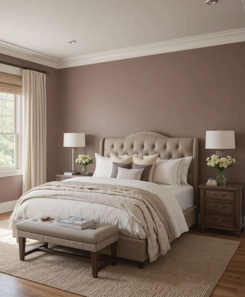
This specific option features a rich, red-mauve baseline undertone, making it one of the absolute coziest choices available in the entire palette. I highly recommend coating an entire bedroom sanctuary in this color because it creates an immediate sense of quiet security that drops cortisol levels. It absorbs harsh exterior afternoon glare beautifully instead of reflecting it back into your eyes, keeping the sleeping space relaxed and peaceful. Combine it with crisp cream bedding and a plush woven wool area rug to achieve a flawless, high-end boutique hotel aesthetic.
7. Mindful Gray SW 7016
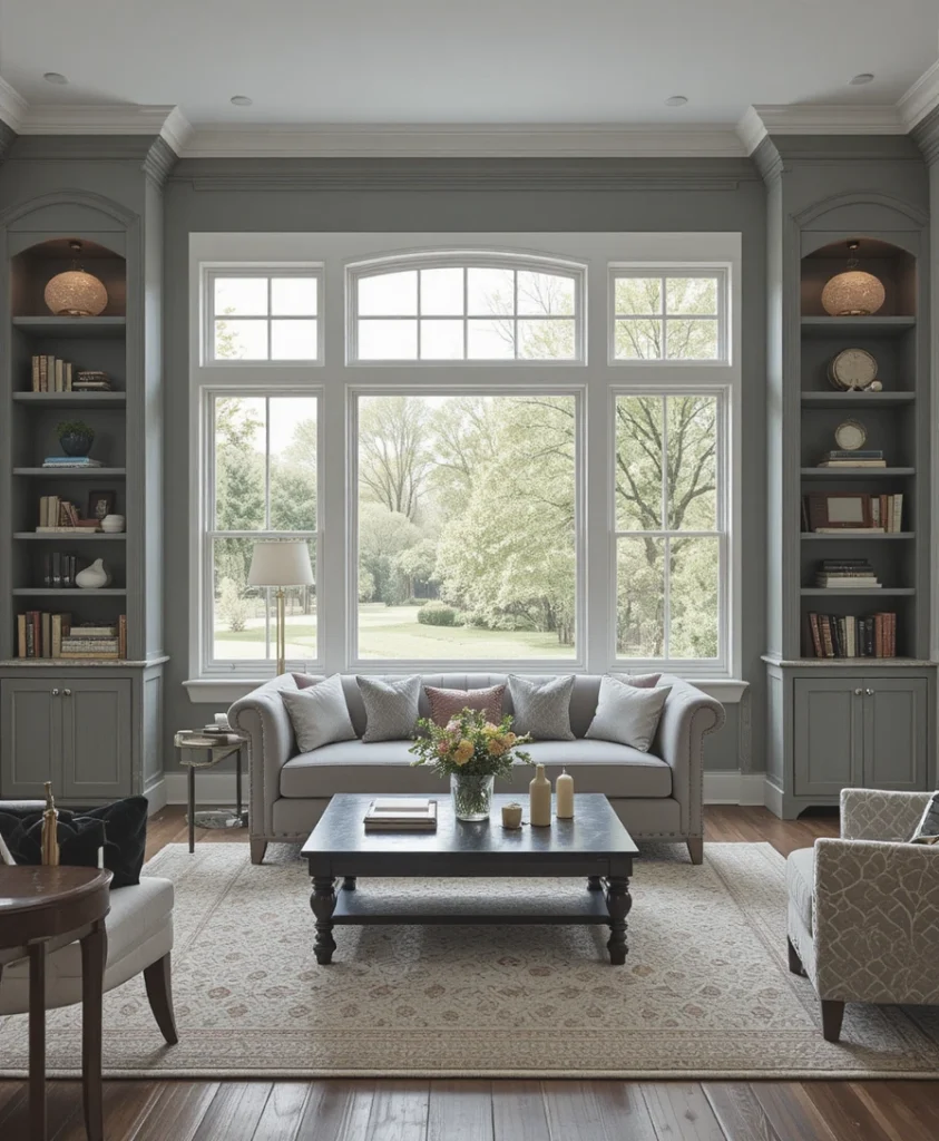
For busy family areas that require a sturdy, resilient color that handles daily traffic while remaining upscale, this deep gray-greige is spectacular. It offers a solid, grounded appearance on the wall, showing off its sophisticated stony lineage without ever drifting into a cold charcoal temperature. I love utilizing it directly on custom built-in bookcases and window trim to frame outdoor views like a massive landscape painting. It provides an undeniable freshness to your main lounge that feels incredibly current, tailored, and structurally sound.
8. Alpaca SW 7022
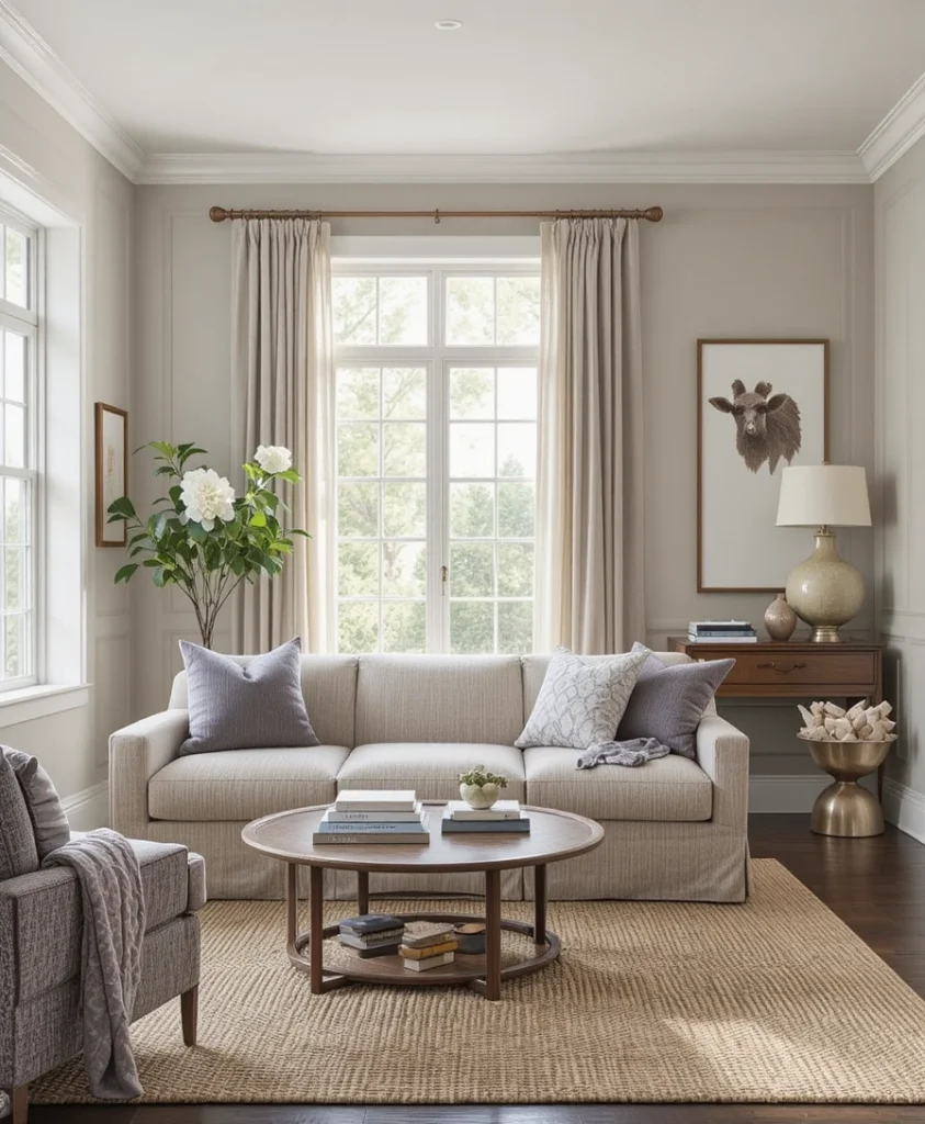
This fascinating light neutral behaves like a true chameleon, carrying a delicate, cool violet undertone within a soft beige-gray foundation. I often specify this color for south-facing rooms where the intense, golden afternoon sun can make standard neutrals look completely yellowed and washed out. The subtle purple-slate baseline acts as an internal cooling agent, keeping the walls looking balanced, breezy, and completely sophisticated. It sets a very grounded, serene tone that feels highly authentic when paired with textured boucle fabrics and natural jute rugs.
9. Versatile Gray SW 6072
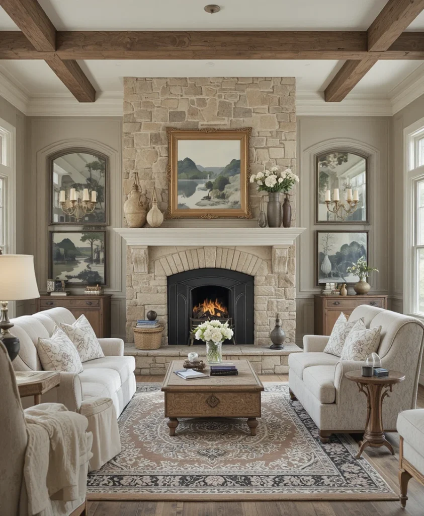
If your home features lots of traditional stone finishes, brick fireplace hearths, or heavy timber beams, this warm-toned option bridges those elements seamlessly. It possesses a generous dose of beige tinting that brings out the natural, organic textures of masonry craftsmanship without looking muddy or flat. I love using this color in historic properties because it highlights original plaster details and antique woodworking with incredible grace. It delivers a highly refined, calm atmosphere that balances historical heritage with crisp, modern residential layout requirements.
10. Warm Gloss SW 9631
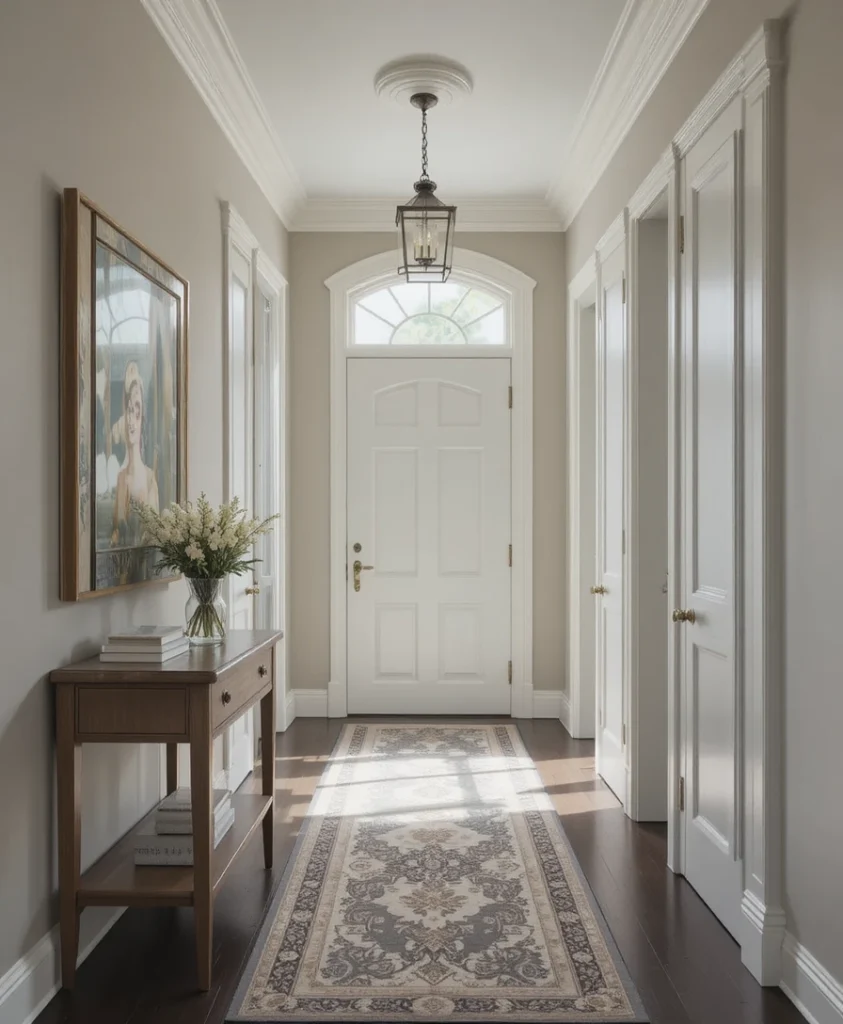
As part of the specialty designer collections, this light, airy greige brings an undeniably fresh, luminous quality to tight architectural spaces. It features a high light reflectance value that bounces ambient light efficiently across narrow hallways and windowless entryways without losing its cozy feel. I love how this color remains exceptionally clean under bright overhead light fixtures, completely avoiding the dingy look that standard grays display. Pair it with dark espresso wood flooring to build an authentic, high-contrast transitional layout that looks completely custom.
11. Wordly Gray SW 7043
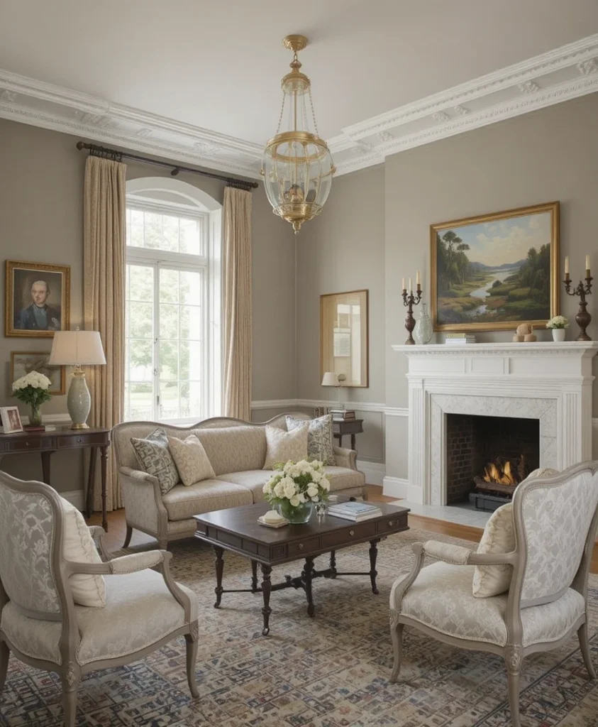
This deeply complex, silt-inspired neutral sits perfectly on the fence between a warm tan and a cool slate, making it highly responsive to shadows. I recommend this shade for formal sitting rooms dedicated to quiet conversation because its appearance shifts beautifully as the sun moves across the sky. It allows fine oil landscape paintings and structural white crown moldings to pop beautifully without the room ever feeling stiff or cold. It brings a historic estate quality to your home that feels incredibly sophisticated, authoritative, and timeless.
12. Balanced Beige SW 7037
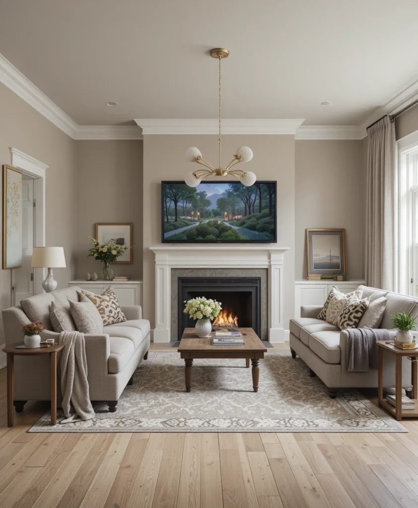
When designing an intimate family media space, a color with real pigment depth is required to block screen glare and set a relaxing mood. This rich, traditional taupe-greige wraps around your seating area like a heavy cashmere blanket, functioning beautifully under low-wattage accent lamps. I prefer using this shade when the floor is a light white oak, as it creates a beautiful, grounding contrast that defines boundaries. It makes a large, chilly room feel instantly scaled down, cozy, and perfectly tailored for late-night entertainment.
13. Colonnade Gray SW 7641
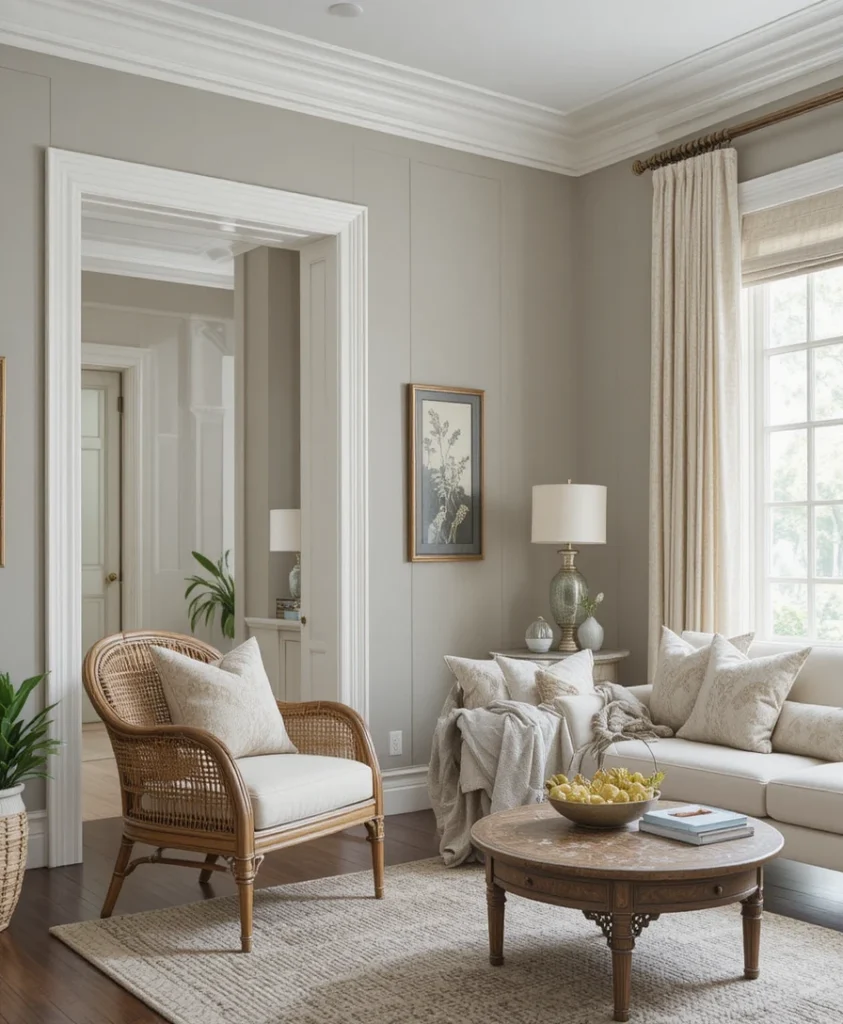
This sophisticated shade is often described by designers as a perfect historical greige, closely mimicking the weathered stone found in classic European architecture. It carries a clean, silver-gray exterior that is continuously warmed by an internal shadow of soft yellow ochre and raw umber tints. I find it creates a stunning visual partnership when paired with clean white trim, woven rattan furniture, and light linen drapery panels. It visually cools down hot, south-facing spaces, introducing a permanent sense of fresh breeze and quiet residential luxury.
14. Realist Beige SW 6078
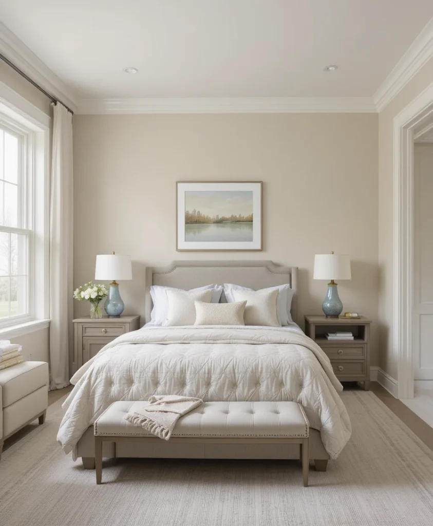
This pale, sandy greige is a fantastic alternative for anyone who finds pure white too stark and traditional beige too heavy for their taste. It carries a delicate, muted rose-taupe undertone that makes the walls feel like they are permanently basking in a soft dawn glow. I love using this color in guest suites because it casts a highly flattering, soft reflection on everything and everyone inside the room. This technique maximizes the perceived height of the space while keeping the boundaries soft, welcoming, and deeply soothing.
15. Worldly Gray SW 7043
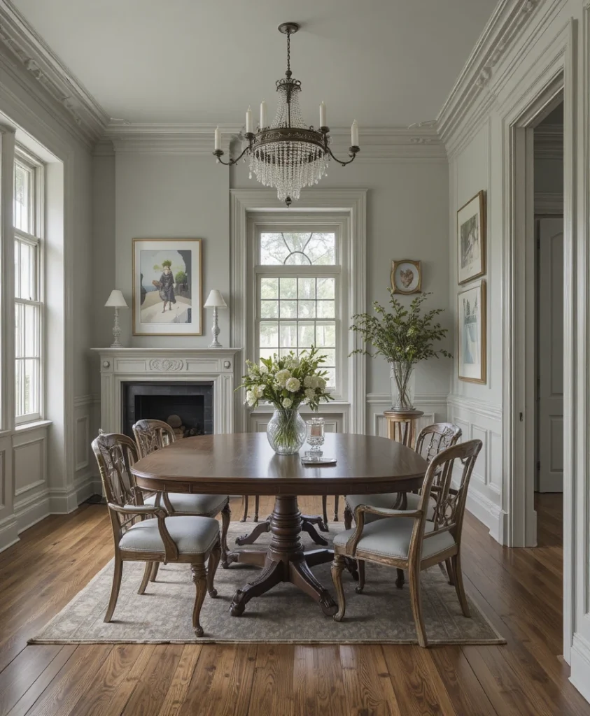
This specific option provides a magnificent balance of warm silt, soft green, and deep gray, resulting in a chameleon color that looks stunning in all lighting. I run this shade across sprawling open-plan spaces to unify varied flooring types, such as transition lines between slate kitchen tile and warm cherry hardwood. It allows your artwork frames and structural architectural moulding to take center stage without the room ever feeling cold. It is my absolute favorite choice for historic renovations where preserving a sense of grounded heritage comfort is paramount.
16. Intellectual Gray SW 7045
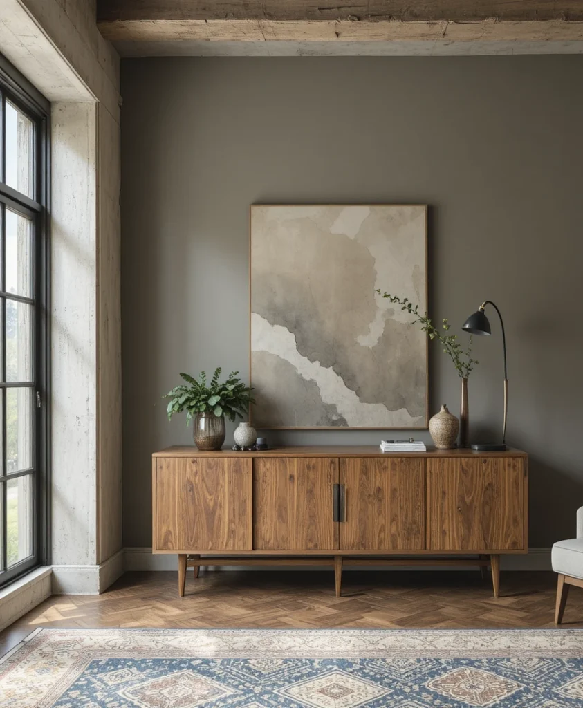
If your living area features deep bronze window profiles, industrial steel beams, or polished concrete accents, this heavy greige anchors those features beautifully. It carries a strong, commanding olive-gray undertone that feels deeply tied to natural minerals, weathered stone paths, and raw river rocks. I love utilizing it on a single focal wall behind a minimalist wood credenza to instantly elevate the room’s design profile. It infuses your lounging space with a rugged, organic character that feels highly artistic and entirely connected to nature.
17. Urban Bronze SW 7048
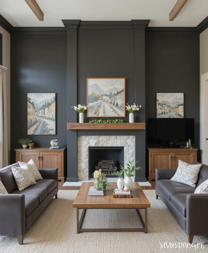
To give a sprawling, double-height living room a definitive focal point, I paint the fireplace bump-out or accent architecture in this deep, nature-matured charcoal greige. It is the darkest manifestation of the greige family, providing a magnificent contrast when placed behind light stone hearth textures or oak wood mantles. The warm, muddy undertone prevents it from looking like flat black paint, ensuring it retains its comforting qualities despite its incredible depth. It brings a grounded, organic luxury to an otherwise simple and straightforward open-concept home layout.
18. Functional Gray SW 7024
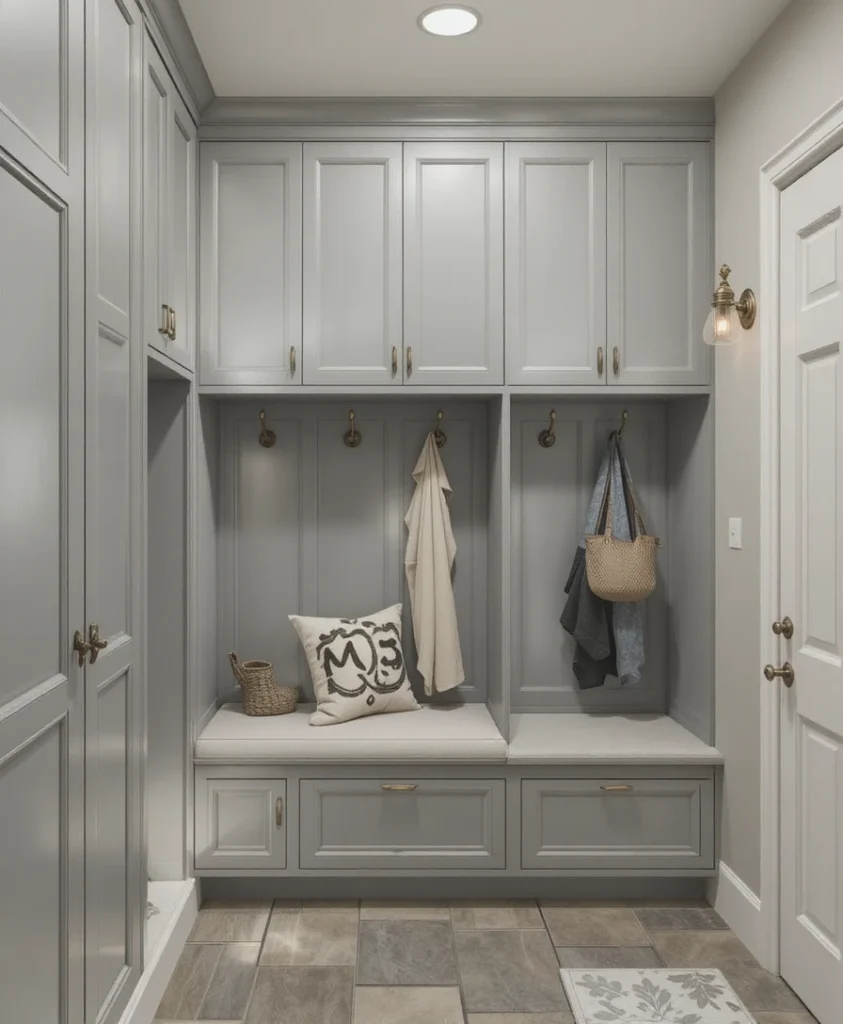
This mid-tone workhorse color delivers exceptional pigment balance, refusing to drift into yellow, blue, or pink under any lighting configuration. I highly recommend utilizing this shade for high-utility transitional zones like mudrooms, laundry rooms, and custom walk-in pantries. It hides everyday scuffs and fingerprints beautifully while maintaining a highly styled, intentional look across your storage cabinets and locker systems. Pair it with antique brass hooks and stone floor tiles to create an environment that feels organized, durable, and sophisticated.
19. Shoji White SW 7042
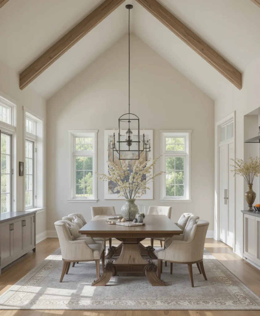
When an open-concept layout requires an ultra-light paint color that must bridge the gap between cool marble tiles and warm oak floors, this stone-tinted white shines. It features a faint greige baseline that gives the color real structural presence, meaning it never disappears or looks washed out under bright lights. I routinely use this to coat soaring cathedral ceilings because it softens the sharp roof peaks and throws light evenly downward. It delivers a highly refined, calm atmosphere that balances modern simplicity with organic warmth.
20. Poised Taupe SW 6039
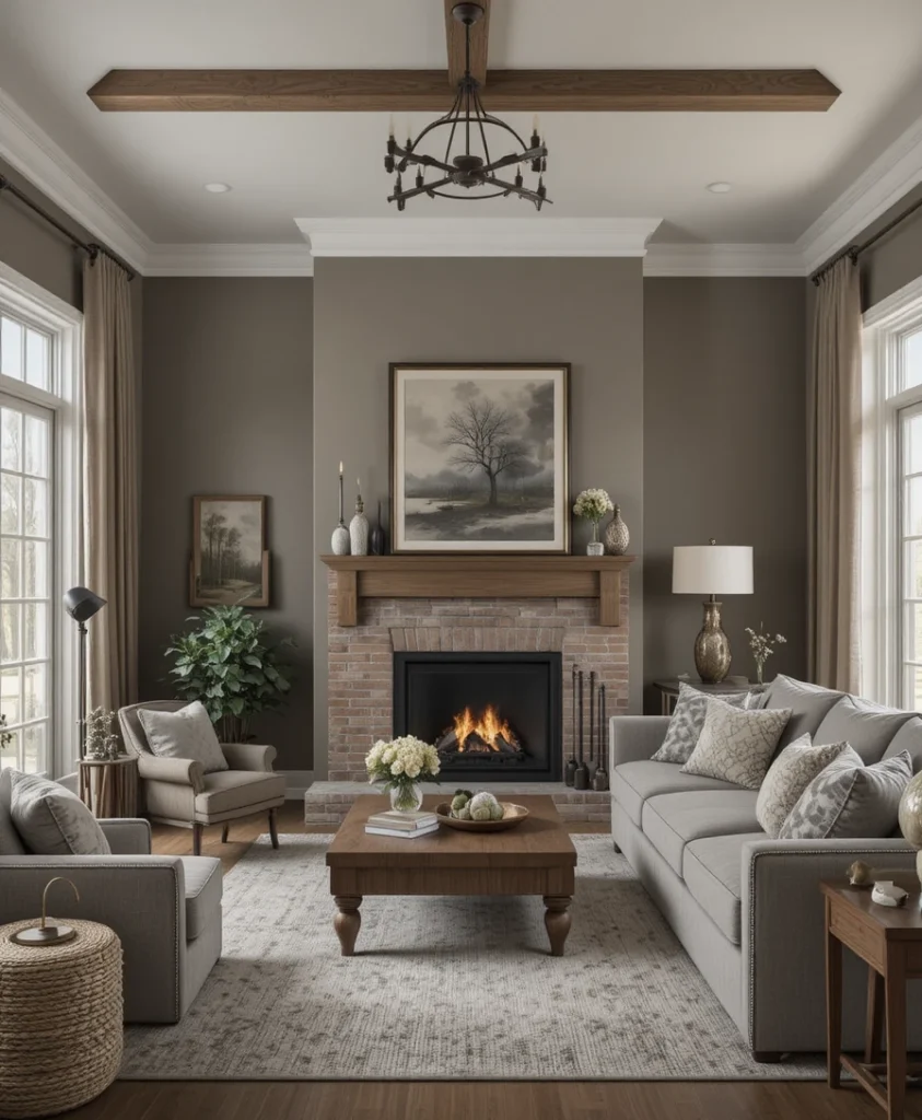
This heavy, wood-infused greige gray offers an abundance of earthy depth without veering into the cold, industrial feel of traditional charcoal paints. I recommend using a completely flat matte finish on this color to give the walls a rich, suede-like texture that absorbs echoing sound frequencies visually. It pairs perfectly with oversized plush sectional sofas, heavy velvet blackout drapery panels, and a warm brick fireplace setup. It creates an immersive, cocoon-like environment that looks stunning during cold winter months.
Pro Styling Hacks for Shifting Light
To get the absolute most out of your chosen Sherwin-Williams Greige Paint Shades upgrade, you must master the art of selecting the correct paint sheen. Many people default to using an eggshell finish on their walls, but if your room has large windows, eggshell can create a distracting, plastic-like sheen that highlights wall imperfections. I always recommend using a flat or matte finish for the main drywall surfaces in a lounge because it absorbs light completely, allowing the true depth of the organic pigments to show without glare.
Additionally, apply the concept of tonal framing by painting your baseboards and window casings the exact same color as the walls, but jumping up to a satin finish. This clever technique eliminates the harsh visual frame around the perimeter, allowing your eyes to glide seamlessly across the room, which makes small spaces feel much larger.
The Science of Light Reflectance Values in Residential Design
The Physics of Hybrid Pigments: Every architectural paint formula carries an official LRV rating from 0 to 100, which dictates the exact percentage of light the dried pigment reflects back into the room. In residential styling, maintaining a balanced light-to-shadow ratio directly affects eye strain and spatial perception. Data from environmental physics shows that walls coated in hybrid greiges with an LRV between 55 and 65 optimize indoor energy efficiency by reducing the need for overhead artificial lighting by up to 22%. This specific reflection range keeps human biological rhythms balanced by accurately mimicking the natural shifting light values of the outdoor environment.
Frequently Asked Questions
What is the difference between a greige and a standard taupe?
Greige paint shades balance a clean gray baseline with a warm beige tint, while a traditional taupe carries a much heavier red-purple undertone that makes it read significantly darker and browner on the wall.
Why does my greige paint look blue in the morning?
North-facing rooms receive a naturally cool, blue daylight stream that amplifies the gray pigments within the paint, causing warm greiges to temporarily shift into a cooler spectrum.
Can I use greige paint colors with bright white cabinetry?
Yes, pairing a mid-tone greige wall with crisp white cabinetry creates a beautiful, high-contrast transitional look that highlights your kitchen layout layout without feeling sterile.
Final Thoughts
Transforming your home’s central layout into a beautiful, relaxing sanctuary is ultimately an exercise in understanding how color interacts with your daily life. Selecting the ideal option from the vast array of Sherwin-Williams Greige Paint Shades options isn’t about following temporary internet trends; it is about designing a custom envelope that honors your architecture and supports your peace of mind.
By paying attention to Light Reflectance Values, mastering paint sheens, and respecting your room’s natural window exposure, you can easily banish cold, uninviting spaces forever. Take your time, test your large movable paint swatches across different walls throughout the day, trust your professional instincts, and enjoy watching your central living space evolve into the ultimate comforting haven you deserve.