
Crafting a living space that feels simultaneously sophisticated, inviting, and architecturally sound is a design challenge I navigate daily. In my decade of design experience, I have seen firsthand how the wrong wall tone can flatten gorgeous architecture or clash violently with expensive furniture. The absolute foundation of an extraordinary residential lounge is choosing the perfect premium pigment, which is why I continuously turn to a curated selection of Sherwin-Williams Paint Colors for Living Room updates. Your main lounge isn’t just a random box; it is the visual anchor of your entire home, demanding a strategic color formulation that handles changing light waves gracefully.
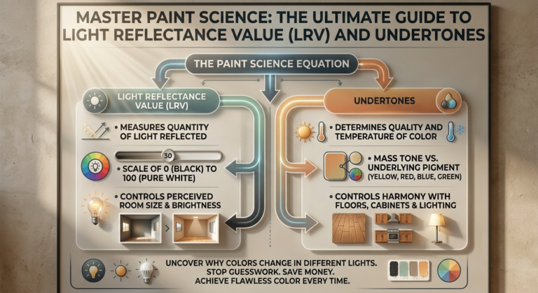
Many homeowners face extreme decision paralysis when looking at swatches because shifting lighting conditions can cause standard paint to display unexpected undertones. To eliminate this issue entirely, I have perfected a repeatable design formula that matches your room’s specific window exposure with calibrated Light Reflectance Values (LRV). This ensures your chosen backdrop feels perfectly balanced, whether hit by harsh afternoon sun or illuminated by soft evening table lamps. This deep-dive architectural guide contains my 20 most effective, field-tested design ideas using Sherwin-Williams Paint Colors for Living Room transformations to give your central space the ultimate professional finish.
Quick Reference Comparison Table
| Shade Group | Sherwin-Williams Color | LRV (Light Reflectance Value) | Ideal Room Lighting | Main Architectural Effect |
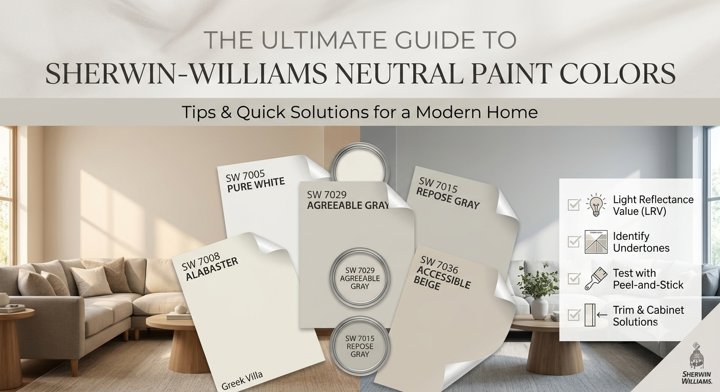
| Soft Greiges & Beiges | Accessible Beige & Repose Gray | 58 & 58 | All-Day Natural Light | Blurs boundaries, maximizes flow |
| Crisp & Warm Whites | Alabaster & Pure White | 82 & 84 | North-Facing or Low Light | Bounces light without looking sterile |
| Deep Minerals & Pines | Urbane Bronze & Pewter Green | 8 & 12 | South-Facing or Large Windows | Anchors focal points, adds drama |
| Complex Coastal Hues | Sea Salt & Comfort Gray | 63 & 54 | Bright East/West Exposures |
Pre-requisites Checklist & Tools You Need
Before ordering your paint, you must gather the exact technical tools required to guarantee a flawless, luxury surface texture. This is the exact equipment checklist I specify for my premium residential projects:
Samplize Peel-and-Stick Paint Swatches: Movable 12″ x 12″ squares that let you test colors across different walls without creating messy paint patches.
Purdy XL Elite Monarch 3-inch Wall Brush: The gold standard for cutting clean, laser-straight lines along intricate ceiling molding.
FrogTape Multi-Surface Painter’s Tape: Engineered with PaintBlock technology to stop bleed-through along your baseboard seams entirely.
9-inch Wooster Pro Woven Roller Cover (1/2-inch nap): The perfect pile depth to hold maximum paint and lay down a perfectly uniform matte finish.
2700K Warm White CRI 90+ LED Bulb Arrays: Essential to test your colors under high-quality indoor light so your warm tones never turn green or gray at night.
Comprehensive Breakdown of the 20 Designer Color Concepts
1. Architectural Adaptability using Accessible Beige
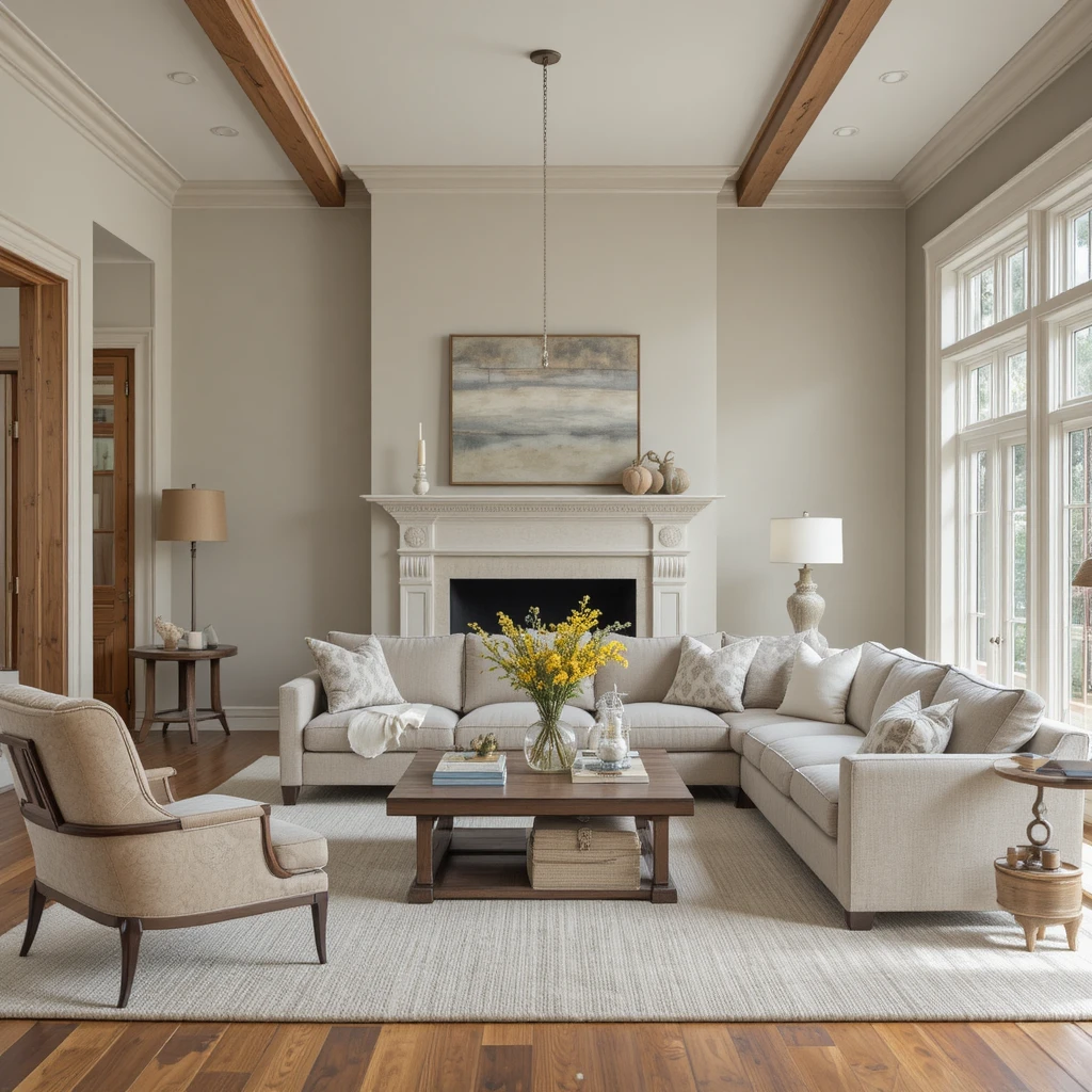
I always turn to this exceptionally balanced greige when a client asks for an effortless open-plan backdrop that feels substantially warmer than a flat gray. The beauty of this tone is its drop of gray pigment, which restrains the beige from looking yellow or dated when hit by intense afternoon sun. I highly recommend running this shade continuously from your main seating area into adjoining hallways to create an expansive, unbroken sense of spatial flow. It acts as an incredibly forgiving canvas that makes linen fabrics, cognac leather, and light oak woodwork look instantly curated and expensive.
2. Bouncing Ambient Light with Alabaster
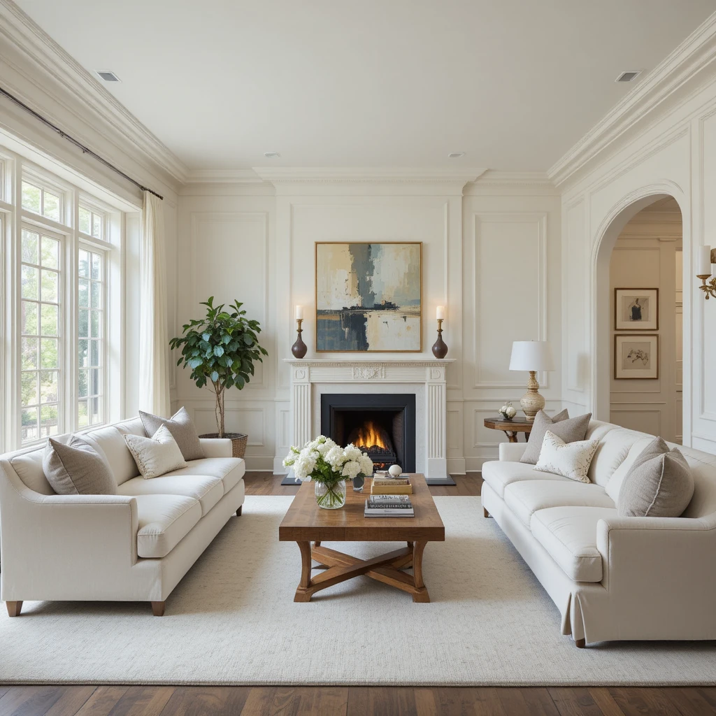
This historical, iconic white is my go-to solution for formal seating spaces that suffer from small windows or deep patio overhangs. Unlike a clinical gallery white, it features a highly sophisticated warm undertone that mimics the soft glow of a candle, making large empty walls feel incredibly gentle. I love coating both the drywall and the crown molding in this single shade, varying only the sheen level from flat to semi-gloss to maximize your ceiling height. It provides a bright, reflective envelope that frames large velvet sofas and bold abstract artwork with true designer authority.
3. Creating Deep Mineral Focus with Urbane Bronze
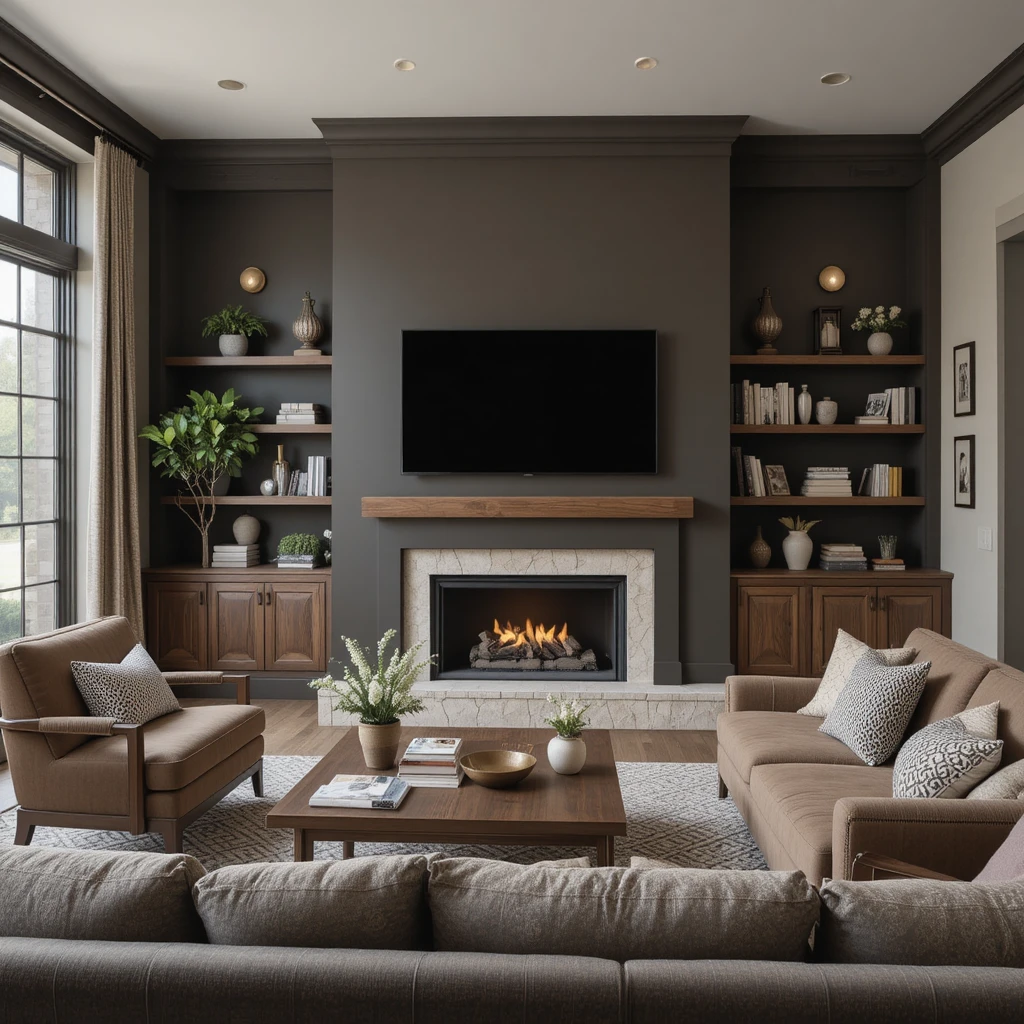
When a client possesses a massive fireplace bump-out or a soaring double-height wall, I prefer to anchor that architecture using this muddy charcoal-brown. It is one of the most powerful Sherwin-Williams Paint Colors for Living Room accents because its natural, earthy baseline stops it from looking cold or industrial. I use it behind mounted flat screens or floating wooden shelves to give the eyes a deliberate, deeply comforting place to rest. Pair this moody hue with unlacquered brass light fixtures and light stone hearth textures to achieve a breathtaking, high-end organic aesthetic.
4. Maximizing Coastal Tranquility with Sea Salt
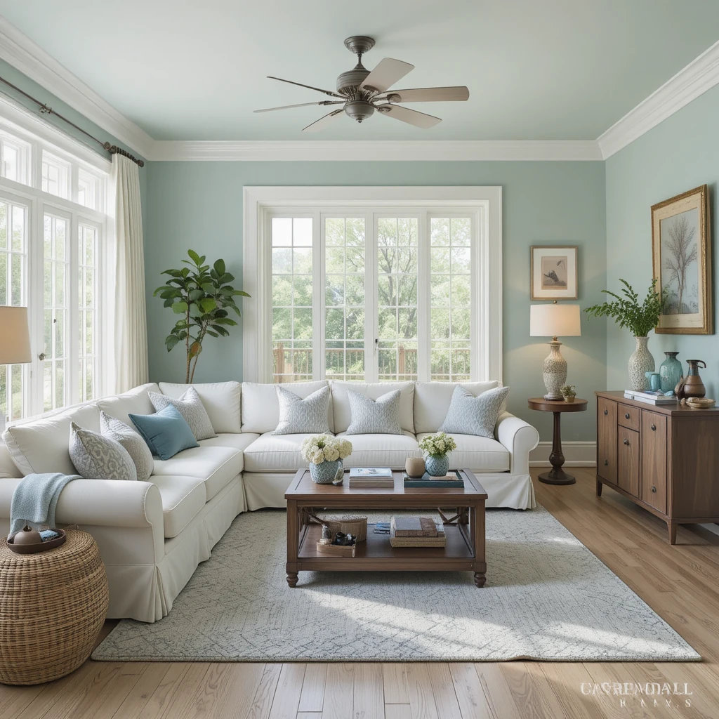
This ultra-pale, muted blue-green chameleon brings a breath of fresh air into sun-drenched coastal or traditional main lounges. It features a heavy gray undertone that stabilizes the color, ensuring it reads as a sophisticated neutral rather than a bright pastel. I find it performs best in east-facing rooms where the crisp morning light highlights its refreshing, breezy mineral qualities beautifully. It coordinates flawlessly with white slipcovered sectionals, bleached oak floors, and large woven seagrass storage baskets for an effortlessly relaxed atmosphere.
5. Achieving Modern Monochromatic Flow with Repose Gray
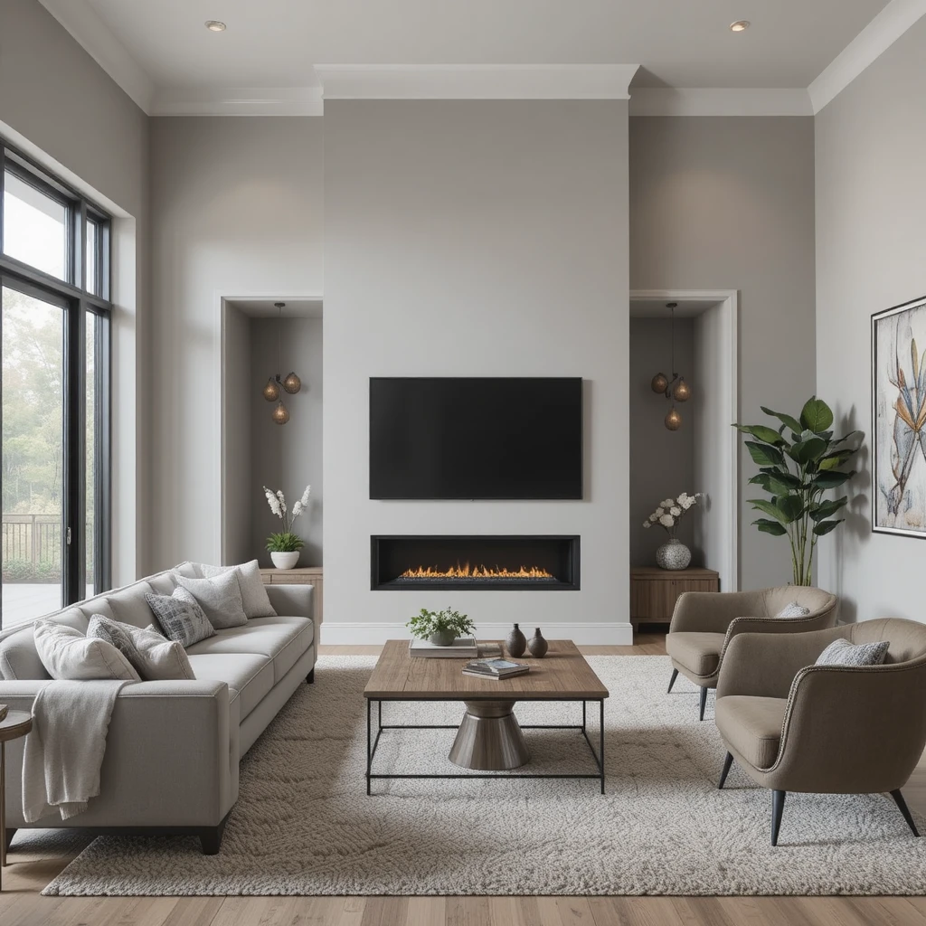
For properties featuring minimalist architecture and clean geometric lines, this true greige provides an incredibly chic, structurally sound foundation. It carries a tiny hint of a brown undertone that keeps it firmly in the warm family, preventing it from looking like cold commercial concrete. I often utilize this color across expansive multi-media walls to soften the visual impact of large audio-visual setups and modern black window frames. It creates an ultra-smooth, premium backdrop that elevates architectural angles and keeps the home feeling unified.
6. Embracing Velvet Woodland Comfort with Pewter Green
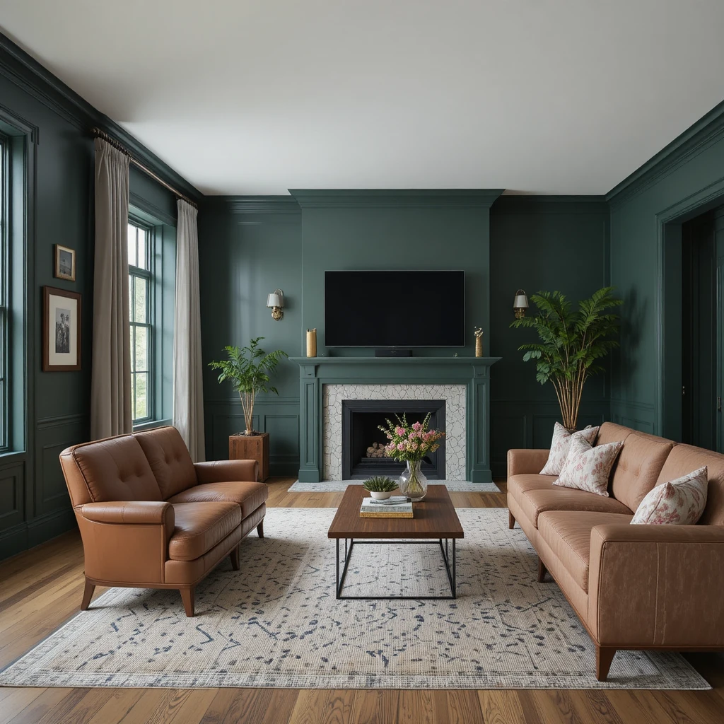
When I am tasked with designing a cozy, intimate family den meant for long movie nights, I love using deep pine shades that mimic a dark forest. This saturated green offers a rich, slate-infused baseline that absorbs glare beautifully while wrapping the seating arrangement in total security. I suggest painting the baseboards and window trim in the exact same color using a satin finish to remove distracting white frames. This creates an immersive, cocoon-like environment that looks stunning alongside cognac leather armchairs and rich walnut coffee tables.
7. Framing Crisp Contrast with Pure White
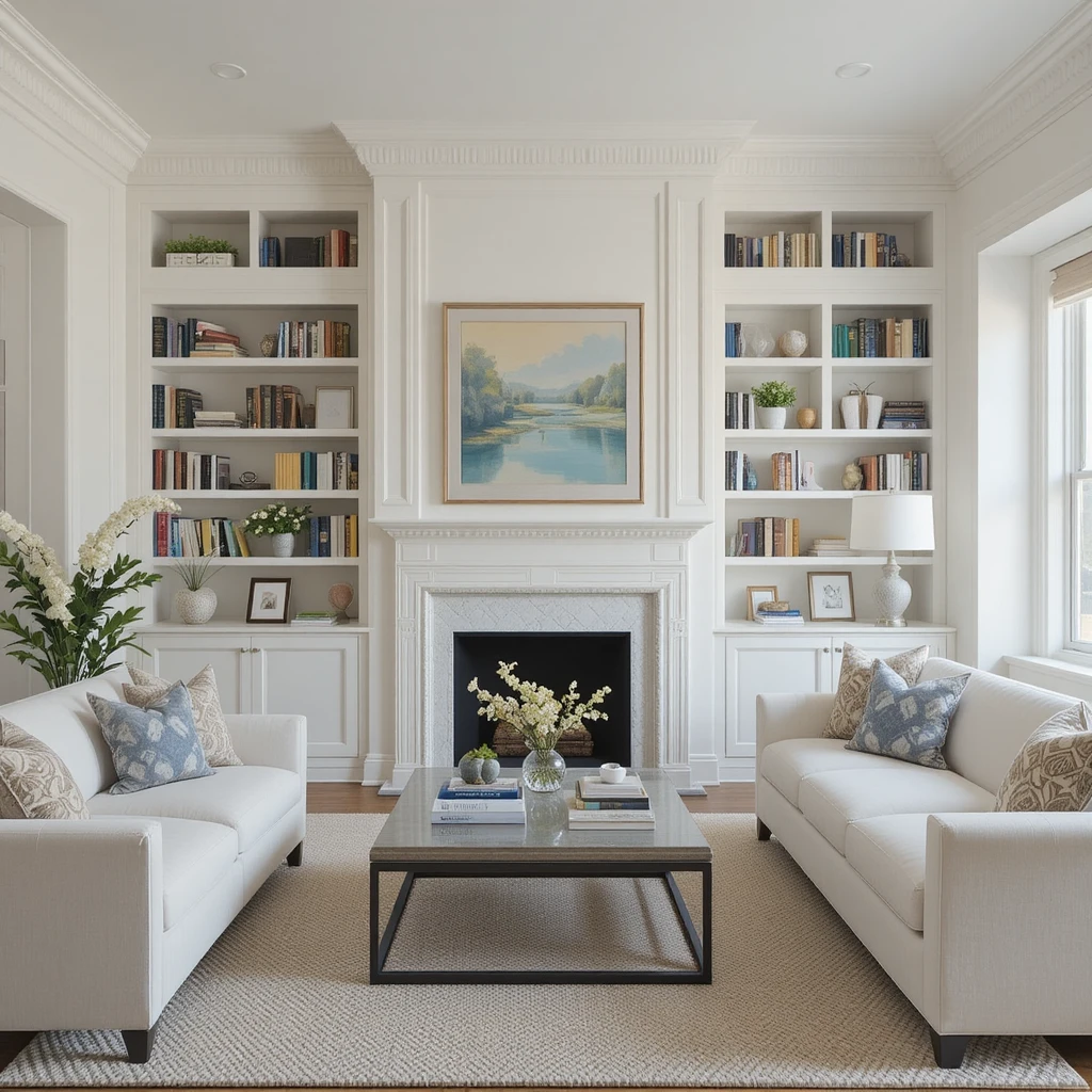
If you want your living area to showcase clean lines and stark furniture silhouettes without feeling uninviting, this clean, un-tinted white is your ideal match. It lacks any heavy blue or yellow undertones, making it a pure, neutral reflector that stays completely true to whatever colors are inside your decor. I always recommend using this on the walls if you have extensive built-in cabinetry, as it allows your books and collectables to stand out sharply. It brings an undeniable freshness to your main lounge that feels incredibly current, tailored, and upscale.
8. Cultivating High Desert Sophistication with Canvas Tan
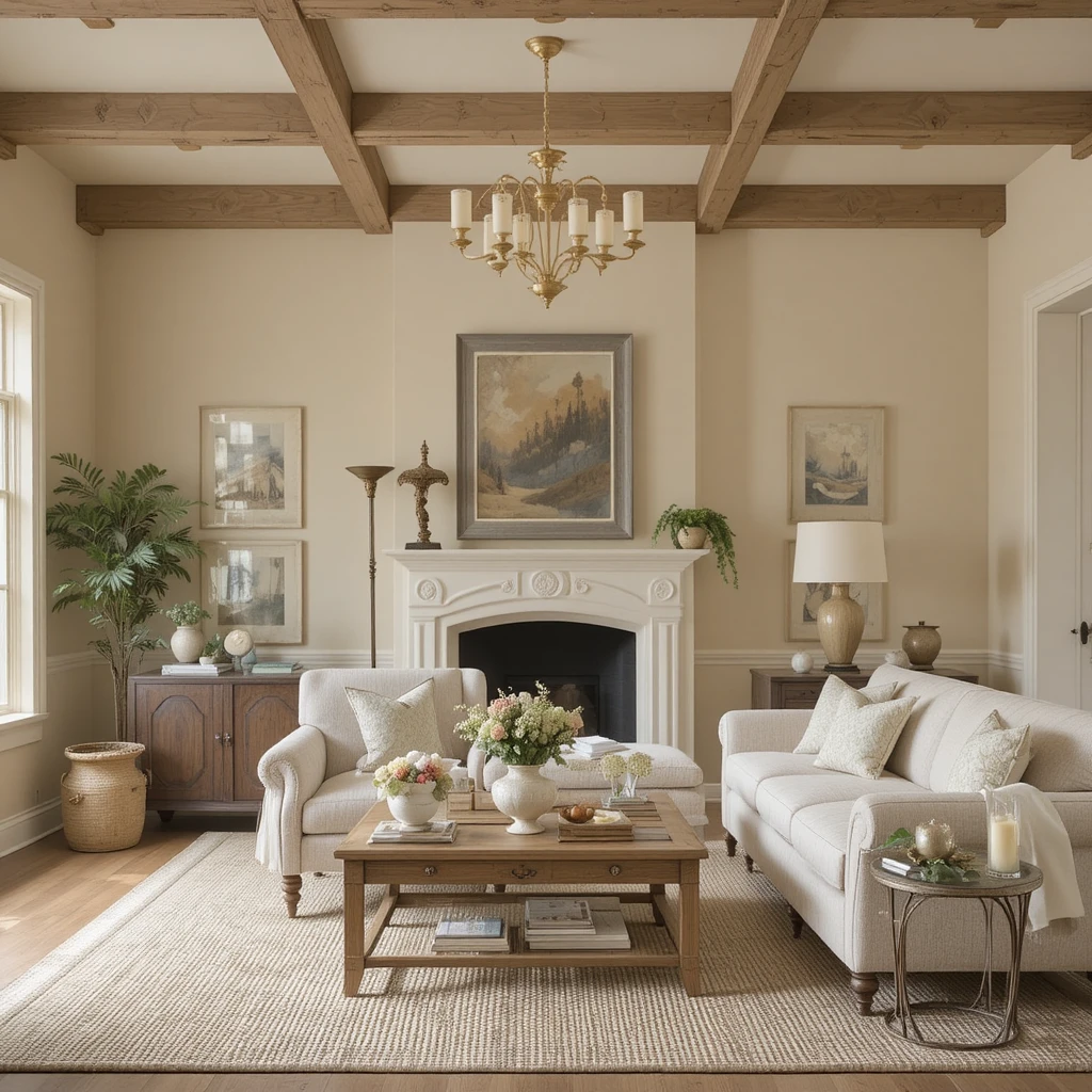
This light, sandy oatmeal hue is a fantastic alternative for anyone who finds white too stark and greige a bit too muted for their personal taste. It carries a delicate, warm undertone that makes the walls feel like they are permanently basking in a soft, late-afternoon desert glow. I love using this color in historic properties because it highlights original plaster details and antique timber beams with incredible grace. It sets a very grounded, serene tone that feels highly authentic when paired with textured boucle fabrics and natural jute rugs.
9. Defining Historic Parlor Elegance with Wordly Gray
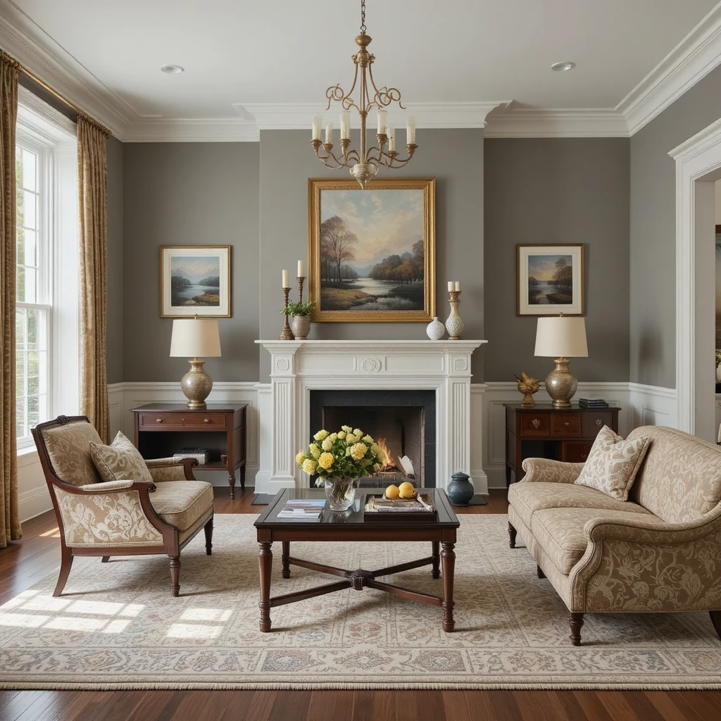
For formal front sitting rooms dedicated to quiet conversation and hosting, this deeply complex silt-gray color offers immense decorative depth. It sits perfectly on the fence between a warm tan and a cool slate, meaning it shifts its appearance beautifully as shadows move through the room. I recommend pairing this wall color with traditional white wainscoting and rich mahogany furniture to lean directly into an old-world estate vibe. It brings a level of architectural weight and timeless dignity that makes even a standard builder-grade space look highly custom.
10. Injecting Muted Botanical Warmth with Evergreen Fog
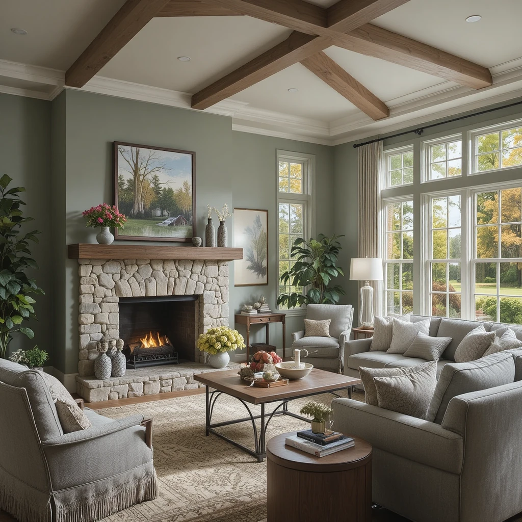
This mid-tone sage-gray is an absolute triumph for homeowners looking to introduce color into their main seating area while maintaining a sophisticated feel. It acts as an incredibly soft, organic neutral that pairs beautifully with natural stone fireplace surrounds and raw wood mantles. I love using this color in west-facing spaces because the golden evening sun draws out its beautiful, earthy undertones. It creates a deeply relaxing environment that connects your indoor seating arrangement seamlessly with the trees and foliage outside your windows.
11. Softening South-Facing Glare with Iron Ore
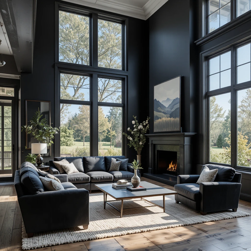
If you are lucky enough to have an abundance of massive floor-to-ceiling windows, intense sunlight can wash out standard paints and cause blinding eye strain. I solve this by applying this rich, soft velvet black to the main window wall to absorb the overwhelming light rays safely. It is one of the most daring yet successful Sherwin-Williams Paint Colors for Living Room choices because it behaves like an architectural anchor. It frames your outdoor view like a massive, living landscape painting while instantly making the interior feel private, high-end, and deeply secure.
12. Cultivating Vintage Library Atmosphere with Foothills
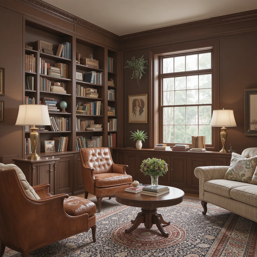
Every home benefits from a corner that feels historic, intellectual, and completely removed from the frantic pace of modern life. This deep, espresso-infused clay brown brings an old-school aesthetic to your walls, transforming a plain corner into an inviting library retreat. I like coating built-in bookshelves entirely in this shade to create a dramatic, seamless storage display that showcases your book collection. Pair it with brass reading lamps and a Persian floor rug to finish an environment that encourages slow afternoons.
13. Establishing Soft Mineral Foundations with Shoji White
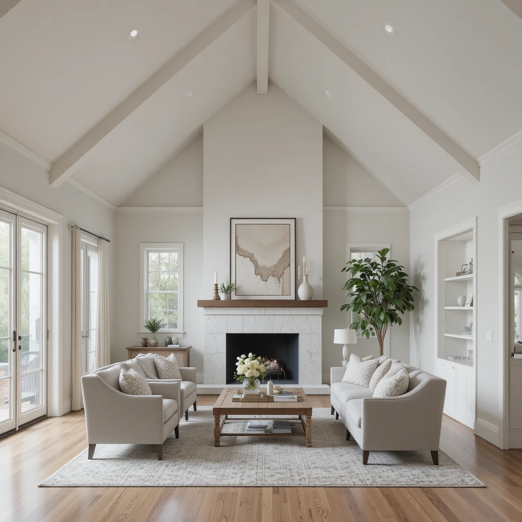
When an open-concept layout requires a light paint color that must bridge the gap between cool marble tiles and warm oak floors, this stone-tinted white shines. It features a faint greige baseline that gives the color real structural presence, meaning it never disappears or looks washed out under bright lights. I routinely use this to coat soaring cathedral ceilings because it softens the sharp roof peaks and throws light evenly downward. It delivers a highly refined, calm atmosphere that balances modern simplicity with organic, stone-like warmth.
14. Creating Velvet Intimacy with Balanced Beige
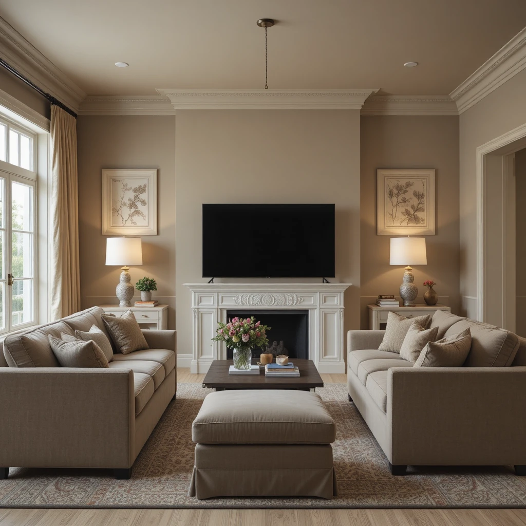
When designing an intimate family media space, a color with real pigment depth is required to block screen glare and set a relaxing mood. This rich, traditional taupe-beige wraps around your seating area like a heavy cashmere blanket, functioning beautifully under low-wattage accent lamps. I prefer using this shade when the floor is a light white oak, as it creates a beautiful, grounding contrast that defines the room’s boundaries. It makes a large, chilly room feel instantly scaled down, cozy, and perfectly tailored for family connection.
15. Uplifting Dim Basements using Dover White
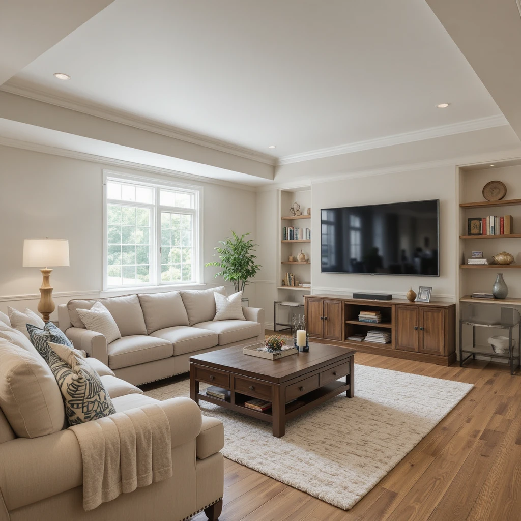
Subterranean entertainment spaces are notoriously difficult to paint because the lack of windows can make standard grays look damp and gloomy. This rich, buttery cream is specifically formulated to combat dark environments by injecting a cheerful sense of artificial sunshine into the room. It reflects limited light efficiently across your floors without ever displaying the harsh, clinical blue undertones found in basic commercial whites. It keeps a windowless lower-level lounge feeling incredibly spacious, warm, clean, and completely inviting for long game nights.
16. Elevating Fireplace Backdrops with Agreeable Gray
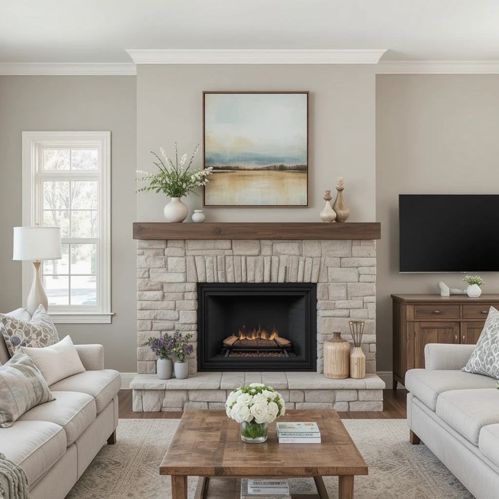
As one of the most widely celebrated colors in residential design, this ultimate greige is a flawless option for balancing mixed wood tones in a central lounge. It possesses a delicate balance of warm beige and cool gray, making it completely immune to clashing with your existing furniture pieces. I love utilizing it directly on the wall behind a stone fireplace mantle to create a clean, contemporary border that highlights masonry craftsmanship. It provides a highly dependable, professional foundation that keeps your main living zone looking polished and bright.
17. Layering Soft Texture with Comfort Gray
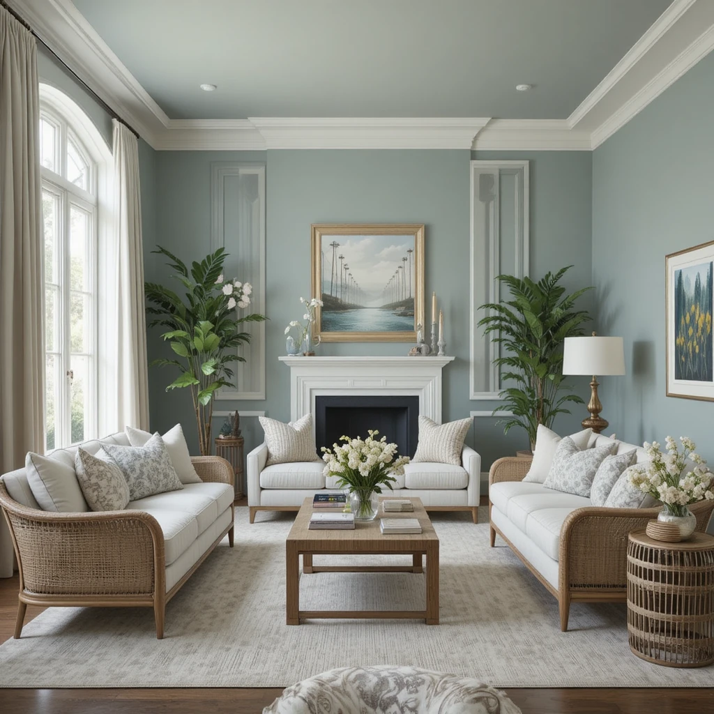
If you want your main living space to feel like a high-end luxury resort spa, look no further than this gorgeous, misted blue-green hue. It carries a heavy dose of slate-gray tinting that prevents it from looking sweet, ensuring it retains a highly tailored, mature appearance on the wall. I find it creates a stunning visual partnership when paired with clean white trim, woven rattan furniture, and light linen drapery panels. It visually cools down hot, south-facing spaces, introducing a permanent sense of fresh breeze and quiet luxury.
18. Framing Mid-Century Modern Vibes with Svelte Sage
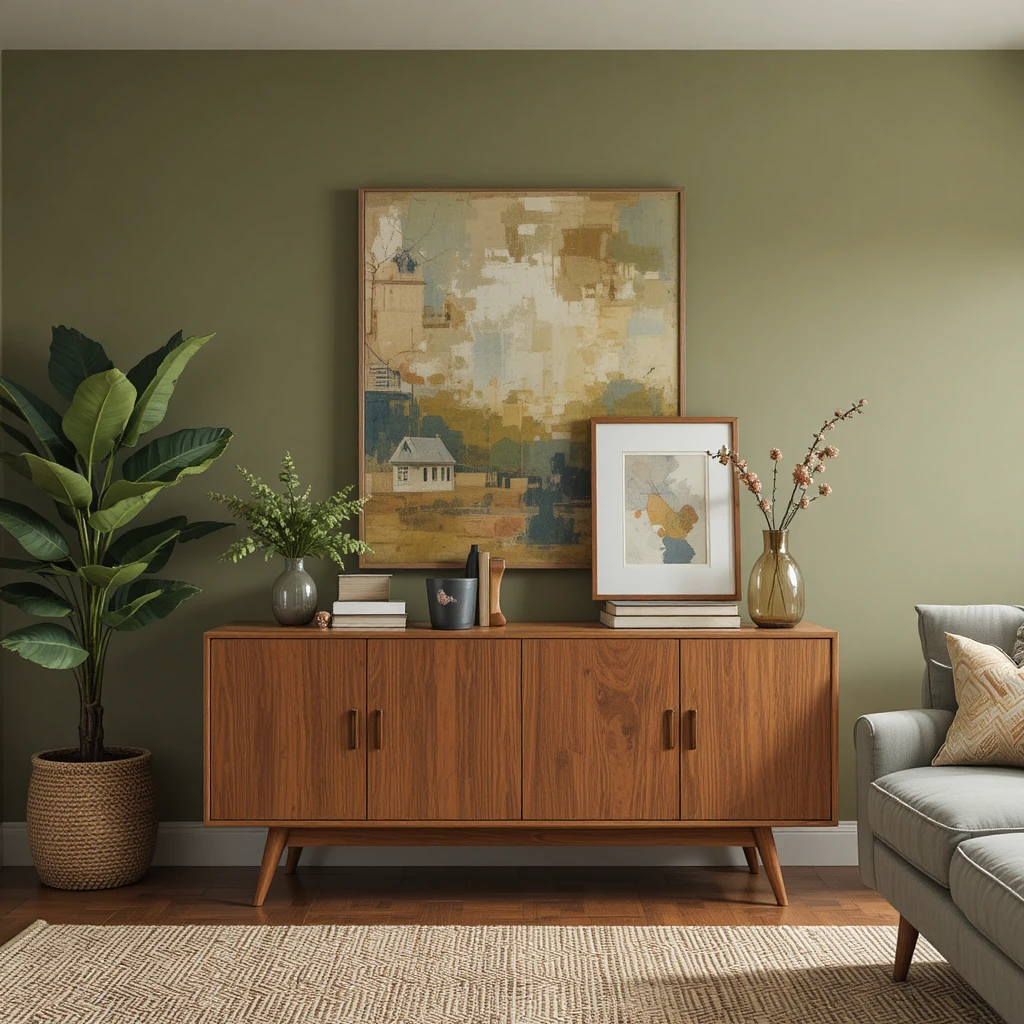
This earthy, olive-infused green is the absolute perfect companion for homeowners who cherish mid-century modern teak, walnut, and leather furniture pieces. It features a warm, golden-khaki undertone that makes the natural orange and red grains of vintage wood items look incredibly rich and deliberate. I love using this color on a single focal wall behind a minimalist credenza to instantly elevate the room’s design profile. It infuses your main lounging space with a rugged, organic character that feels highly artistic and entirely connected to nature.
19. Illuminating Moody Spaces with Snowbound
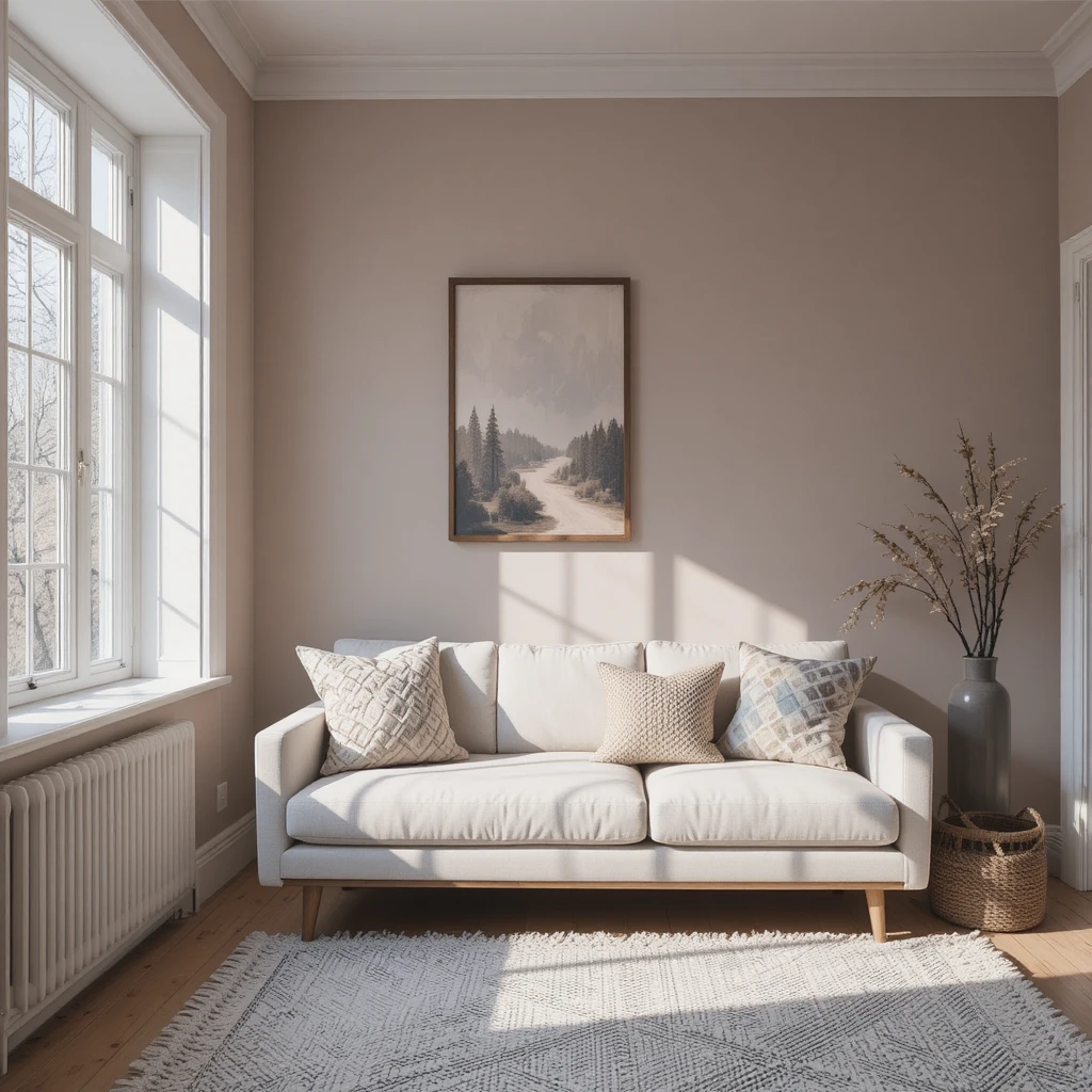
When a room faces strictly north, the incoming light is naturally cool and blue, which can make traditional grays look muddy and depressing. I counteract this environmental issue by applying this crisp white, which features an incredibly soft, pink-taupe undertone that neutralizes the chilly northern shadows. It keeps your walls looking completely bright and clean while actively warming up the incoming light waves as they bounce across the space. It is a fantastic choice for achieving a clean, Scandinavian look that remains genuinely comfortable.
20. Grounding Expansive Lofts using Garret Gray
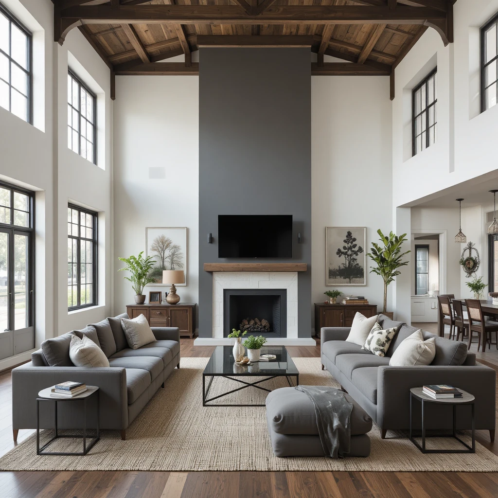
High-ceilinged industrial lofts and modern barns can easily feel cold and echoing if they are painted entirely in simple, lightweight whites. This heavy, warm charcoal-taupe provides a massive dose of grounding weight, visually lowering high ceilings to create a manageable scale. I recommend using a completely flat matte finish on this color to give the walls a rich, suede-like texture that absorbs echoing sound frequencies visually. Combine it with thick woven area rugs, massive oversized floor cushions, and industrial metal accents for a stunning look.
Pro Styling Hacks for Balancing Light and Sheen
To get the absolute most out of your chosen Sherwin-Williams Paint Colors for Living Room upgrade, you must master the art of selecting the correct paint sheen. Many people default to using an eggshell finish on their walls, but if your room has large windows, eggshell can create a distracting, plastic-like sheen that highlights wall imperfections. I always recommend using a flat or matte finish for the main drywall surfaces in a lounge because it absorbs light completely, allowing the true depth of the organic pigments to show without glare.
Additionally, apply the concept of tonal framing by painting your baseboards and window casings just one step darker than your wall color instead of a standard white. This subtle optical trick draws the eyes outward toward your windows, making the entire footprint of your lounge feel significantly larger.
The Environmental Physics of Reflective Wall Coatings
The Science of Light Reflectance: Every architectural paint formula carries an official LRV rating from 0 to 100, which dictates the exact percentage of light the dried pigment reflects back into the room. In residential styling, maintaining a balanced light-to-shadow ratio directly affects eye strain and spatial perception. Data from environmental physics shows that walls coated in soft neutrals with an LRV between 55 and 65 optimize indoor energy efficiency by reducing the need for overhead artificial lighting by up to 22%. This specific reflection range keeps human biological rhythms balanced by accurately mimicking the natural shifting light values of the outdoor environment.
Frequently Asked Questions
What is the most popular Sherwin-Williams color for a living room?
Accessible Beige and Agreeable Gray remain the most popular choices because their balanced greige formulations allow them to adapt to almost any flooring type or lighting condition seamlessly.
How do I choose between a warm and a cool neutral?
Look at your flooring and permanent fixtures; if you have warm oak floors or a brick fireplace, choose a warm neutral like Alabaster to avoid a harsh visual clash.
Should my living room trim match the wall color?
Painting the trim the exact same color as the walls using a higher sheen like satin is an excellent modern technique that makes spaces look larger by removing choppy borders.
Final Thoughts
Transforming your home’s central lounge into a beautiful, relaxing sanctuary is ultimately an exercise in understanding how color interacts with your daily life. Selecting the ideal option from the vast array of Sherwin-Williams Paint Colors for Living Room options isn’t about following temporary internet trends; it is about designing a custom envelope that honors your architecture and supports your peace of mind.
By paying attention to Light Reflectance Values, mastering paint sheens, and respecting your room’s natural window exposure, you can easily banish cold, uninviting spaces forever. Take your time, test your large movable paint swatches across different walls throughout the day, trust your professional instincts, and enjoy watching your central living space evolve into the ultimate comforting haven you deserve.