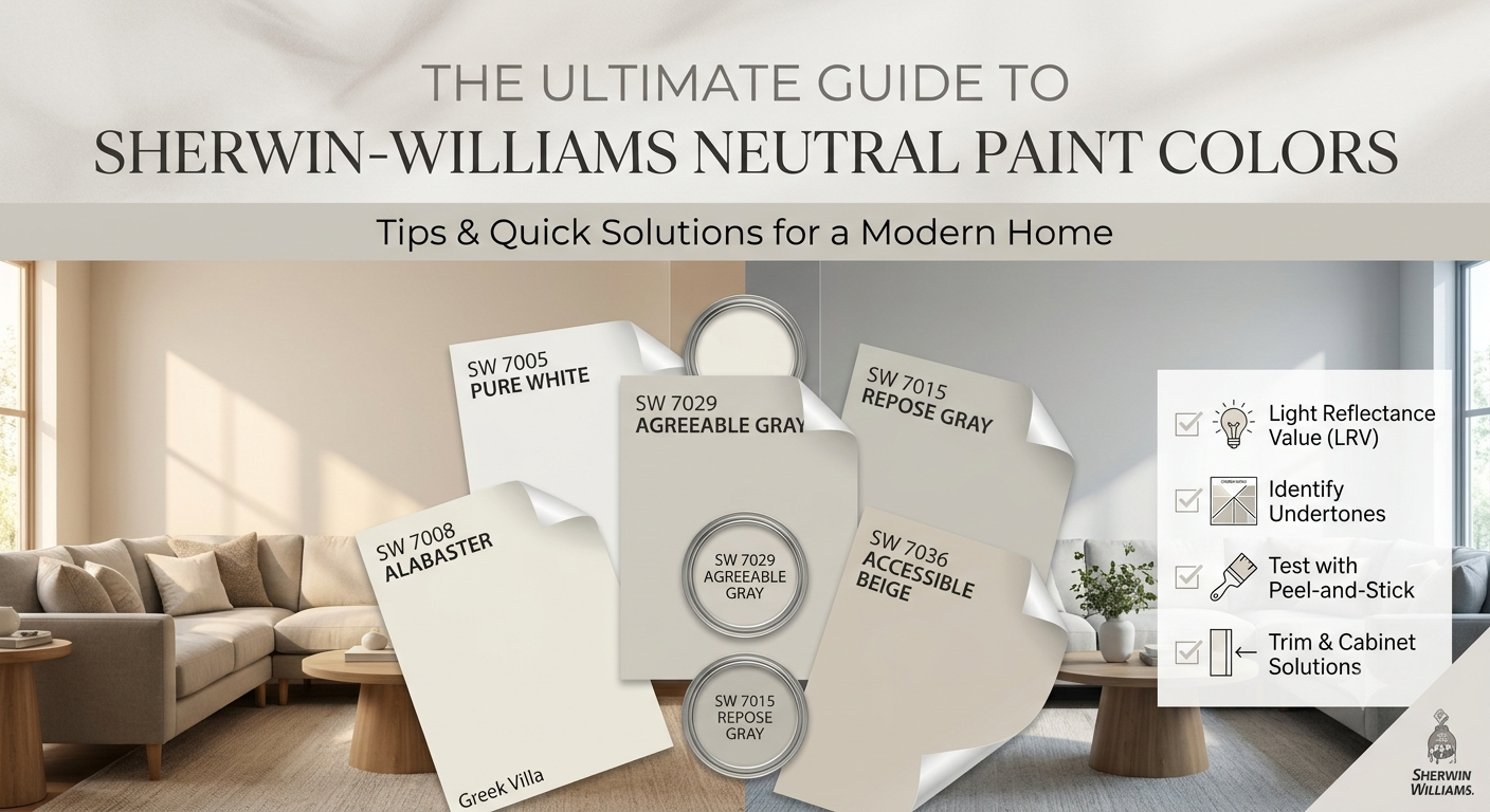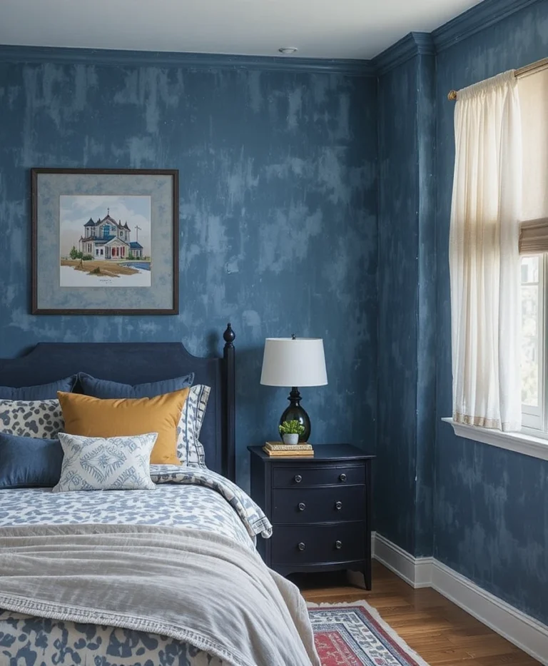

Transforming a cold, stark room into a welcoming sanctuary is a daily challenge I tackle in my interior design practice. Over the past decade, I have watched trends cycle from sterile minimalist grays to overly vibrant accent walls, but my absolute secret weapon for creating timeless comfort is a meticulously curated Sherwin-Williams Neutral Palette Warm & Cozy atmosphere. True comfort isn’t just about plush pillows; it is rooted entirely in the underlying undertones of your walls. When we select the right soft, enveloping tones, we visually alter the architecture of a room, making large spaces feel intimate and small rooms feel incredibly secure.
Many homeowners struggle with neutrals because they accidentally choose undertones that feel muddy or clinical under specific lighting conditions. To solve this, I have developed a foolproof, repeatable system that relies on balancing light reflectance values with warm, complex undertones. This ensures that your spaces look radiant in both natural morning sunlight and soft evening lamplight. In this comprehensive guide, I will share my top 20 professional design ideas leveraging the ultimate Sherwin-Williams Neutral Palette Warm & Cozy toolkit to help you completely reinvent your living space.
Quick Reference Comparison Table
| Idea Number | Sherwin-Williams Color | LRV (Light Reflectance Value) | Best Room Placement | Primary Mood |
| 1 to 5 | Alabaster & Accessible Beige | 82 & 58 | Living Rooms, Entryways | Airy yet grounded comfort |
| 6 to 10 | Balanced Beige & Shaker Beige | 46 & 54 | Bedrooms, Dining Spaces | Enveloping, organic warmth |
| 11 to 15 | Wool Skein & Canvas Tan | 63 & 64 | Kitchens, Home Offices | Sun-drenched, crisp tranquility |
| 16 to 20 | Virtual Taupe & Urbane Bronze | 13 & 8 | Media Rooms, Accent Walls | Dramatic, moody |
Pre-requisites Checklist & Tools You Need
Before you crack open a single paint can, you must gather the exact technical tools to ensure a flawless application. Here is what I pack in my design kit for every single residential project:
Samplize Peel-and-Stick Sheets: Never paint directly onto the wall first; use 12″ x 12″ movable samples to test light transitions.
Purdy ClearCut Elite 2.5-inch Angle Brush: This tool is non-negotiable for achieving razor-sharp lines along your baseboards.
3M ScotchBlue Sharp Lines Painter’s Tape: Essential for protecting your crisp white ceiling borders from bleeding.
9-inch Wooster Pro Woven Roller Cover (3/8-inch nap): Perfect for applying thick, matte coatings on residential drywall.
LED 2700K Warm White Lightbulbs: Switch your lighting to this temperature to accurately assess your warm neutrals at night.
The 20 Definitive Design Ideas for Your Home
1. Enveloping Living Rooms with Accessible Beige
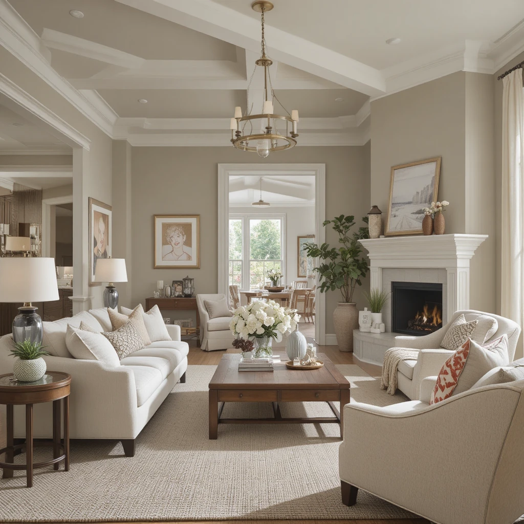
I always turn to this iconic shade when a client wants an effortless transition away from cold grays into a true Sherwin-Williams Neutral Palette Warm & Cozy environment. The genius of this color lies in its precise balance of gray and beige, which prevents it from ever turning dingy or yellow in low lighting. I love washing an entire open-concept living space in this tone because it bridges the gap between modern architecture and traditional comfort beautifully. It acts as a soft canvas that lets rich wooden furniture and cream wool textiles truly pop.
2. The Sun-Drenched Entryway Using Alabaster
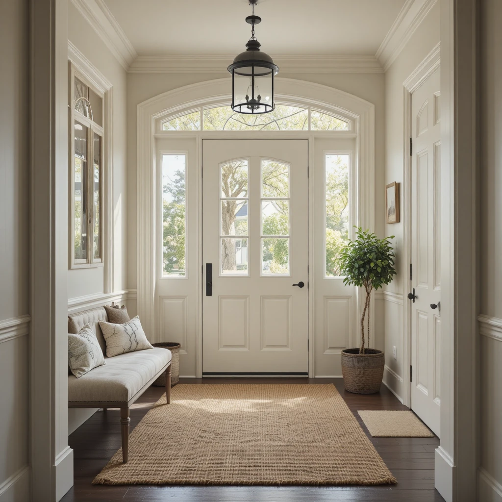
First impressions matter immensely, and utilizing this soft, historical white creates an immediate sense of peace the moment you cross the threshold. I recommend applying this crisp yet warm hue to entryways that lack expansive windows because it bounces maximum light without feeling stark. It provides a subtle, welcoming glow that softens hard architectural edges and contrasts beautifully with dark matte black door hardware. By pairing it with a woven jute rug, you establish an instantly grounded, organic welcome.
3. Cozy Bedroom Sanctuaries Cloaked in Balanced Beige
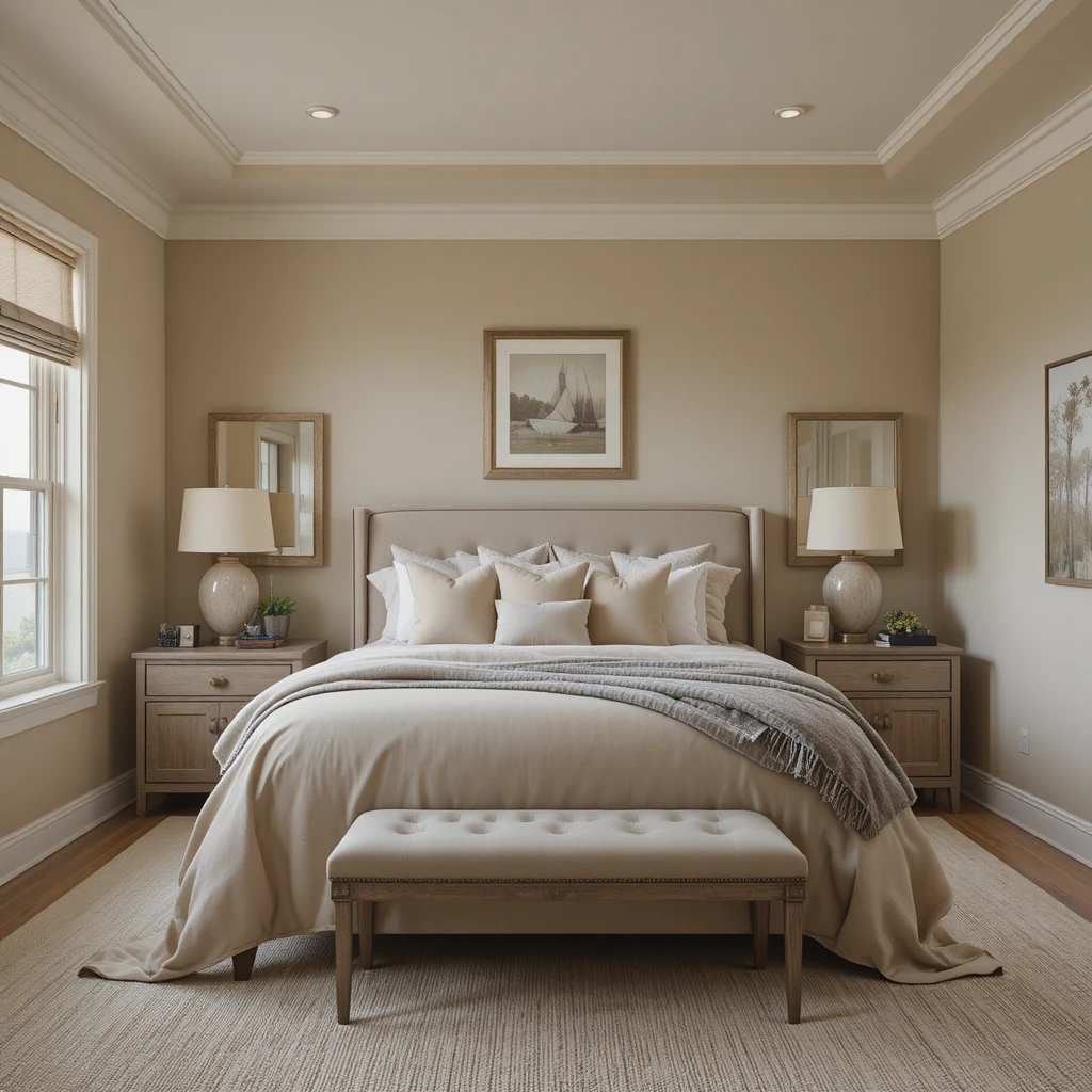
When designing a master bedroom meant for deep relaxation, I prefer a neutral shade with a bit more structural depth. This particular tone wraps around the room like a cashmere blanket, offering a slightly deeper taupe undertone that excels under warm evening lamplight. I often specify this color for south-facing bedrooms where the intense afternoon sun can make standard whites look completely washed out. It grounds the bed styling and creates a clear, distinct perimeter that signals your brain it is time to unwind.
4. Sophisticated Dining Rooms Formed by Shaker Beige
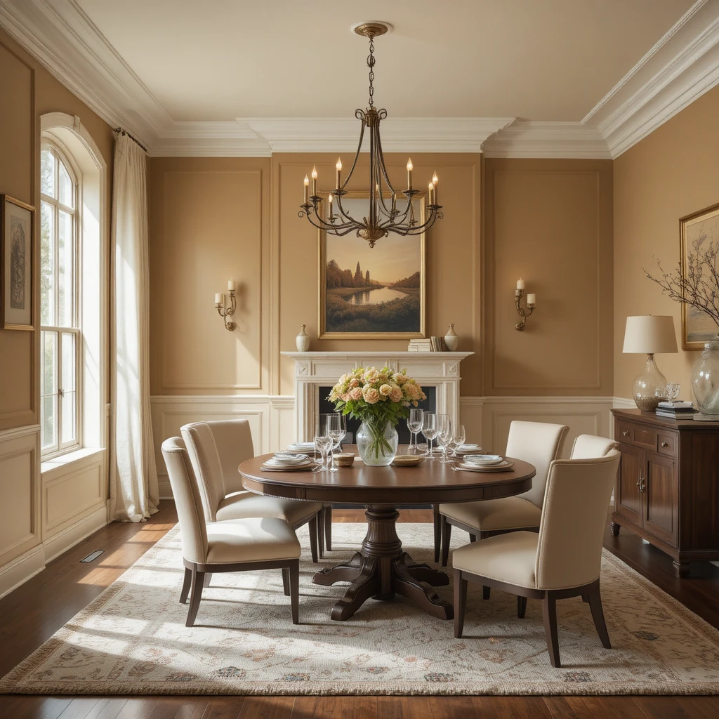
Dining spaces require a unique backdrop that feels inviting during intimate evening dinner parties, which is why this classic tan works so magnificently. It possesses a rich, golden-amber undertone that mimics the look of candlelight, making the entire room feel inherently celebratory and upscale. I love pairing this wall color with deep walnut dining tables and brass light fixtures to elevate the luxury factor. It ensures that the room feels physically warm and tightly curated even when the overhead lighting is dimmed low.
5. Crisp Kitchen Perimeters Refined with Canvas Tan
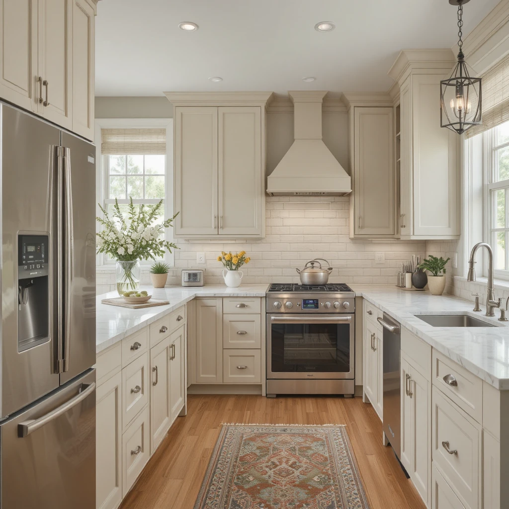
Kitchens can easily feel overly clinical with all their stainless steel appliances and hard stone countertops, but this soft oatmeal shade changes everything. I frequently use it on kitchen cabinetry to provide a gentle contrast against stark white quartz surfaces without creating a jarring visual break. It features a hint of a green-gray undertone that keeps the warmth looking incredibly sophisticated and clean rather than overly yellowed. The result is a highly functional culinary space that feels like the comforting heart of the home.
6. Layered Textural Halls Dressed in Wool Skein
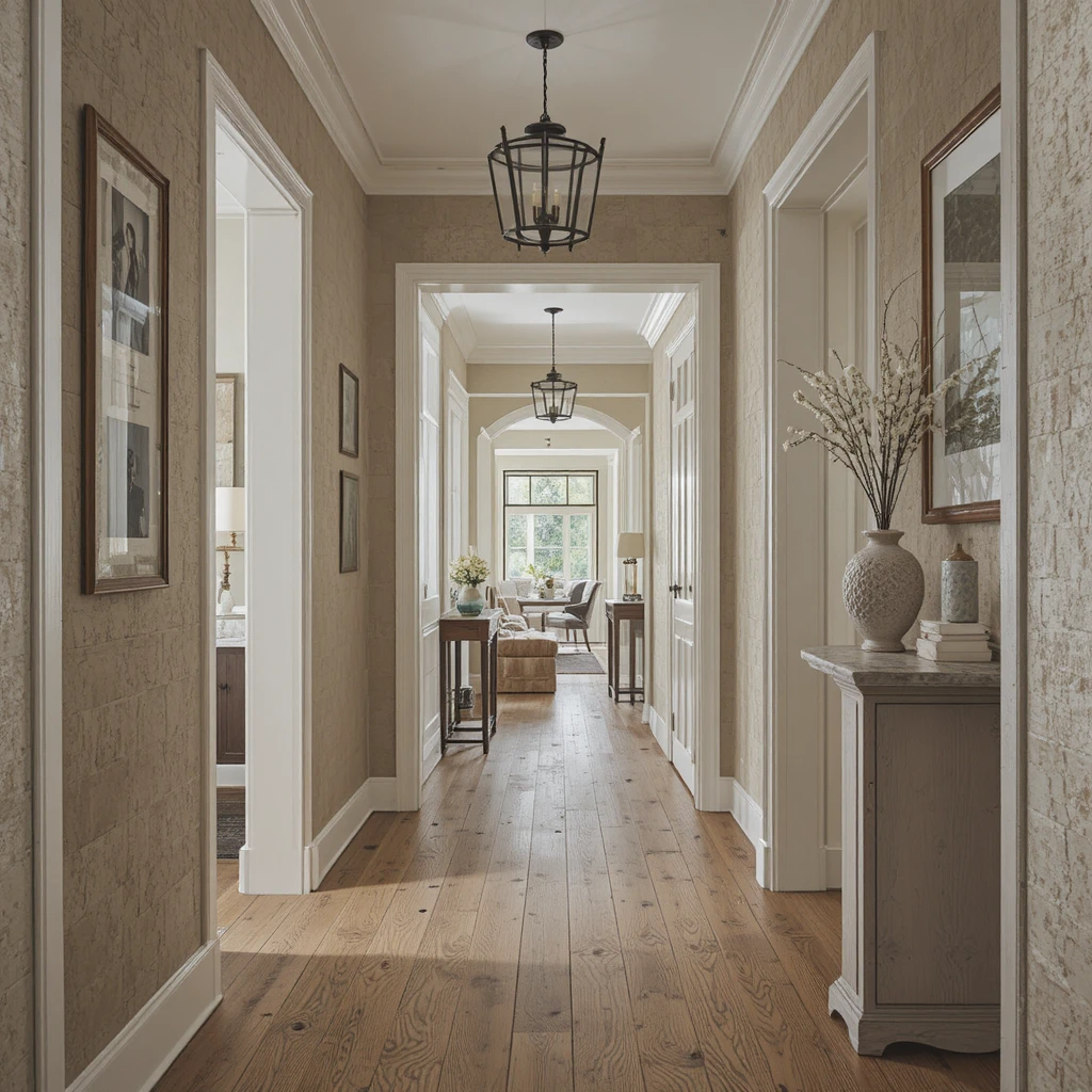
Hallways are notorious for feeling like dark, forgotten tunnels, but applying this stone-inspired neutral instantly breathes life into them. It behaves like a true chameleon, shifting from a soft khaki to a creamy beige depending on how the light bounces through adjacent doorways. I use this shade to create a seamless connective thread between bedrooms and main living spaces, maintaining visual continuity throughout the house. It pairs beautifully with framed black-and-white family photography and warm oak flooring.
7. Moody Reading Nooks Anchor-Painted in Virtual Taupe
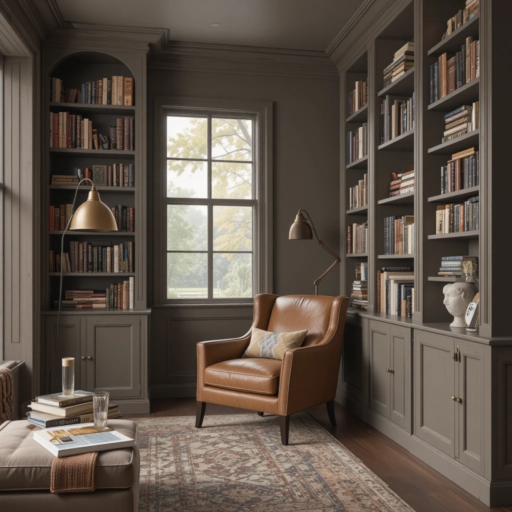
Every home needs a quiet corner dedicated to slow afternoons, and this deep, saturated espresso-infused neutral creates the ultimate cozy escape. I suggest using this dramatic shade on both the walls and the built-in bookshelves to create an immersive, library-like atmosphere. It creates a stunning sense of intimacy by visually bringing the walls inward, making a oversized corner feel perfectly tailored. Pair it with a cognac leather armchair and a brass reading lamp for an incredibly rich aesthetic.
8. Focal Accent Architecture Elevated by Urbane Bronze
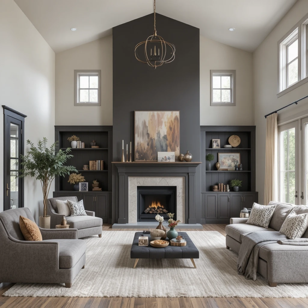
To ground an expansive room with a soaring ceiling, I utilize this deep, nature-inspired charcoal brown as a striking anchor point. It provides a magnificent contrast when placed behind a fireplace mantle or a minimalist media console, giving the eye a deliberate place to rest. The warm, muddy undertone prevents it from looking like flat black paint, ensuring it retains its comforting qualities despite its depth. It brings a grounded, organic luxury to an otherwise simple Sherwin-Williams Neutral Palette Warm & Cozy configuration.
9. Serene Home Offices Bathed in Manchester Tan
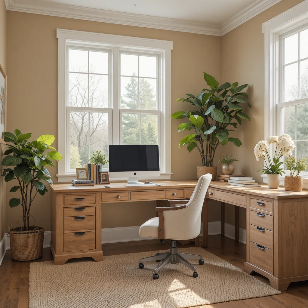
Working from home requires a balanced backdrop that promotes mental clarity while remaining entirely comfortable throughout long workdays. This muted, sandy hue provides exactly that by delivering soft warmth without any distracting yellow or pink overtones to disrupt your focus. I find that it coordinates beautifully with light oak desks and fresh indoor greenery, creating a peaceful, productive environment. It keeps your background looking exceptionally professional on video calls while maintaining a cozy, residential energy.
10. Luxurious Guest Suites Wrapped in Creamy
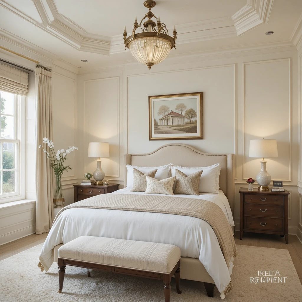
Your guests deserve to feel like they are staying in a high-end boutique hotel, and this rich, buttery white delivers that exact experience. It is devoid of any harsh blue undertones, meaning it casts a highly flattering, soft glow on everything and everyone inside the room. I love coating the walls, trim, and ceiling in this single color using varied sheens to create a seamless, cloud-like effect. This technique maximizes the perceived height of the room while keeping the boundaries soft and deeply soothing.
11. Organic Minimalist Baths Styled with Modern Gray
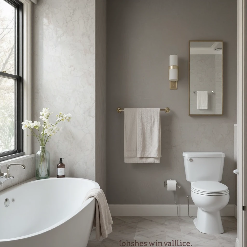
Bathrooms often feel cold due to porcelain fixtures, but this specific greige introduces a spa-like tranquility that warms up the space instantly. It maintains a clean, contemporary edge while carrying just enough red undertone to keep the room from feeling like a commercial locker room. I recommend pairing it with natural cedar accents and waffle-weave cotton towels to create an oasis of rest. It handles the steam and shifting humidity beautifully without ever losing its delicate, comforting character.
12. Warm Mudrooms Tailored in Stone Lion
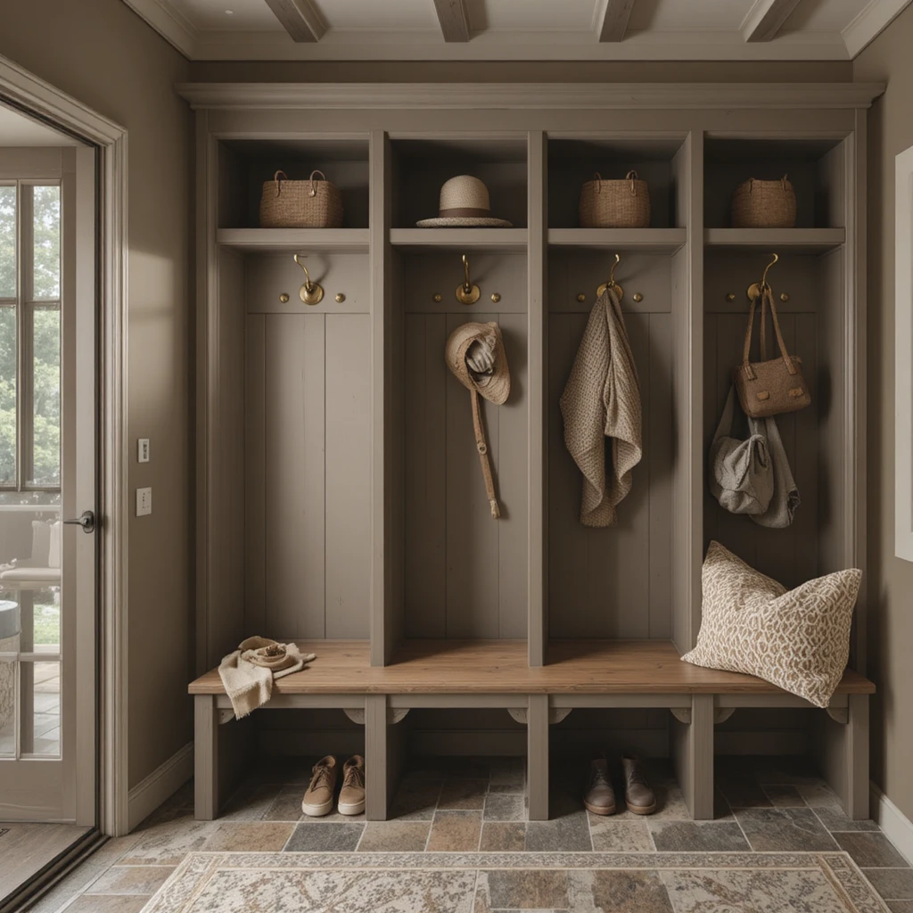
Mudrooms handle the chaotic transition from the outdoors, meaning they require a sturdy, forgiving color that still feels integrated with the rest of your home. This deep clay-influenced taupe hides everyday scuffs and footprints beautifully while providing a highly styled, intentional look to storage cubbies. I always pair it with antique brass hooks and stone floor tiles to leaning into its rugged, earthy origins. It ensures the very first functional space you encounter feels entirely coordinated and deeply cozy.
13. Elevated Ceilings Finished in Aesthetic White
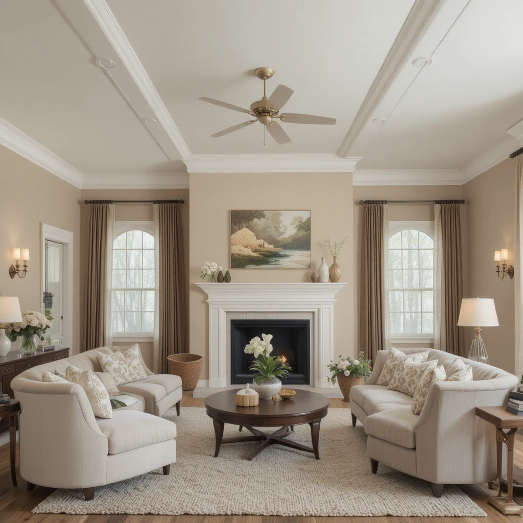
Never underestimate the power of the ceiling when executing a comprehensive Sherwin-Williams Neutral Palette Warm & Cozy master plan. Dropping a stark, bright ceiling paint into a room painted with warm neutrals creates a harsh visual disconnect that ruins the cozy flow. This specific off-white contains a drop of beige, making it the perfect partner for deeper wall tones because it softens the overhead transition. It reflects light gently downward, mimicking a soft morning sky rather than a harsh studio light.
14. Intimate Media Spaces Defined by Sandbar
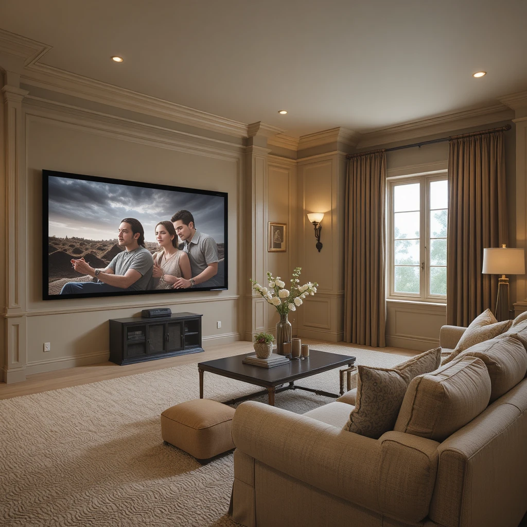
Watching movies requires an environment that minimizes screen glare while maximizing the physical sensation of comfort and relaxation. This mid-tone khaki shade absorbs excess light beautifully without plunging the entire room into total darkness during daytime hours. I highly recommend painting the baseboards and trim in the exact same shade to eliminate distracting borders around the perimeter. It pairs perfectly with oversized plush sectional sofas and heavy velvet blackout drapery panels.
15. Sunroom Sanctuaries Blended with Rice Grain
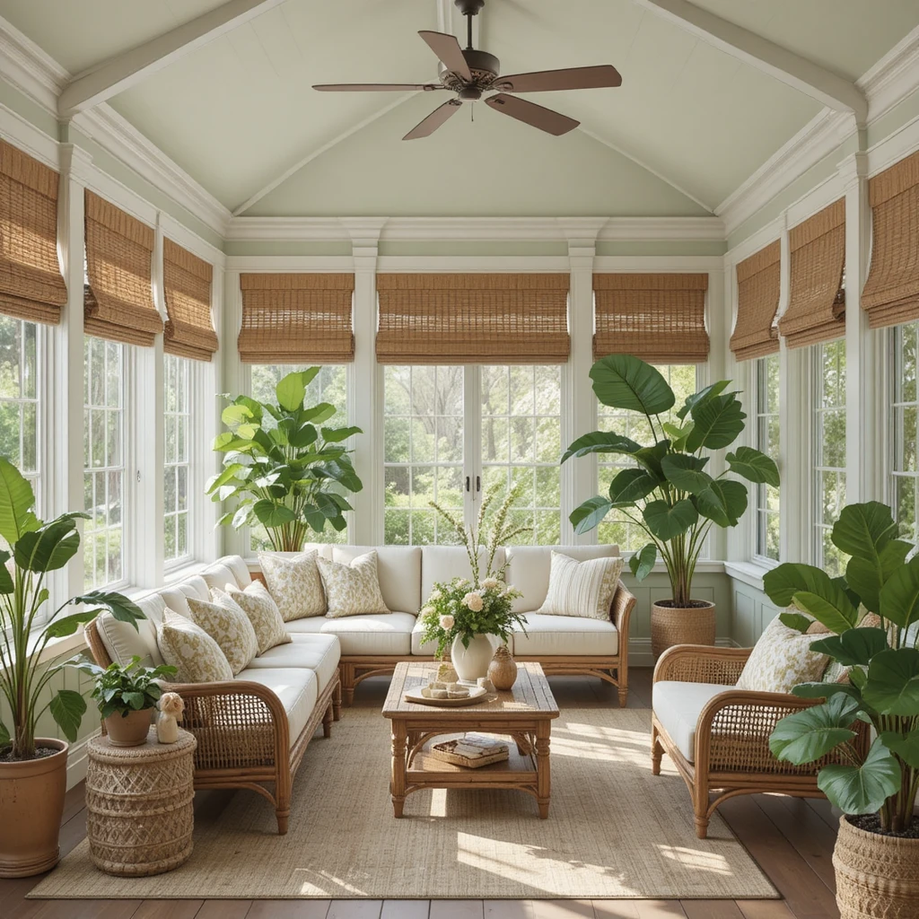
Sunrooms receive an absolute abundance of natural light, which can easily blindingly wash out standard neutral paint choices. This color features a subtle green-gold baseline that thrives under intense sunlight, transforming the room into an indoor garden pavilion. It prevents the space from looking frosty during the cold winter months while remaining cool and organic during peak summer heatwaves. It looks spectacular alongside rattan furniture, woven shades, and large leafy fiddle-leaf fig plants.
16. Tailored Hallway Cabinetry Stained in Mega Greige
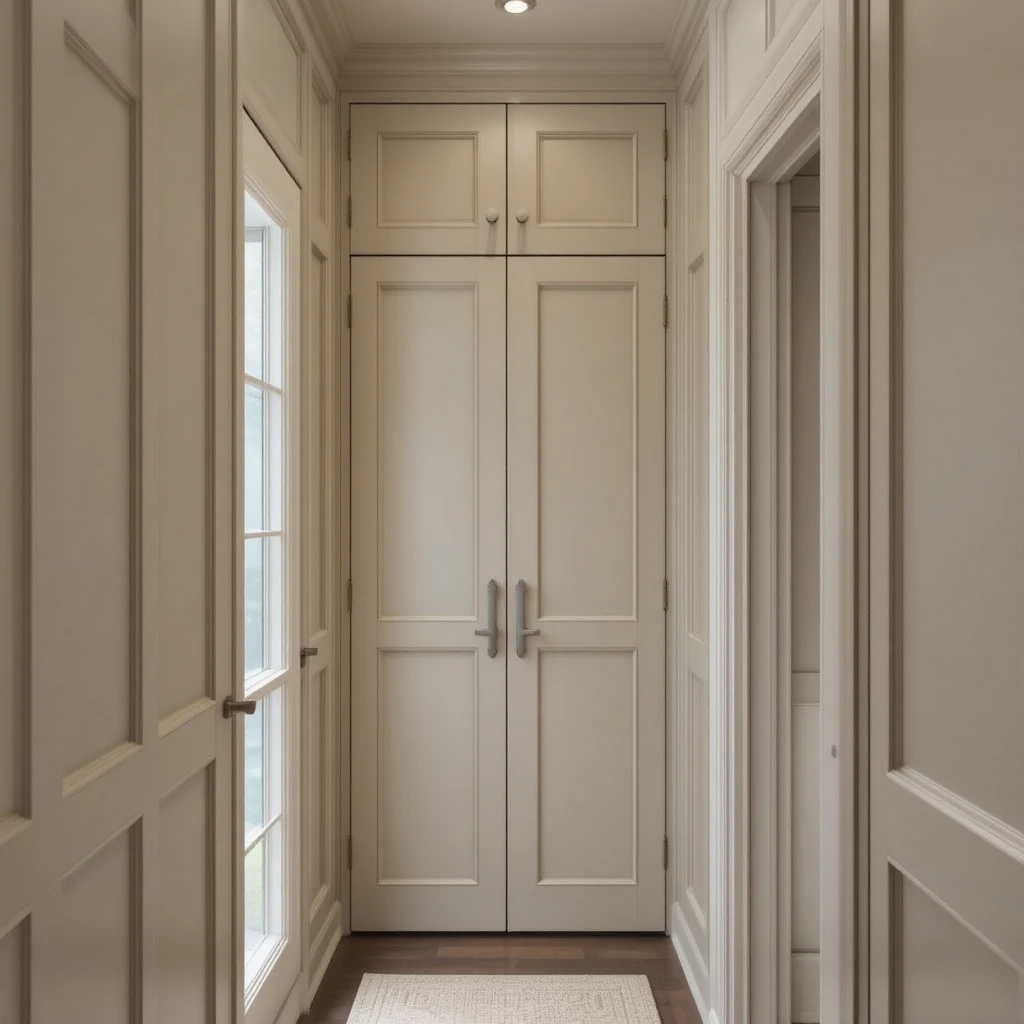
Built-in cabinets and linen closets can become beautiful design statements when coated in this heavy, impactful greige tone. It offers significantly more presence than standard beige, making it an excellent choice for adding architectural weight to flat hallway walls. I love using a satin finish on the woodwork here to let the warm, stony undertones catch the light when doors are opened. It creates a highly custom, designed look that elevates the everyday utility of your storage spaces.
17. Relaxing Nursery Backdrops Painted in Soft Chamois
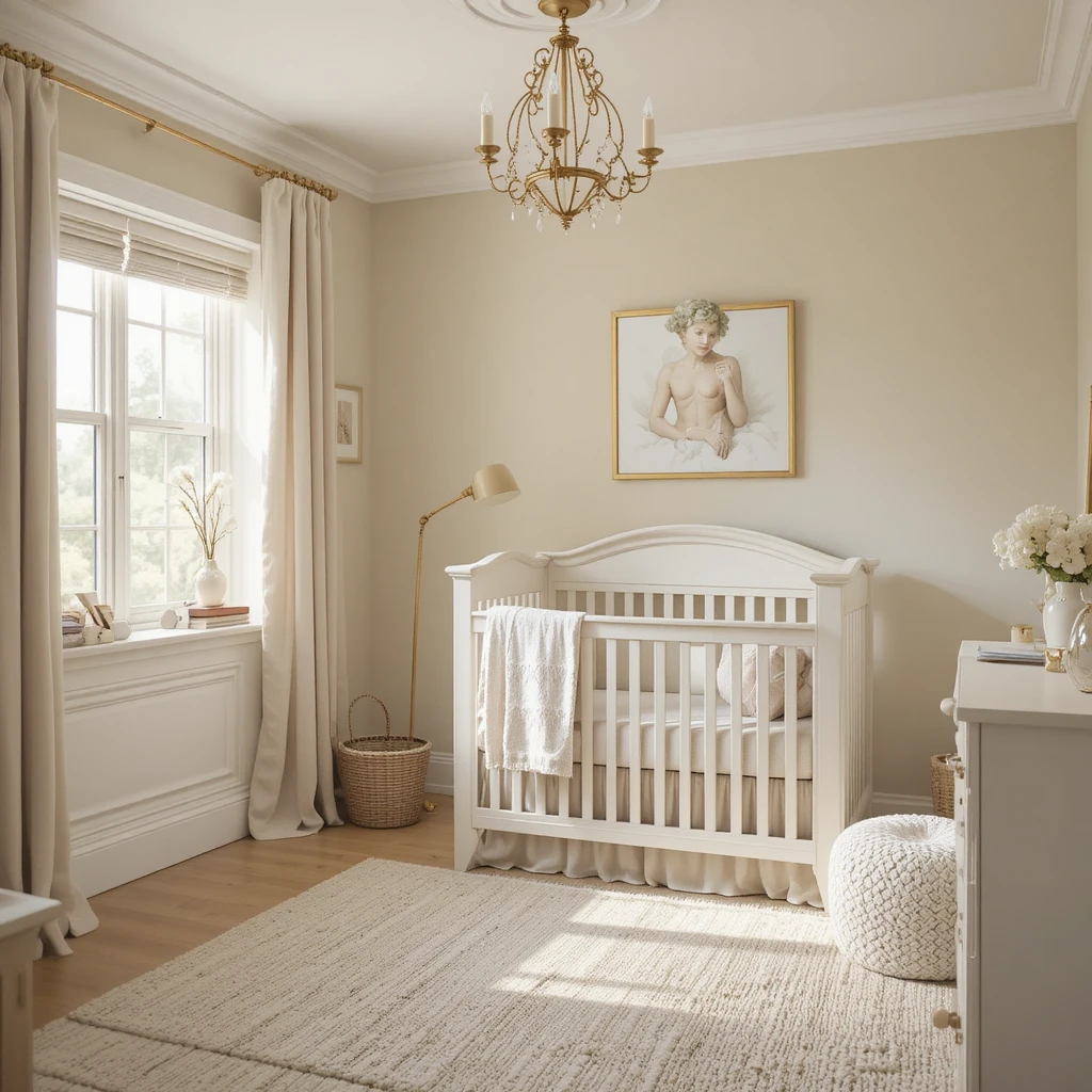
A nursery demands an atmosphere of absolute peace and safety, completely free from loud, overstimulating colors or cold minimalist tones. This incredibly delicate cream brings a whisper of golden warmth that feels like soft sunshine holding the room together. I use it to create a nurturing environment that transitions seamlessly from naptime darkness to bright morning playtime. It pairs beautifully with natural unfinished light woods, soft sage greens, and neutral linen crib bedding.
18. Elegant Formal Parlors Formed by Wordly Gray
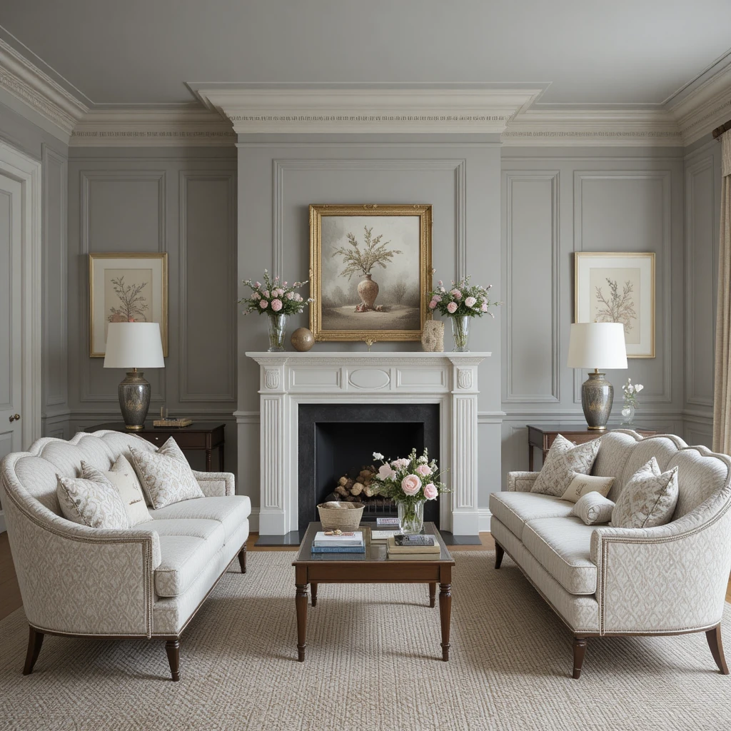
For formal sitting rooms where you host conversation, you need a neutral that feels deeply sophisticated yet completely approachable. This shade balances equal parts warm silt and cool slate, creating an incredibly complex background that adapts to your decor choices. It allows fine art frames and structural architectural moulding to take center stage without the room ever feeling cold. It is my absolute favorite choice for historic homes where preserving a sense of heritage comfort is paramount.
19. Welcoming Craft Rooms Brightened by Dover White
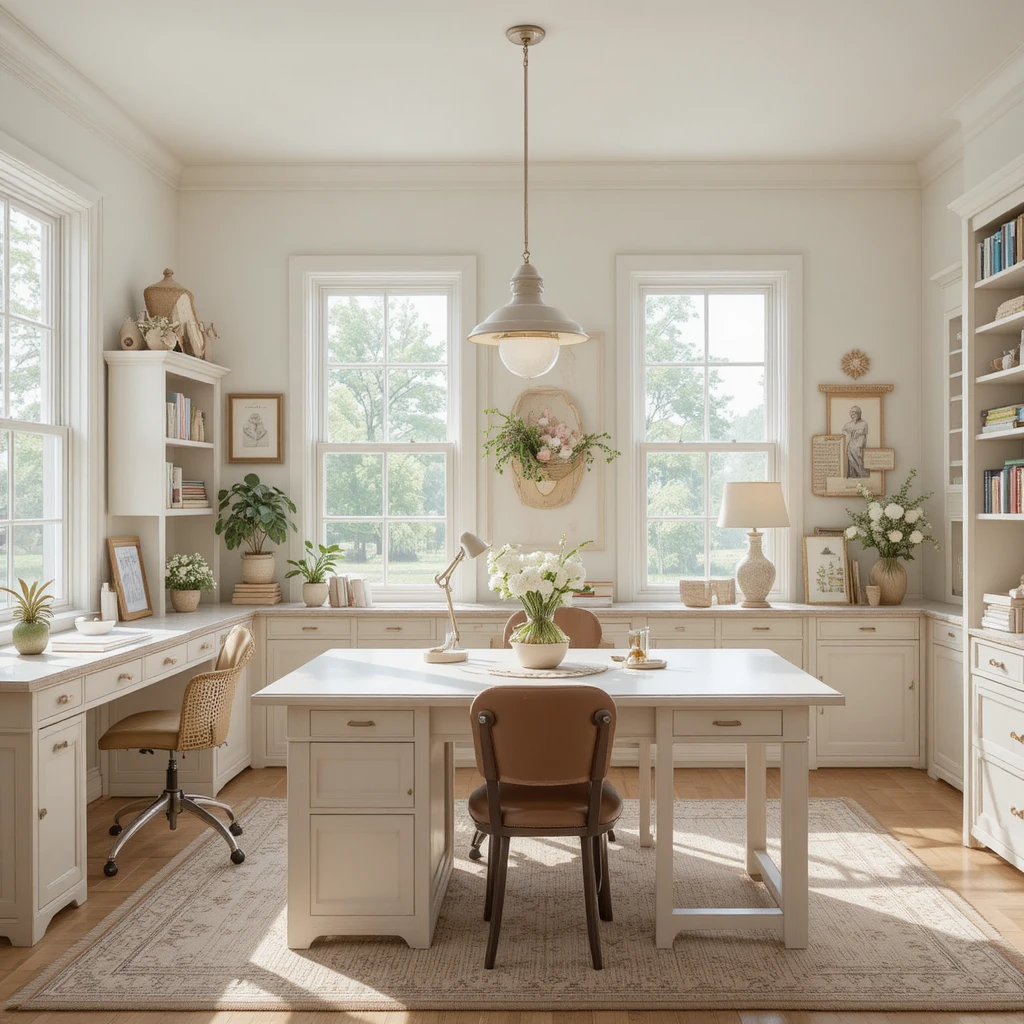
Creative spaces require a clean palette so you can see your projects clearly, but a clinical white can quickly stifle your creative energy. This iconic warm white brings a radiant, time-tested coziness that keeps your mind feeling inspired and entirely relaxed. I love how it reflects natural light across worktables, making the entire room feel spacious, clean, and highly organized. It provides a cheerful backdrop that keeps long hours of making or reading feeling incredibly comfortable and bright.
20. Cozy Basement Dens Grounded by Latte
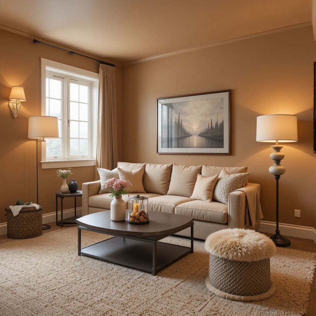
Basements are notoriously difficult to design due to subterranean lighting, but this rich, caramel-infused hue completely conquers the dark. It actively injects a sense of warmth and sunshine into spaces that completely lack natural windows, overriding the cold subterranean concrete feel. I recommend using it across all four walls to create a continuous cocoon of rich, warm color that invites family movie nights. Pair it with plush Berber carpeting and plenty of soft, layered floor lamps to maximize the comfort.
Pro Styling Hacks for Warm Neutrals
To get the absolute most out of your Sherwin-Williams Neutral Palette Warm & Cozy selection, you must master the optical trick of monochromatic layering. Instead of painting your walls one color and your trim a stark white, paint your trim the exact same color as the walls but step up the sheen to a semi-gloss. This eliminates the harsh visual frame around your room, making the walls feel like they extend infinitely while creating a soft, cohesive boundary.
Additionally, always pay attention to your flooring transitions. Warm neutrals require a grounding element; if your floors are a cool gray laminate, your warm walls will look yellowed and mismatched. Introduce large, neutral area rugs that feature a mix of cream, taupe, and charcoal fibers to knit the wall color and the flooring together seamlessly.
The Science of Color Psychology in Spatial Design
The Physics of Warmth: Data from environmental design studies shows that human perception of room temperature can vary by up to 5 degrees Fahrenheit based entirely on the color palette of the walls. Warm tones with red, orange, and yellow-gold undertones stimulate the nervous system slightly, increasing heart rate and creating a physical sensation of warmth. Conversely, high-reflectance cool grays bounce shorter light wavelengths, which can trigger a psychological sense of chilliness and isolation in low-light environments.
Frequently Asked Questions
What is the best Sherwin-Williams warm neutral for a dark room?
Accessible Beige or Alabaster work best because their high Light Reflectance Values bounce limited light efficiently while their warm undertones prevent the dark corners from turning gray.
Can I mix warm neutrals with cool gray furniture?
Yes, but you must bridge the gap using a transitional textile like a tweed or woven rug that contains both warm tan and cool gray threads to unify the space.
What trim color goes best with a warm neutral palette?
I recommend Sherwin-Williams Alabaster or Pure White, as they provide a clean contrast without introducing harsh, cold blue undertones that clash with the walls.
Final Thoughts
Curating a beautiful home is all about listening to how a space feels when you sit still in it at the end of a long day. Embracing a Sherwin-Williams Neutral Palette Warm & Cozy approach isn’t about playing it safe with color; it is an intentional design choice to prioritize peace, comfort, and architectural harmony. By understanding how undertones interact with your unique lighting, you can easily banish cold, uninviting spaces forever. Take your time, test your paint samples across different walls, trust your design instincts, and watch your home transform into the ultimate comforting sanctuary you deserve.