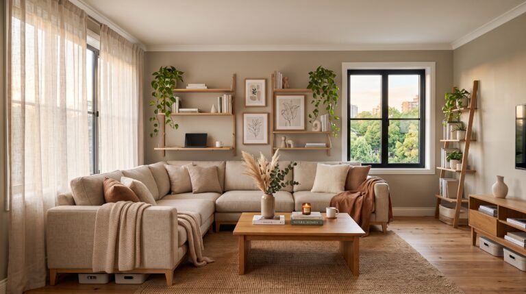

When I walk into a space, the first thing I look at isn’t the furniture; it’s the walls. As an interior designer, I have spent over a decade helping parents move past the tired trope of “baby blue” to create environments that truly reflect a personality. Selecting the right boys’ bedroom paint ideas is about more than just aesthetics; it is about crafting a sanctuary that balances focus, rest, and inspiration. I believe that your choice of color dictates the energy of the room, and if we get the palette right, the rest of the design elements fall into place naturally. When I design a bedroom, I always start by considering the light source—north-facing rooms need warmer, more saturated tones to counteract the bluish tint of the natural light, while south-facing rooms can handle cooler, crisper shades that might otherwise look harsh.
My philosophy has always been to treat the walls as the primary tool for emotional regulation within the home. By utilizing a mix of bold accents and calming neutrals, I can manipulate the perceived size of a room, making a cramped sleeping area feel expansive or a large, cold room feel like an intimate retreat. These boys’ bedroom paint ideas are curated to shift the focus away from generic, “safe” design choices and toward a more intentional, sophisticated aesthetic that grows with the individual. It is about understanding that a room is a living, breathing entity that needs to support both high-energy creativity and deep, restorative downtime, and the paint is the very first layer of that support system.
Quick Reference: Finding the Right Vibe
| Vibe | Color Palette | Primary Goal |
| Sophisticated | Navy & Charcoal | Calm & Focus |
| Energetic | Terracotta & Ochre | Creativity |
| Minimalist | Warm Gray & Cream | Airy & Open |
| Nature-Inspired | Sage & Forest Green | Relaxation |
Essential Tools for a Professional Finish
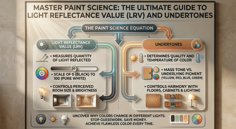
Before you pick up a brush, you need the right setup. I never start a project without ensuring my client has a high-quality, angled sash brush for cutting in, a 3/8-inch nap microfiber roller for smooth surfaces, and a sturdy extension pole. You will need painter’s tape (the high-adhesion blue kind), a drop cloth made of canvas rather than plastic to prevent slippage, and a high-quality primer if you are covering a dark color. Always check the light reflectivity value (LRV) on the back of the paint can; it’s the secret technical detail most homeowners overlook.
20 Transformative Paint Concepts for the Modern Bedroom
1. Midnight Navy Sophistication

There is a profound depth to a true navy that transforms a small bedroom into a cozy, cocoon-like environment. I love using this for an accent wall behind a headboard to anchor the room visually, as the dark saturation draws the eye and creates an immediate sense of weight and importance. By keeping the remaining walls a crisp, gallery-white, the navy doesn’t feel oppressive; instead, it provides a sophisticated contrast that feels timeless. The key here is using a high-quality matte pigment to ensure the wall doesn’t bounce light around, which keeps the atmosphere grounded and perfect for winding down after a long day of mental stimulation.
2. Earthy Forest Green Accents
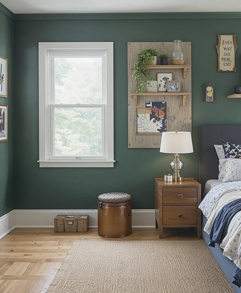
Bringing the outdoors in creates a grounding effect that is perfect for a space meant for rejuvenation. I love using a muted forest green on a singular accent wall, which provides depth without overwhelming the rest of the bedroom. This color works beautifully with organic textures like raw wood shelving or jute rugs, establishing an environment that feels both sturdy and serene. It is a sophisticated way to integrate color while maintaining a mature, elevated aesthetic that bridges the gap between structured design and natural, organic comfort.
3. Crisp Architectural Grey
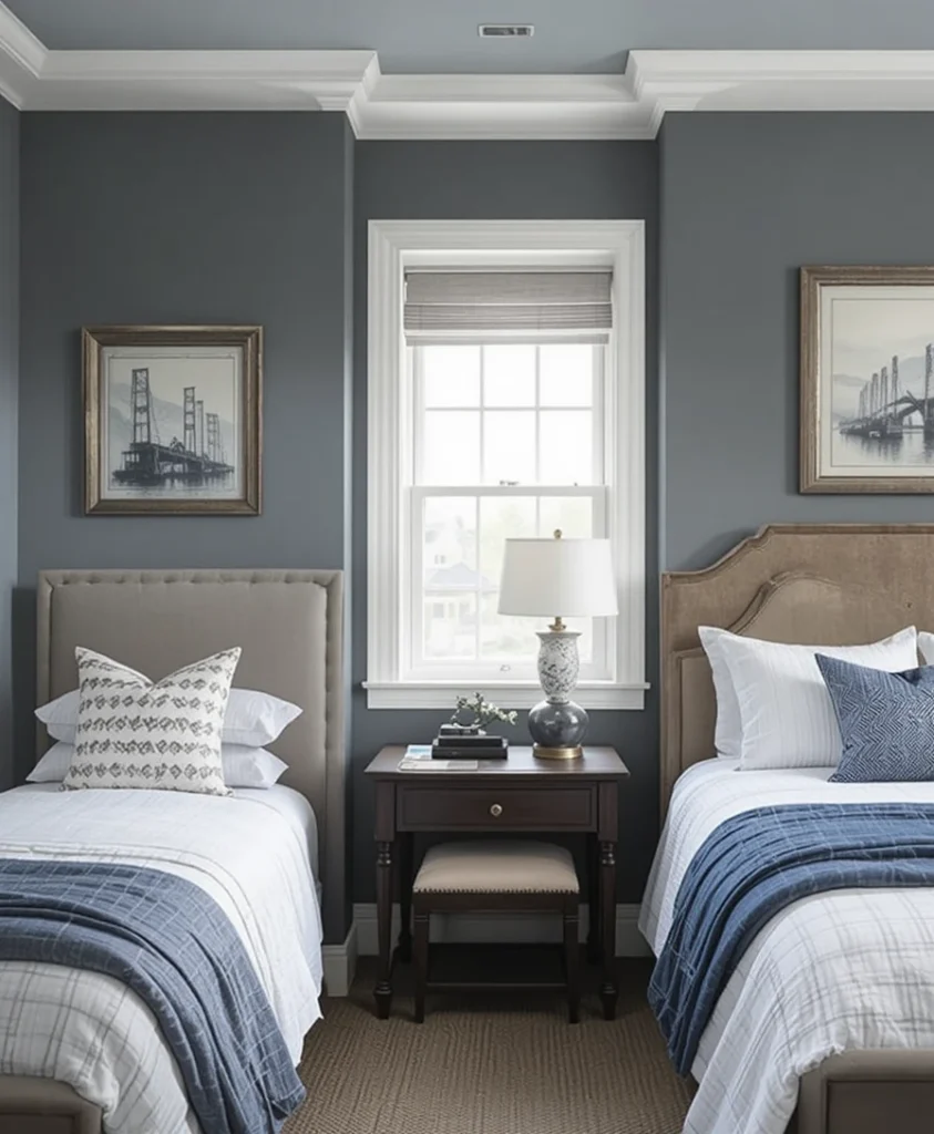
For a truly modern approach, I lean toward a cool, industrial grey that leans slightly toward blue undertones. This shade is highly versatile, allowing for frequent updates to decor and bedding without the need to repaint the walls. When I use this on every wall, I ensure the trim is painted in a crisp, clean white, which creates a sharp, architectural contrast. It is the ultimate choice for those who prioritize a clean, uncluttered visual experience in their living quarters, allowing the shape of the room itself to stand out as the primary design feature.
4. Dynamic Burnt Orange Zones
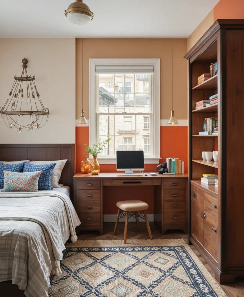
If the room requires a surge of energy, burnt orange is a brilliant, unconventional choice that I frequently implement to break up monotony. Rather than painting the entire room, I suggest using this for a color-blocked section, perhaps outlining a study corner or a dedicated reading nook. It pairs exceptionally well with warm walnut woods and black metal frames, creating a mid-century modern vibe that feels intentional. This creates a focal point that is stimulating without being distracting, striking a perfect balance between creative inspiration and the need for a relaxed sleeping environment.
5. Slate Blue Minimalism
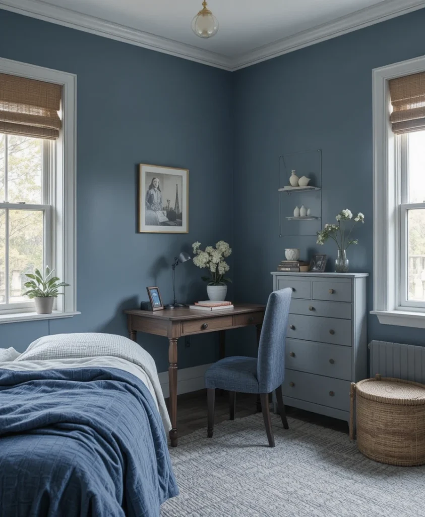
Slate blue is a subtle, grey-infused hue that offers a sense of stability and calm that is hard to replicate. I find that this color works wonders in rooms that receive a lot of natural light, as it shifts and changes beautifully throughout the day. It provides a sophisticated alternative to standard primary blue, offering a much more adult feel. I often recommend this for spaces where focus and academic performance are the primary goals for the occupant, as the muted undertones help to minimize visual noise and promote a serene atmosphere for deep thought.
6. Matte Black Statement
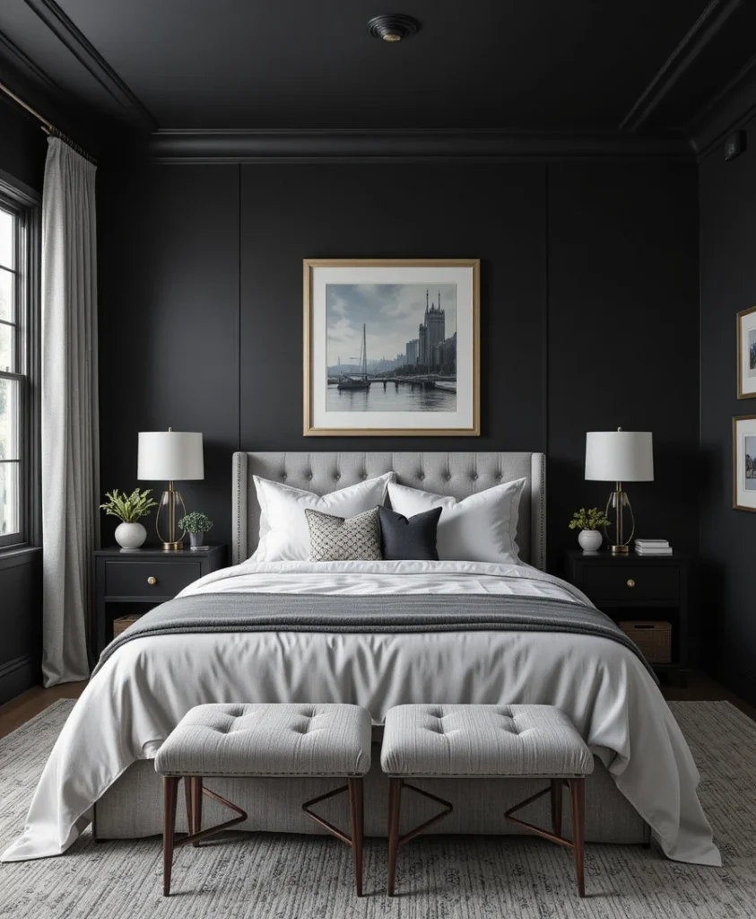
I often hear clients worry about using black in a bedroom, but when executed correctly, it is one of the most powerful boys’ bedroom paint ideas. Using a true matte black on the walls creates a dramatic, theater-like quality that is perfect for a refined bedroom. The key is to introduce high-contrast textures, such as crisp white linens or light grey textiles, to keep the space from feeling heavy. It is a bold, confident design move that pays off with incredible style depth, turning a standard room into a high-end, gallery-like sanctuary.
7. Soft Stone Beige
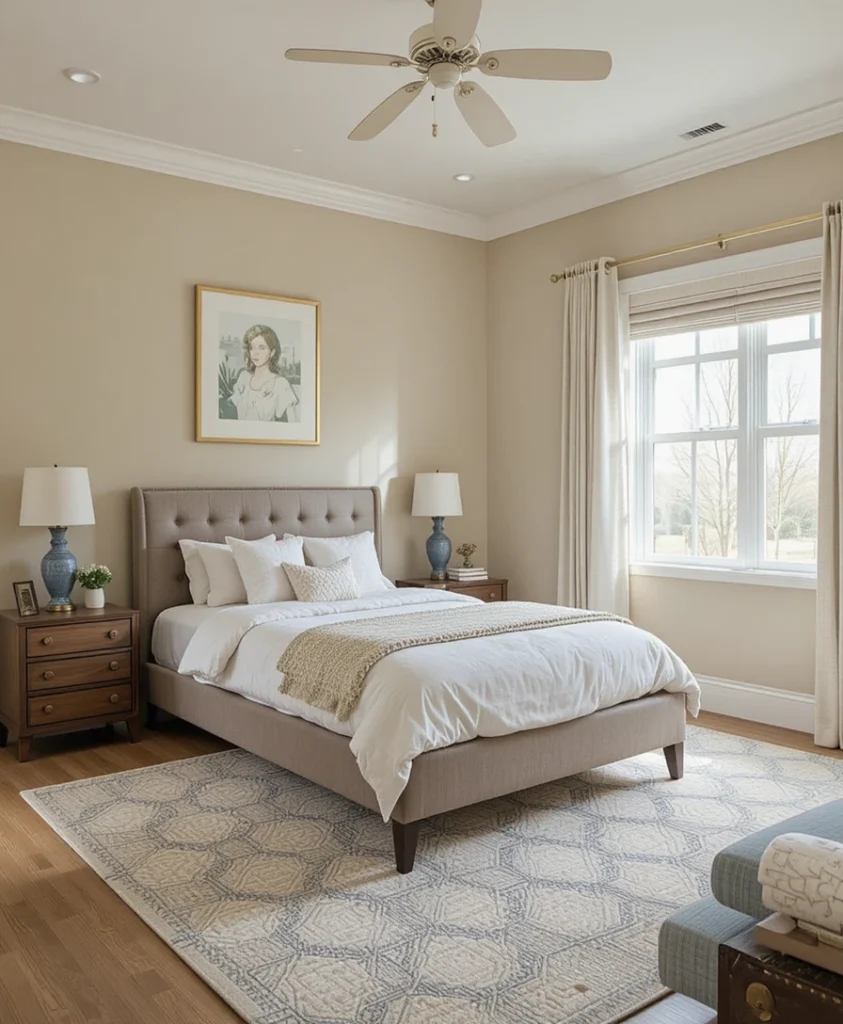
For a lighter, airier feel, stone-toned beige is an underrated champion that provides warmth without the yellow undertones found in cheaper, dated creams. This neutral base allows for a highly flexible room where the color palette can be shifted through accessories like rugs, pillows, or wall art. I find this color particularly effective in smaller rooms, as it reflects light and makes the space appear significantly larger. It is a safe, yet incredibly stylish, foundation for any interior design scheme, providing a calm and welcoming environment that feels like a blank, sophisticated slate.
8. Teal and Charcoal Depth
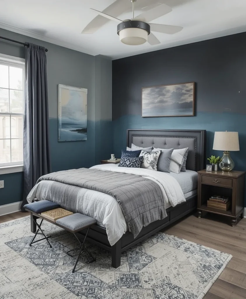
Combining a dark charcoal with a secondary wall in a rich, moody teal creates a sophisticated, layered look that feels very custom. I find that this dual-tone approach gives the bedroom a professional designer touch that is rare to find in standard designs. It creates a defined transition between the sleeping area and the rest of the room, effectively zoning the space for different activities. This is a must-try for anyone looking to step away from monochromatic walls in favor of something more complex, moody, and undeniably modern in its execution.
9. Washed Denim Effect
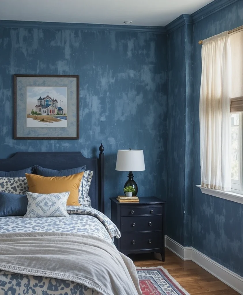
The texture of washed denim provides a relaxed, comfortable aesthetic that is perfect for a bedroom. Using a specialty glaze or a rag-rolling technique with a medium-blue paint can replicate this look, adding a unique, tactile quality to the walls. It feels lived-in and comfortable, stripping away the pretension often associated with high-end interior design. I recommend this for those who want a room that feels approachable, casual, and distinctly personal, creating a space that feels like a favorite pair of jeans—comfortable, reliable, and perfectly suited to daily life.
10. Deep Plum Contrast
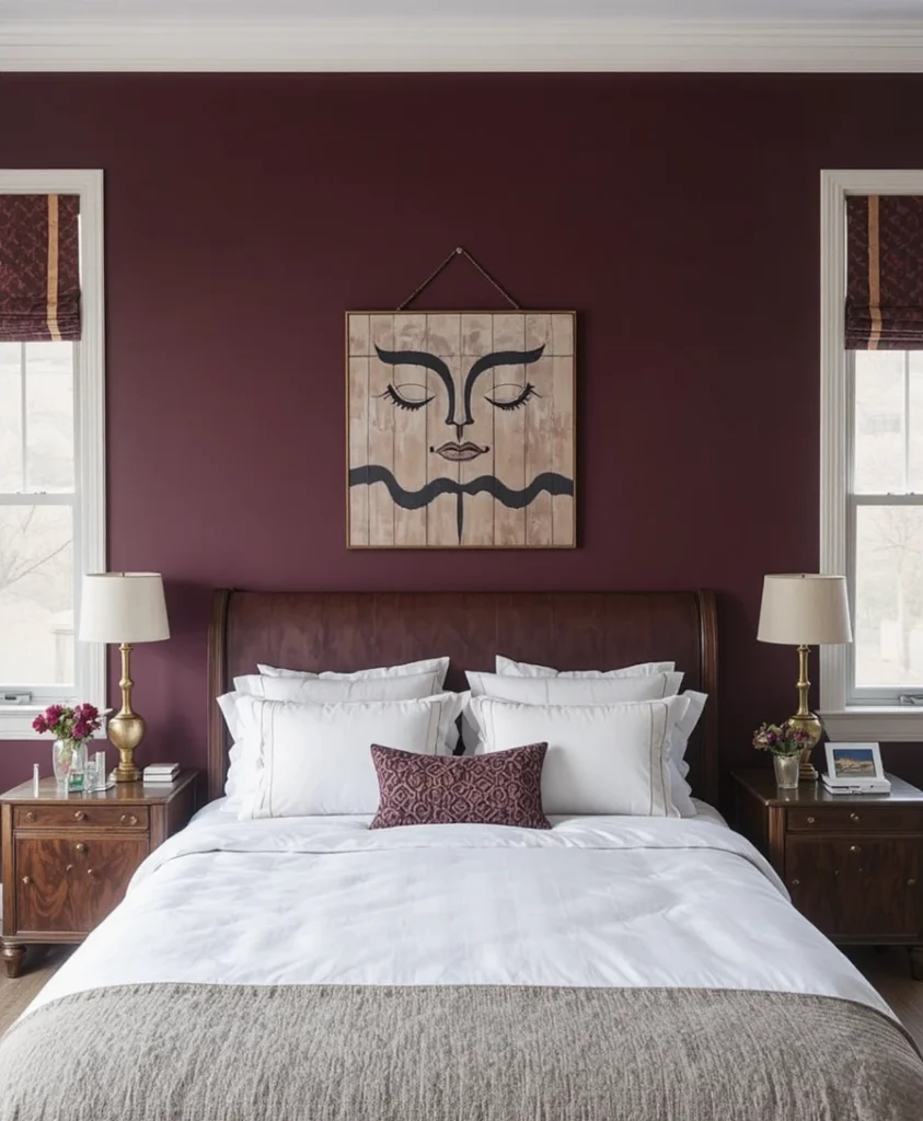
Deep, saturated plum is a daring, high-fashion color that adds an unexpected touch of luxury. When paired with brass or gold accents, it creates a rich, opulent environment that is both calming and intellectually stimulating. I suggest using this on a wall that serves as the backdrop for a headboard to anchor the room and create a sense of theater. It is a fantastic option for those who want to push the boundaries of traditional masculine color palettes, resulting in a space that feels curated, bold, and incredibly unique.
11. Concrete Industrial Grey
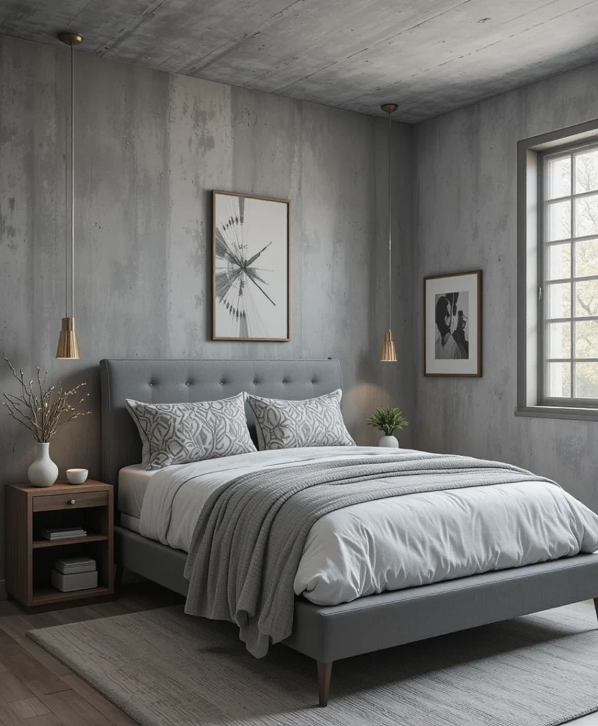
Emulating the look of raw concrete through specialized paint finishes is a brilliant way to add texture to a modern bedroom. This provides an urban, loft-like feel that is consistently popular for modern, structured rooms. I often advise my clients to keep the rest of the furniture minimal to let the wall texture take center stage. This choice is incredibly durable and hides minor imperfections on the wall surface exceptionally well, making it a highly practical choice for a high-traffic area that requires a tough, long-lasting aesthetic.
12. Serene Sage Green
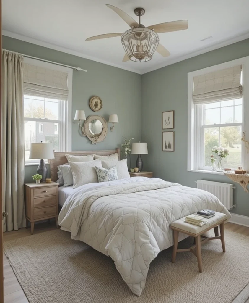
Sage green is a muted, earthy tone that promotes tranquility, making it perfect for a restful sleep environment. It sits perfectly between blue and green, offering a natural feel that is very soothing to the eyes. I find it works best when paired with warm, light-toned woods, creating a Scandinavian-inspired aesthetic that is both functional and beautiful. It is an excellent choice for a space that needs to function as both a bedroom and a retreat, encouraging a slow, peaceful transition from the busy world outside into your personal sanctuary.
13. Sophisticated Taupe
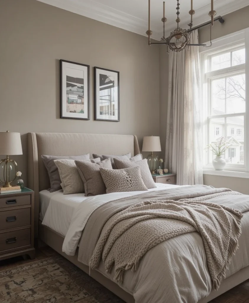
Taupe is the bridge between grey and brown, offering a warm, grounded neutrality that feels very sophisticated. It is far more interesting than a standard grey and provides a cozy, cocoon-like feeling that is perfect for a bedroom. When I design with taupe, I prioritize layering different textures, such as wool throws and velvet cushions, to add visual interest. It is a fail-safe option that brings an immediate sense of maturity to any room, ensuring the space feels cozy and comfortable without ever feeling sterile or cold.
14. Graphite and Copper
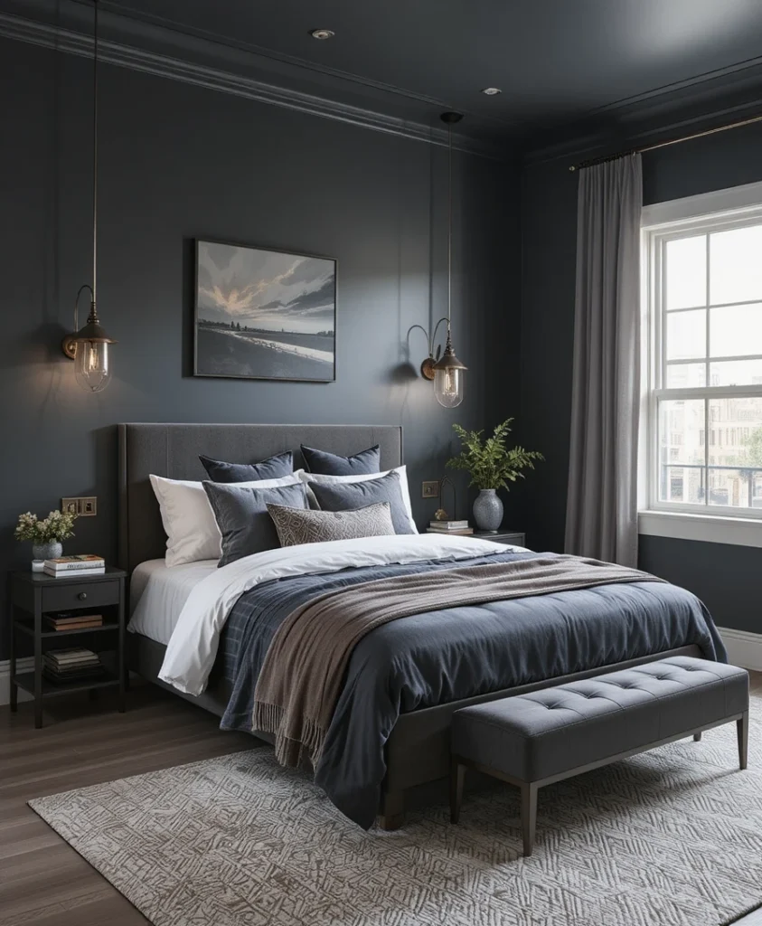
Graphite is a dark, metallic-leaning grey that looks stunning when accented with copper lighting or hardware. This combination exudes a modern, high-tech energy that is very appealing for a contemporary bedroom. I suggest painting the walls in a deep, dark pigment to allow for a subtle sheen that interacts with the metallic elements as the sun moves across the room. It is an elegant, high-contrast look that feels very intentional and sharp, providing a sophisticated backdrop for technology or minimalist decor pieces.
15. Muted Mustard Accents
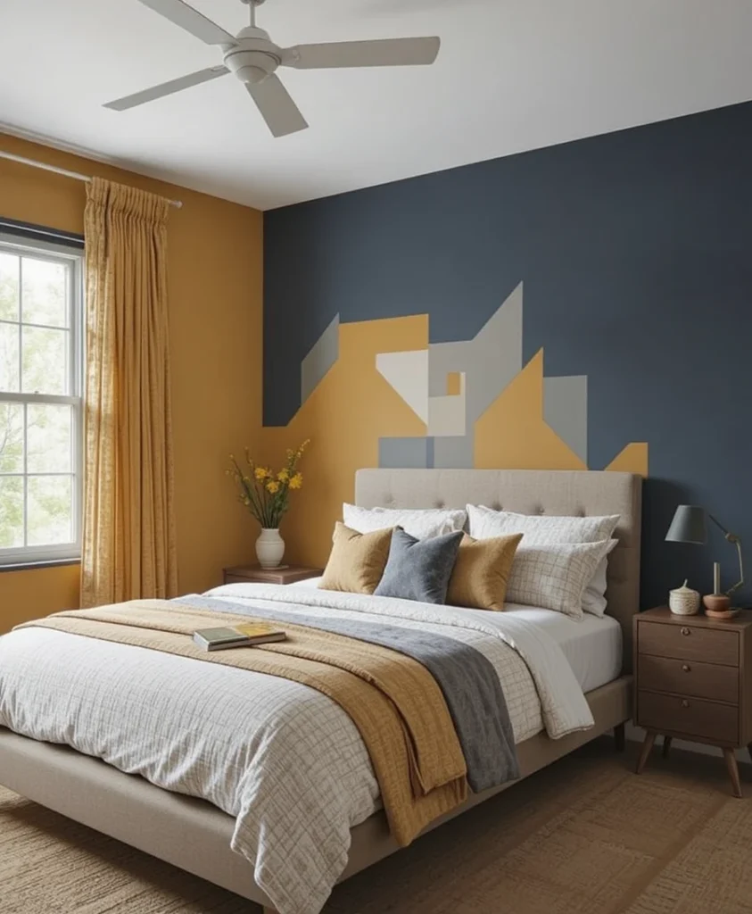
Mustard is a bold color that can be surprisingly sophisticated when used in the right, muted shade. Rather than a bright, jarring yellow, I use a deep, earthy mustard for accent walls or geometric painted shapes to ground the energy of the bedroom. It brings a sunny, optimistic energy to the room without being overwhelming or childish. This color pairs perfectly with dark blue or charcoal, creating a balanced and striking aesthetic that feels creative, warm, and highly curated for someone who appreciates bold design choices.
16. Antique Bronze Wash
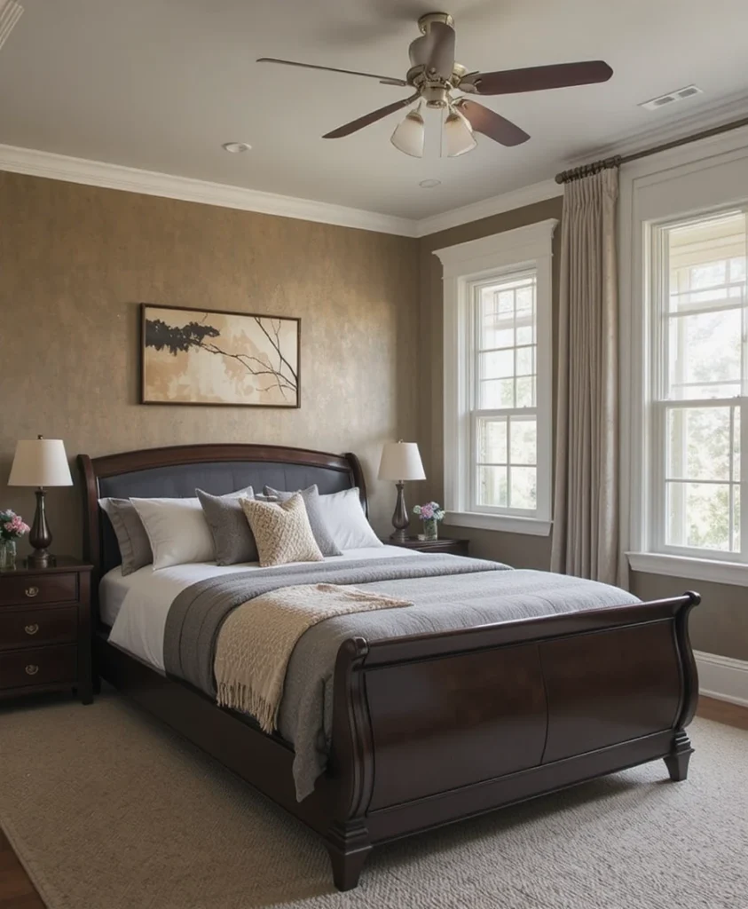
For a more artistic approach, an antique bronze wash over a neutral base can add a subtle, metallic shimmer to the walls of a bedroom. This is a sophisticated way to add depth and interest to a room without committing to a solid, dark color. It catches the light throughout the day, creating a dynamic environment that feels warm and inviting. I recommend this for those who want a truly unique, one-of-a-kind finish that feels less like a paint job and more like a high-end wall treatment.
17. Cool Mint Refresh
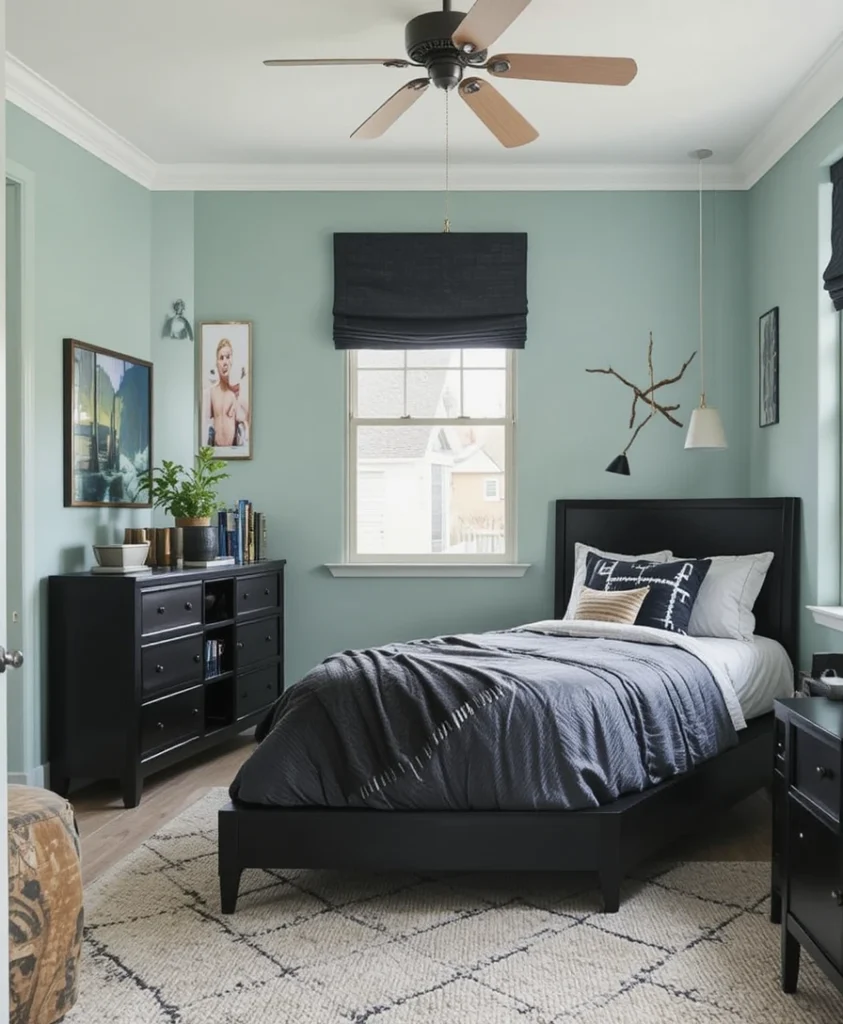
Mint green, when chosen in a desaturated, grey-tinted hue, can feel very modern and fresh. It is an excellent color for smaller bedrooms, as it keeps the space feeling bright and expansive, unlike darker tones. I pair this with black accents to ground the space and prevent it from feeling too light or clinical. It is a crisp, clean choice that feels very current and design-forward, providing a lighthearted yet mature backdrop that is perfect for a room that needs to feel energetic during the day and peaceful at night.
18. Terracotta Warmth
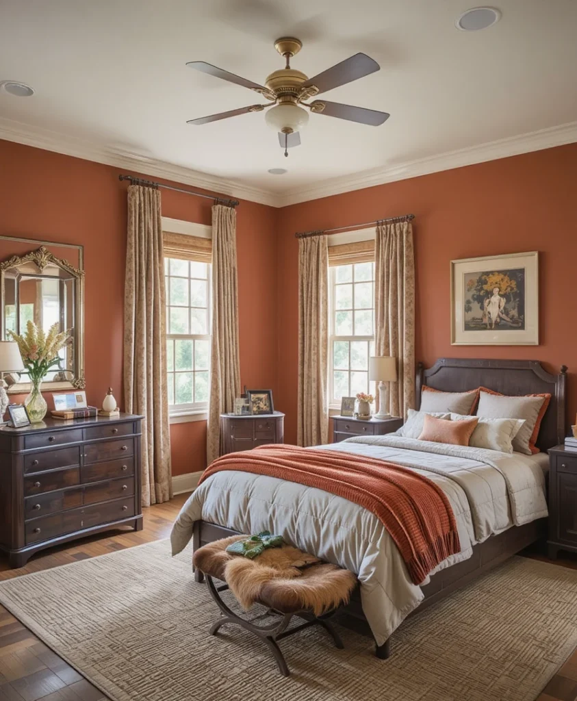
Terracotta is a warm, clay-based color that brings a sense of comfort and history to a bedroom. It feels grounded and solid, making it an excellent choice for a space that needs to feel like a stable home base. I prefer a deep, brick-leaning terracotta that pairs beautifully with leather accents and dark wooden furniture. It is a timeless color that feels incredibly cozy during the colder months, providing a sense of sun-baked warmth that stays with you even when the weather outside is gray and uninviting.
19. Graphite and White Geometric
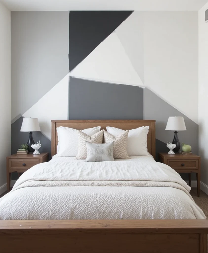
Using geometric shapes painted in varying shades of graphite and white can create a feature wall that acts as the bedroom‘s main art piece. This requires careful taping and patience, but the result is a sophisticated, architectural focal point that commands attention. It adds movement and structure to the room without the need for additional decor, which is a massive win for minimalist design lovers. I suggest keeping the geometry large and simple to ensure it remains timeless rather than trendy, creating a clean, high-impact look.
20. Deep Ocean Teal
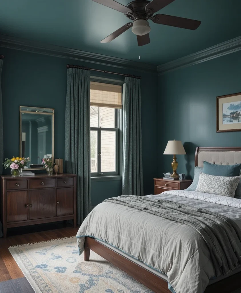
Deep ocean teal is a complex, saturated color that bridges the gap between blue and green perfectly. It is incredibly calming while still being visually interesting and rich, making it perfect for a bedroom escape. I love using this color in rooms with darker wood tones, as the contrast is naturally striking and very masculine. It is a sophisticated choice that makes a room feel larger and more intentional, effectively wrapping the space in a tranquil, watery embrace that is both modern and timelessly elegant.
The Science of Color: Why It Matters
In my practice, I often refer to environmental psychology to explain why certain colors work better than others for specific functions. Research suggests that cool colors like blues and greens can lower heart rates and encourage deeper rest, which is why they are often favored for sleeping areas where recovery is the primary objective. Conversely, warmer tones like ochre or terracotta stimulate the brain and can increase creative output, which is why I often suggest them for rooms that double as hobby spaces. When choosing from these boys’ bedroom paint ideas, consider the primary function of the room—if it is purely for sleeping, lean into the cooler spectrum; if the room serves as a hub for hobbies, don’t shy away from those warmer, more stimulating shades.
Frequently Asked Questions
How do I choose the right finish for a high-traffic room? I always recommend an eggshell or satin finish for walls. They offer a slight sheen that is much easier to wipe clean than flat paint, yet they don’t produce the distracting glare of a high-gloss finish.
Should I paint the trim the same color as the walls? Painting trim the same color as the walls creates a seamless, modern, and expansive look. If you have intricate crown molding you want to highlight, stick to a crisp white, but for a minimalist vibe, matching is the way to go.
How many samples should I test before committing? Never judge a color by the swatch. Buy at least three sample pots and paint large sections on different walls. Observe how the color changes throughout the day as the natural light shifts—this is the only way to avoid regret.
Final Thoughts
Designing a space is an intimate process that goes beyond just picking a color from a deck; it is about defining how you want to exist within your own four walls. The paint you choose for a bedroom sets the stage for the rest of your home’s story, acting as the foundation upon which every other design choice—from the texture of the sheets to the placement of the lighting—is built. Whether you lean toward the moody, quiet depth of navy or the vibrant, creative energy of terracotta, remember that these walls are the backdrop for everything else you add, and they have the power to fundamentally alter your mood every time you walk through the door.
Don’t be afraid to experiment, prioritize the feeling you want to cultivate over what is currently “trending,” and always—above all—trust your own eye when the light hits the wall. I have seen thousands of rooms, and the ones that stand the test of time are always the ones where the owner listened to their gut and chose a color that made them feel at home. Take your time with the process, enjoy the transformation that a fresh coat of paint brings, and rest easy knowing that you’ve created a space that is uniquely and undeniably yours. Your home is the most important environment you will ever inhabit, and by investing this time in selecting the perfect boys’ bedroom paint ideas, you are investing in the long-term comfort, creativity, and peace of mind of the person who will inhabit that room every single night.