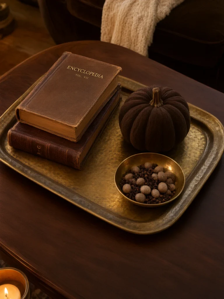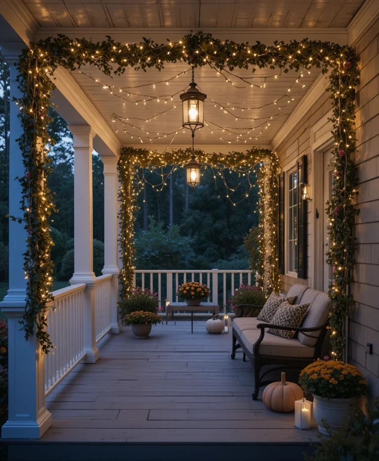

When I walk into a residential space that feels flat, sterile, or disconnected from the rhythms of nature, I know exactly what is missing. Over my past decade working as an interior designer, helping clients transform chaotic houses into intentional homes, I have learned that the quickest way to ground a room is by shifting its seasonal narrative.
Autumn arrives with a distinct sensory shift, and translating that transition indoors requires a deliberate approach to color theory. If you have ever wondered how to curate a rich, layered fall colour palette that feels sophisticated rather than kitschy, you are in the right place. I am going to share my personal playbook for weaving depth, warmth, and timeless autumn elegance into your living spaces using twenty distinct design directions.
| Feature / Aspect | Design Detail | Primary Objective |
|---|---|---|
| Dominant Tone | Grounded Warmth | Establishing immediate psychological comfort |
| Accent Strategy | Saturated Jewel Tones | Adding visual weight and focal contrast |
| Material Pairing | Raw Wood & Brushed Brass | Enhancing textural authenticity |
| Lighting Layering | 2700K Warm Ambiance | Accentuating rich autumnal pigments |
Essential Tools and Materials for Your Seasonal Redecoration
Before diving into the creative application of a fall colour palette, you need the right physical toolkit to evaluate pigments accurately under different lighting conditions.
Handheld Color Spectrometer or Fan Decks: Essential for matching exact paint undertones against textile swatches.
Full-Spectrum LED Bulbs (2400K to 2700K): Crucial for preventing warm autumn pigments from looking muddy or overly yellow at night.
Large Peel-and-Stick Sample Boards (12×18 inches): To test paint shades across different walls before committing.
Natural Fiber Swatches: Linen, heavy wool, raw silk, and brushed velvet to assess how light interacts with textured surfaces.
20 Unique Ways to Implement a Sophisticated Fall Colour Palette
1. Burnt Ochre and Raw Linen Harmony
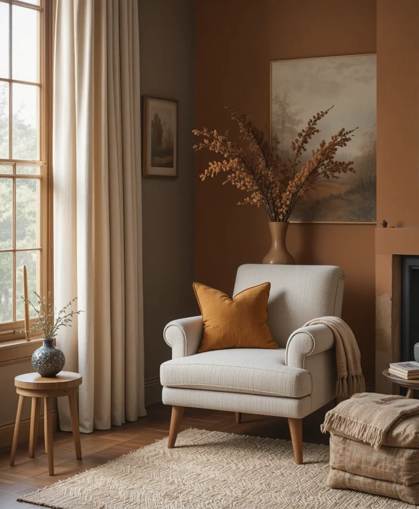
When I want to introduce warmth without overwhelming a room, I always start with burnt ochre paired with raw, unbleached linen. This combination mimics the sun-baked soil of late autumn while keeping the overall envelope light and breathable. I typically use burnt ochre on heavy throw pillows or a structured accent chair, letting the neutral linen curtains diffuse natural daylight into a soft, golden glow.
2. Muted Terracotta and Brushed Brass
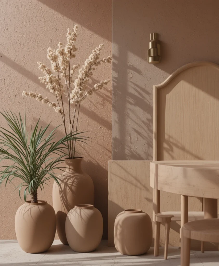
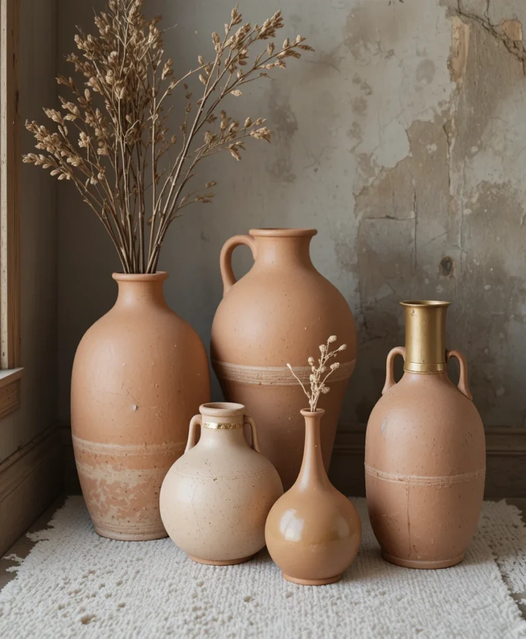
Terracotta has evolved far beyond rustic plant pots; when styled with brushed brass, it offers an understated luxury. I love incorporating muted terracotta through matte ceramic vases or textured wall plaster, letting the metallic warmth of brass hardware catch the low afternoon sun. This pairing introduces a subtle Mediterranean warmth that transitions beautifully into the cooler months.
3. Deep Olive and Aged Leather
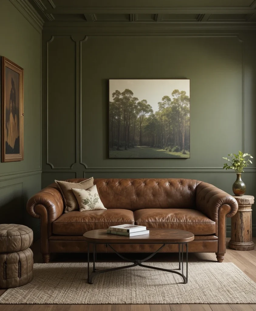
There is an inherent grounding quality to deep olive green that instantly calms an active space. In my own design practice, I frequently layer olive walls behind vintage saddle-leather seating to create a rich, enveloping atmosphere. The pairing feels organic, masculine yet soft, and anchors a room with the quiet dignity of an old-growth forest.
4. Rich Rust and Charcoal Contrast
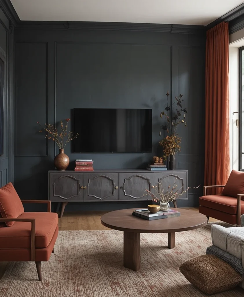
If you crave high-contrast drama without resorting to stark black and white, rich rust against deep charcoal is a phenomenal alternative. I often specify charcoal for large foundational pieces like a media console or accent wall, then punch it up with rust-colored velvet upholstery. The interplay between the cool, moody charcoal and the fiery rust creates instant visual depth.
5. Warm Mustard and Espresso Brown
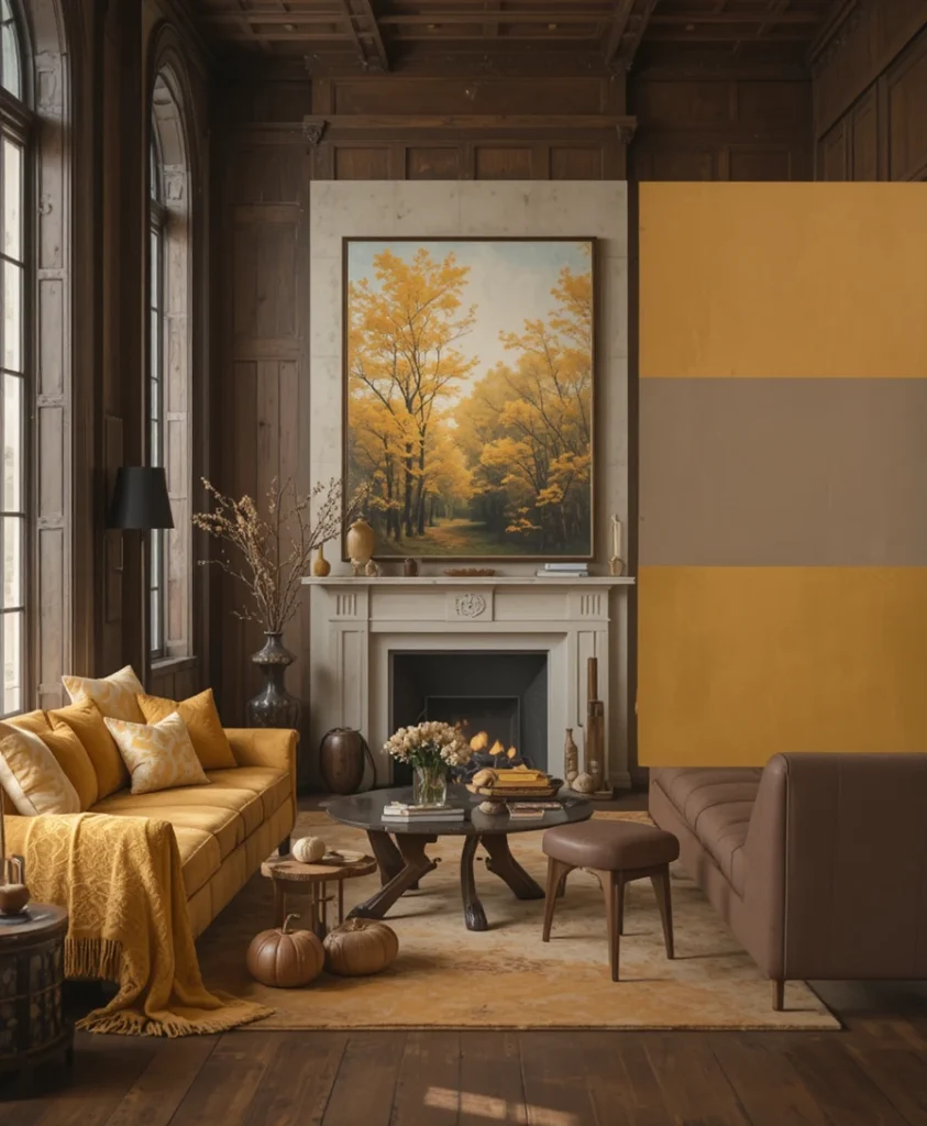
Mustard yellow can easily skew loud if mishandled, but when grounded by espresso brown, it matures into a sophisticated statement. I use espresso as a heavy baseline in wood tones and floor finishes, allowing rich mustard accents in art or woolen blankets to pop. This combination feels like stepping into a sunlit library filled with leather-bound books.
6. Amber Glow and Slate Gray
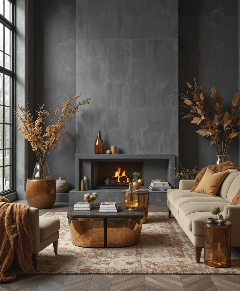
Slate gray provides a contemporary, architectural coolness that begs for the counterweight of amber tones. By introducing amber-tinted glassware or warm wood side tables against a gray backdrop, you neutralize any clinical chill in the room. I find this mix particularly effective in modern open-concept living spaces that need a dose of seasonal intimacy.
7. Fig and Antique Bronze
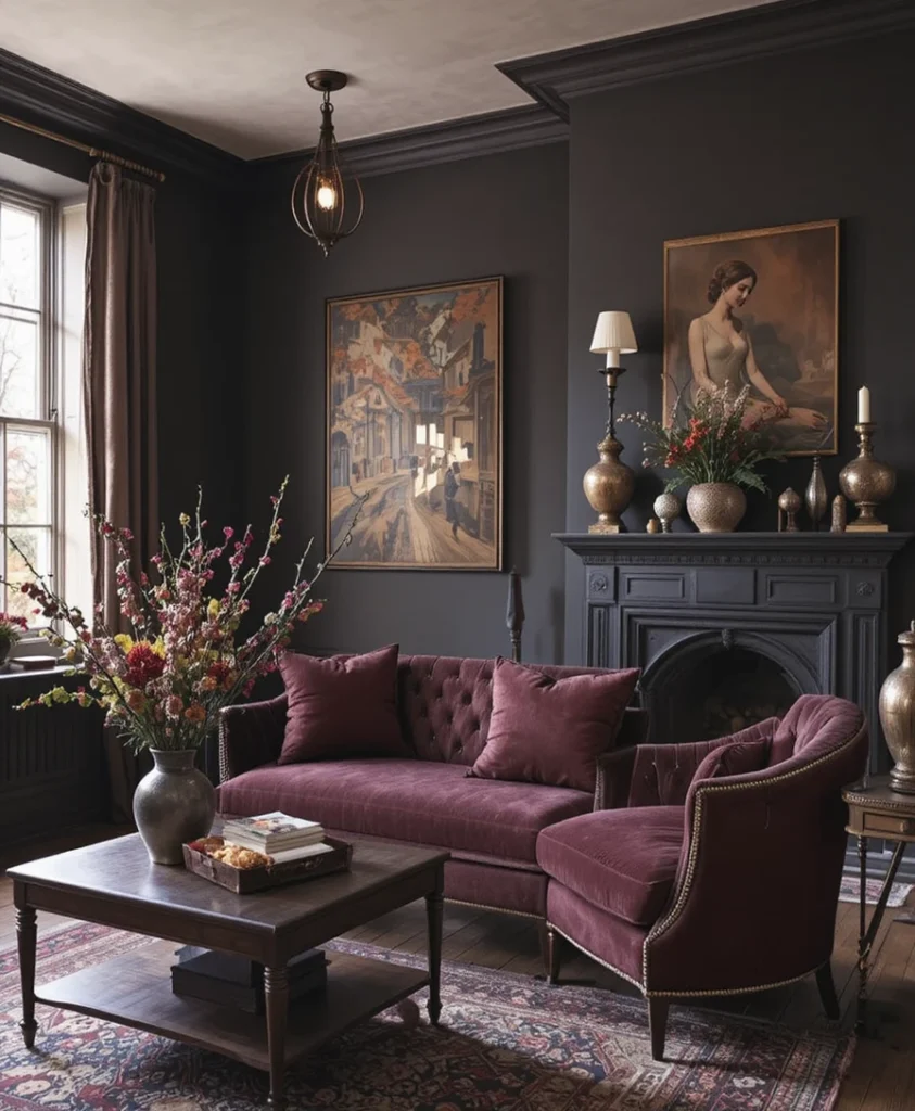
Moving away from predictable autumn brights, deep fig offers a moody, sophisticated twist on traditional seasonal decor. I love pairing dark fig walls or upholstery with antique bronze light fixtures to cast a romantic, shadowed glow. It is a bold choice that rewards the eye with subtle, complex undertones as evening approaches.
8. Spiced Pumpkin and Creamy Oatmeal
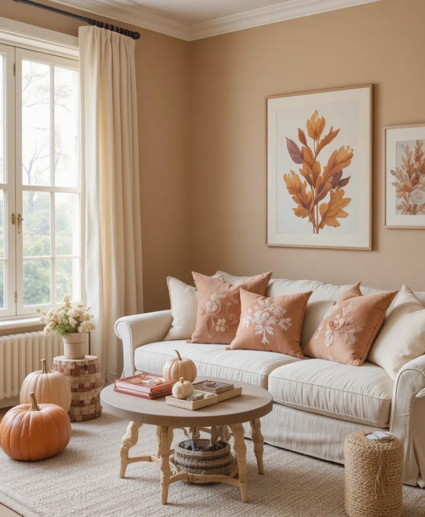
For those who prefer a softer, brighter seasonal transition, spiced pumpkin paired with creamy oatmeal strikes a delightful balance. Instead of neon oranges, opt for a dusty, desaturated pumpkin hue on ceramics or linen cushions. Layered against neutral oatmeal walls, the space feels airy, inviting, and effortlessly chic.
9. Forest Pine and Warm Taupe
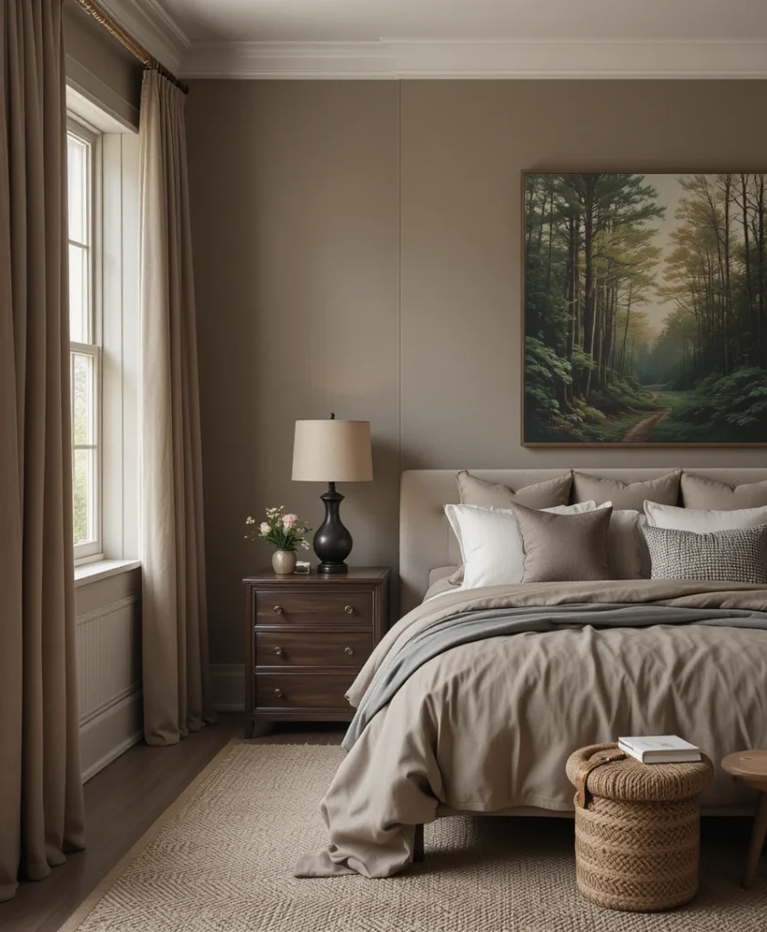
Bridging the gap between late summer greenery and deep winter woods, forest pine paired with warm taupe creates a serene sanctuary. I frequently recommend this palette for bedrooms, using taupe as the primary wall color and introducing pine through heavy drapery or botanical artwork. It promotes deep rest while keeping the room visually connected to nature.
10. Cinnamon Bark and Pale Birch
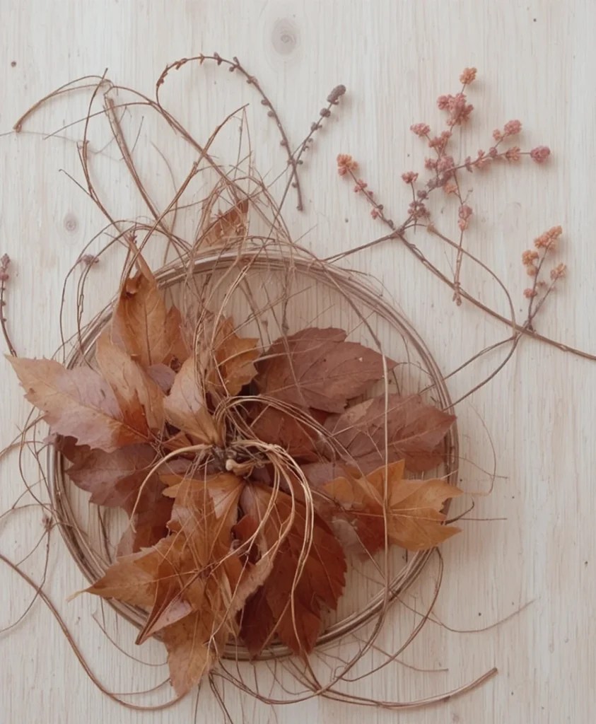
Cinnamon bark brings an intoxicating warmth to minimalist interiors, especially when contrasted against pale birch wood surfaces. I rely on this combination when a client wants an autumnal feel without adding heavy clutter. The crispness of birch keeps the rich, spicy cinnamon tones from feeling heavy or claustrophobic.
11. Antique Gold and Moody Indigo
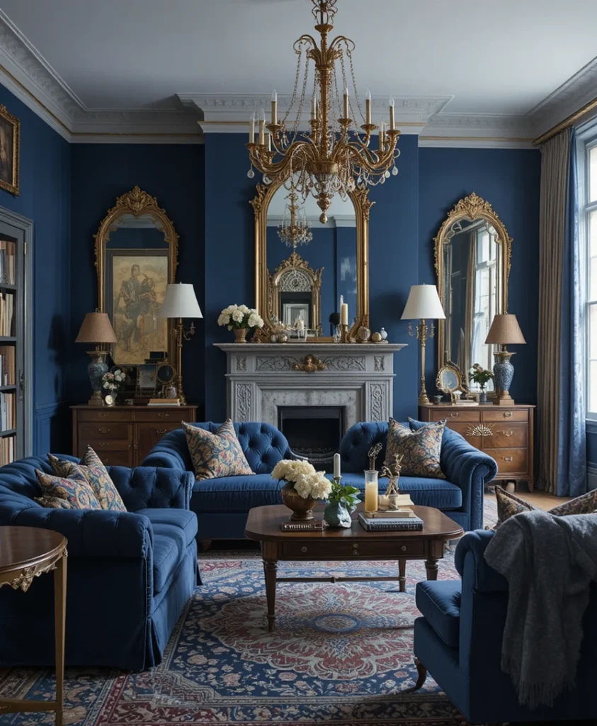
While indigo is traditionally viewed as a summer staple, pairing it with antique gold instantly shifts its mood toward the cooler equinox. I use deep indigo on large upholstered sofas and layer antique gold mirrors and brass frames across the room. The resulting contrast is both dramatic and timelessly elegant.
12. Chestnut Brown and Soft Sage
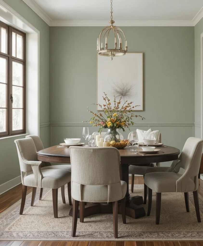
Chestnut brown provides an earthy, reliable anchor, while soft sage introduces a subtle, herbaceous freshness. I often use this combination in dining rooms, where chestnut wood tables benefit from the calming presence of sage-colored tableware or upholstered chairs. It feels organic, grounded, and deeply restorative.
13. Plum and Honeyed Wood
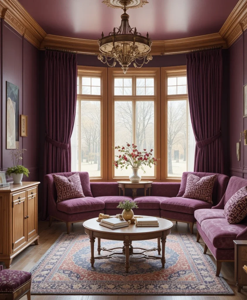
Plum is an underrated powerhouse in interior styling, offering a regal depth that feels exceptionally cozy in autumn. When placed alongside honeyed oak or maple furniture, the purple undertones in the plum pop against the golden warmth of the wood. I love using this pairing in reading nooks to create an intimate cocoon.
14. Paprika Red and Flaxen Neutral
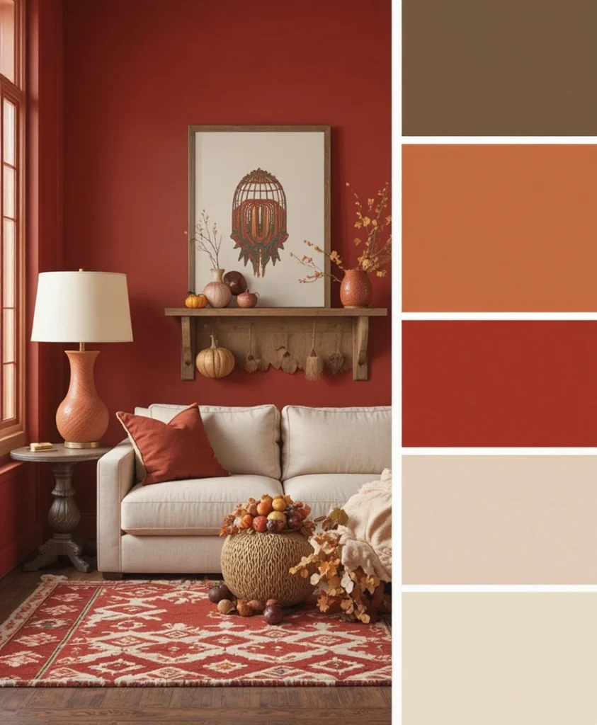
Paprika red delivers a fiery jolt of energy without screaming for attention, especially when tempered by neutral flaxen tones. I treat paprika as an accent color for patterned rugs or ceramic table lamps, letting the neutral flaxen upholstery keep the room grounded. It is a vibrant nod to changing leaves and harvest festivals.
15. Dark Chocolate and Warm Wheat
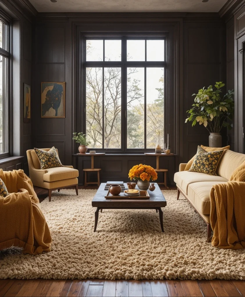
Monochromatic layering reaches its peak sophistication when you combine deep dark chocolate with buttery warm wheat tones. I design spaces using this palette by mixing high-pile wool rugs in wheat shades with heavy dark chocolate wood furniture. The textural interplay does all the heavy lifting, creating a feast for the tactile senses.
16. Copper Patina and Slate Blue
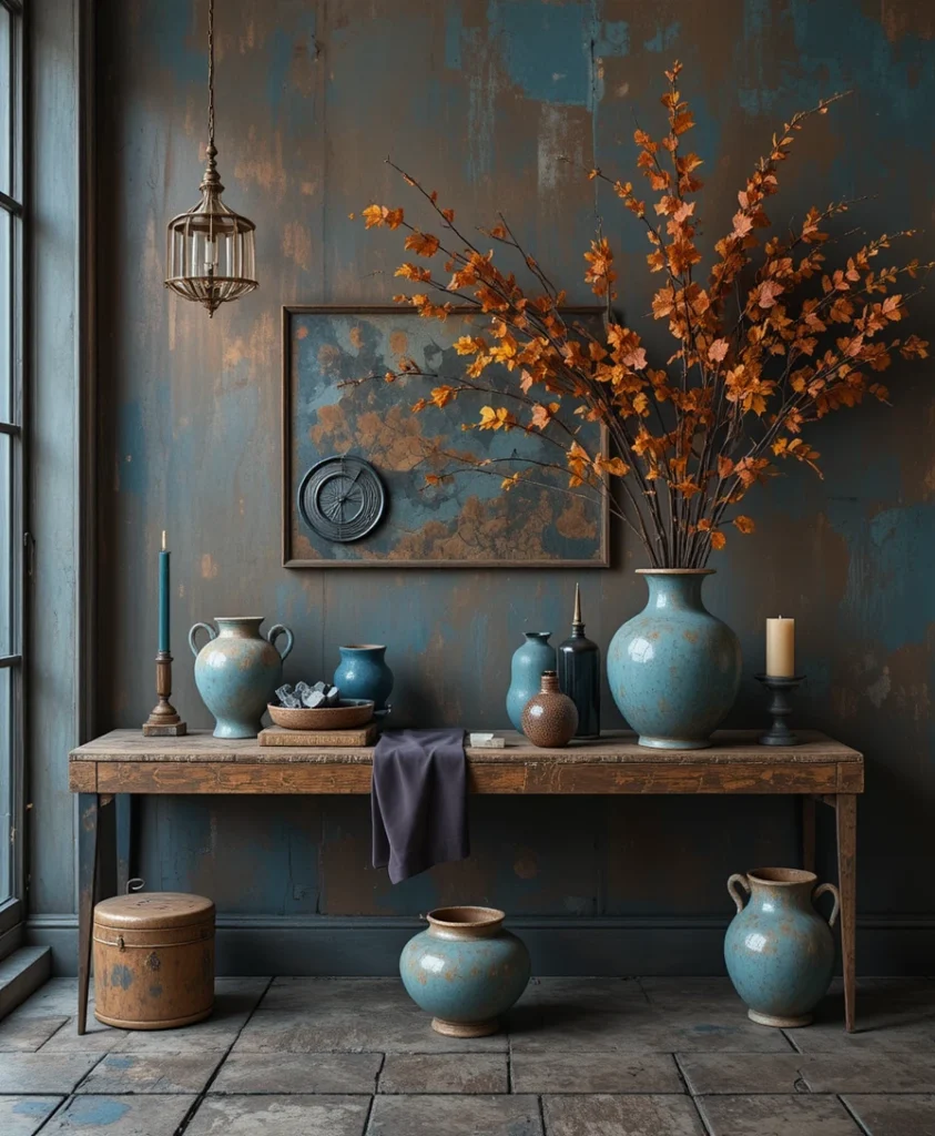
For an unexpected twist on traditional autumn hues, weathered copper patina paired with slate blue offers a gorgeous historic charm. I use this palette to evoke the look of aged architectural elements, incorporating verdigris ceramics alongside cool blue textiles. It introduces a collected, worldly aesthetic to any room.
17. Saffron and Charcoal Gray
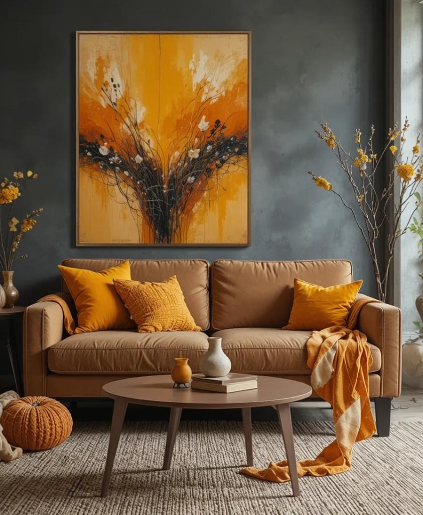
Saffron brings a vibrant, spice-market intensity that cuts straight through the gloom of shortening autumn days. When balanced against a charcoal gray backdrop, the yellow-orange hue glows with an internal radiance. I often introduce saffron through velvet throw pillows or abstract canvas art to lift the energy of a moody den.
18. Hazelnut and Soft Peach
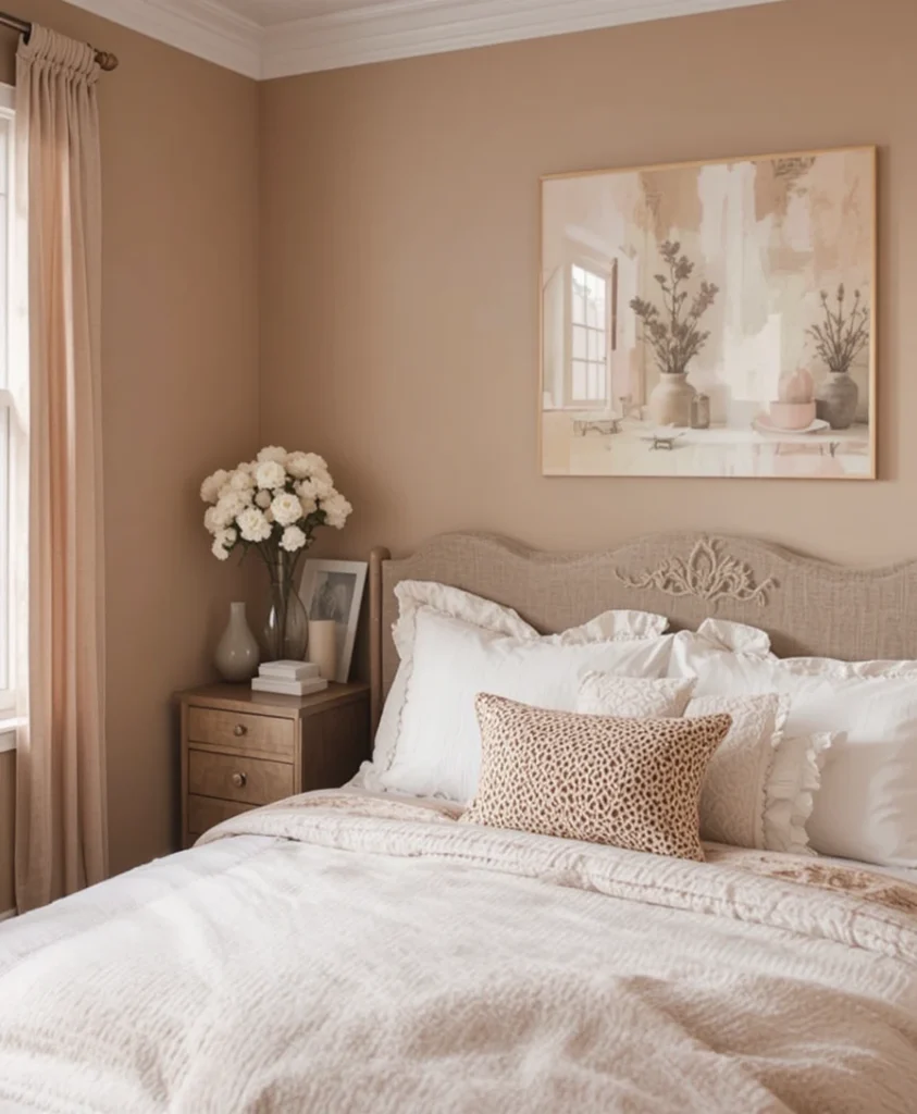
If dark, heavy palettes are not your preference, hazelnut paired with a dusty, muted peach offers a gentle seasonal transition. This combination feels warm, welcoming, and slightly nostalgic. I find it works wonders in guest bedrooms, creating an immediate sense of hospitality and calm.
19. Moss Green and Warm Caramel
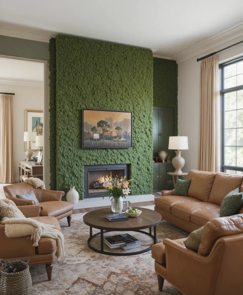
Moss green brings the wild, unbridled texture of the forest floor indoors, while warm caramel softens its rugged edge. I frequently apply this pairing in open-plan living areas, using moss on accent walls and caramel leather on seating. It creates a seamless visual flow that honors natural outdoor transformations.
20. Burgundy and Warm Alabaster
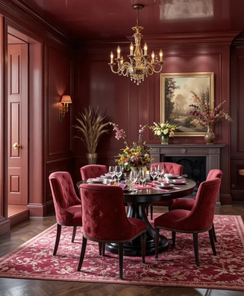
Burgundy is the ultimate power player for autumn luxury, but it requires a clean backdrop to truly shine. By pairing deep burgundy accents with crisp, warm alabaster walls, you let the rich wine tones command the room without darkening the space. I use this in formal dining spaces to create an intimate, restaurant-quality ambiance.
Optical Tricks and Pro Styling Hacks
To make your fall color selections work harder for your space, you need to understand how light and scale manipulate pigment.
The 60-30-10 Rule: Dedicate 60% of the room to a neutral base (like oatmeal or warm taupe), 30% to a foundational autumn tone (like olive or chestnut), and 10% to a high-impact accent (like burnt ochre or saffron).
Finish Layering: Matte paints absorb light and make rich colors feel velvety and deep, whereas satin or semi-gloss metal finishes bounce light around to keep dark rooms from feeling cavernous.
Textural Contrast: A flat orange wall looks amateur, but a textured plaster wall in the exact same hue looks high-end because of how shadows catch the surface micro-relief.
Scientific and Psychological Insights on Autumnal Tones
Color psychology proves that our environment directly dictates our nervous system’s response. According to environmental psychology research, warm-wavelength colors (ranging from 580 to 700 nanometers)—which encompass our entire fall colour palette—stimulate feelings of physical warmth, security, and social connection. Furthermore, evolutionary biology suggests that seeing earthy tones like terracotta, rust, and forest green subconsciously signals safety and resource abundance before winter sets in, lowering cortisol levels and encouraging relaxation within the home.
Frequently Asked Questions
How do I incorporate a fall color palette without painting my walls?
Focus on textiles and accessories. Swap lightweight linen cushion covers for heavy wool or velvet in rust and olive, layer a textured wool rug over your existing flooring, and introduce seasonal ceramics or amber glassware on open shelving.
Can I mix warm autumn tones with cool modern decor?
Absolutely. The key is balance. If your home features cool gray floors or minimalist steel fixtures, introduce warm autumn colors through tactile elements like leather, wood, and heavy woven blankets to bridge the visual gap.
What is the best lighting temperature for warm color palettes?
Stick strictly to LED bulbs between 2400K and 2700K. Cooler bulbs (3000K and above) will drain the rich, golden pigments out of your fall color scheme, making reds look muddy and yellows look harsh.
Final Thoughts
Designing with a seasonal palette is never about chasing fleeting trends or filling your home with temporary plastic trinkets. It is about tuning your living space to the natural cadence of the world outside your window, creating an environment that wraps you in comfort as the days grow short. Take your time experimenting with these tones, trust your instincts, and let your home become a true sanctuary of warmth and reflection.