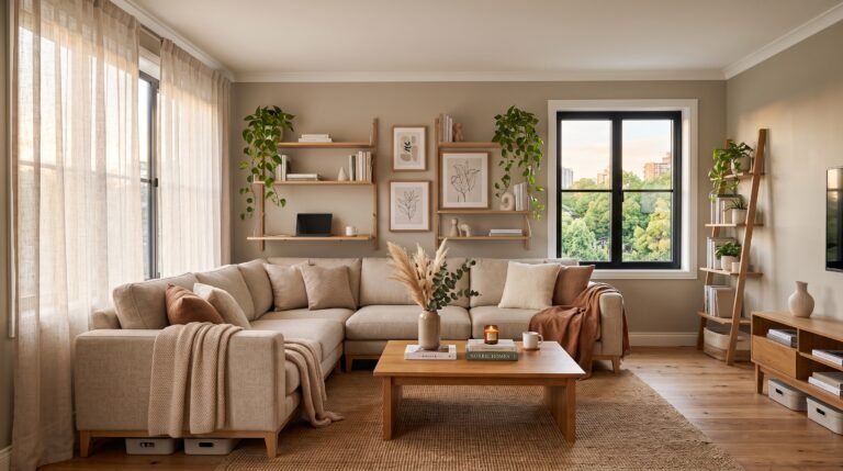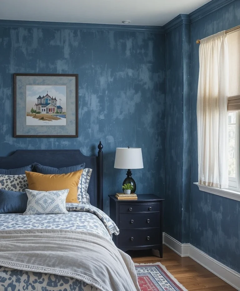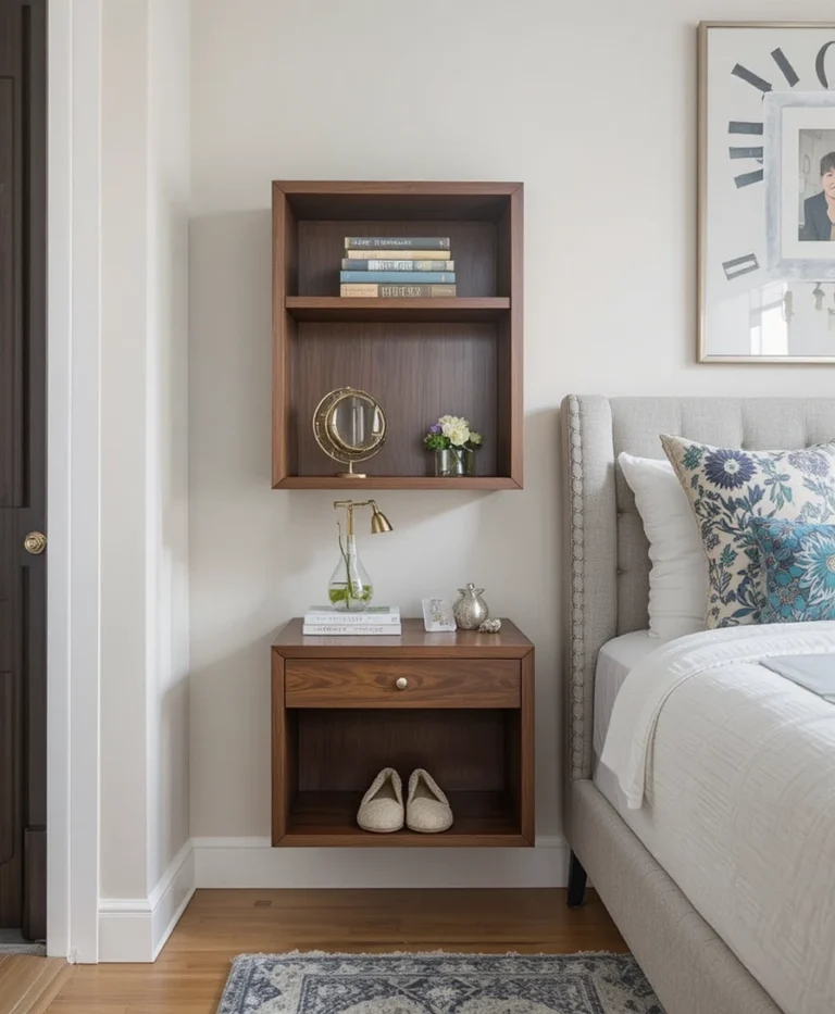

Boho bedroom decor gets flattened online into a checklist: add a macramé wall hanging, add a plant, add some fairy lights, done. The problem is that following the checklist literally often produces a room that looks like a showroom display rather than somewhere a specific person actually lives, because real boho spaces are built from things that were chosen over time, not bought in one weekend from the same three stores. This list goes into the reasoning behind each idea, where people commonly overdo it, and how to make the eclectic look feel curated instead of cluttered.
Whether you’re starting from a completely blank rental room or slowly evolving a space you already have, the ideas below are built around one core boho principle: layered, personal, and a little imperfect on purpose.
1. Layered Textiles Work Best With a Limited Color Story
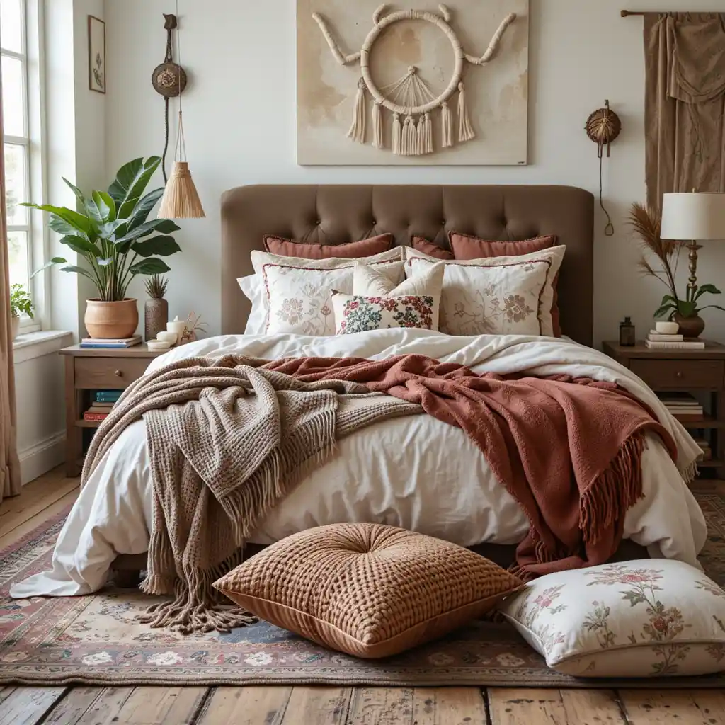
Stacking rugs, blankets, and pillows in different textures is the fastest way into the boho look, but it falls apart fast if every piece is a different color with no relationship to the others. Pick two or three colors from your earthy palette and let every textile pull from that same small set, even if the patterns themselves vary a lot. A chunky cream throw, a rust-toned woven blanket, and a mustard pillow read as intentional together in a way that five random colorful pieces never quite do.
2. Macrame Should Be Sized to the Wall, Not Just Centered on It
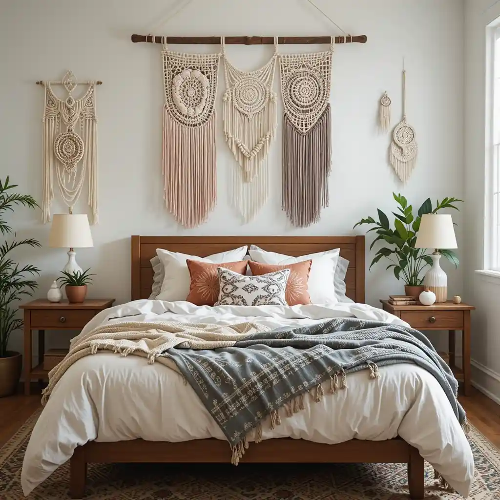
A small macrame piece on a large blank wall tends to look lost rather than intentional, which is the most common mistake people make with this one. Either commit to a large statement piece that fills real visual space above the headboard, or group a couple of smaller pieces together with intentional spacing, rather than hanging one modest piece dead center on an oversized wall. Handmade or vintage macramé from a secondhand shop also tends to have more character than a mass-produced version, since slight irregularities in the knotting are part of what makes it look handcrafted.
3. Earthy Tones Need One Neutral Base to Avoid Looking Busy
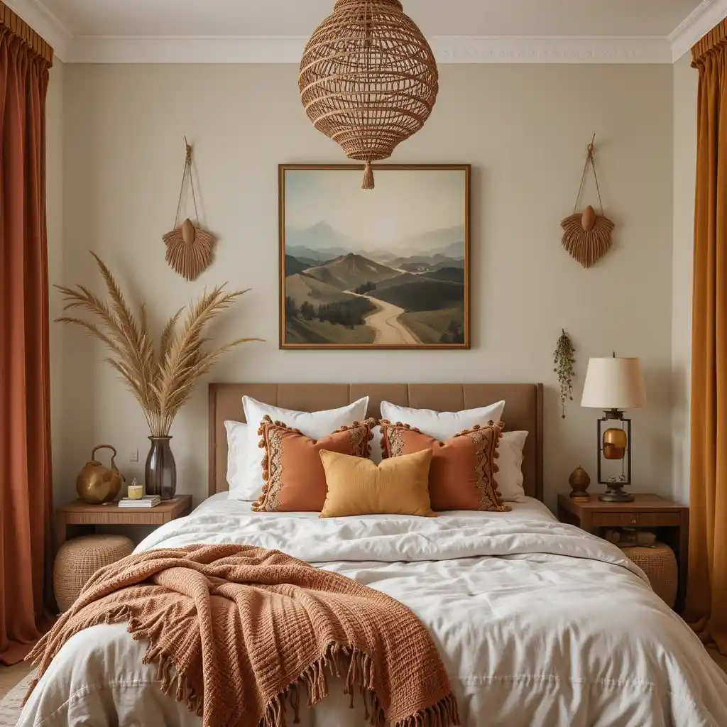
Terracotta, olive, rust, and mustard are the classic boho palette, but using all four at full intensity in a small room can start to feel chaotic rather than calm. The trick is picking one of them as a true accent color and keeping the walls, bedding, or largest furniture piece in a warm neutral like sand or cream, so the bold tones have room to breathe instead of competing with each other. This is especially worth remembering in a smaller bedroom, where too many saturated colors at once can make the room feel smaller than it is.
4. Rattan Furniture Reads as Boho Only in the Right Proportions
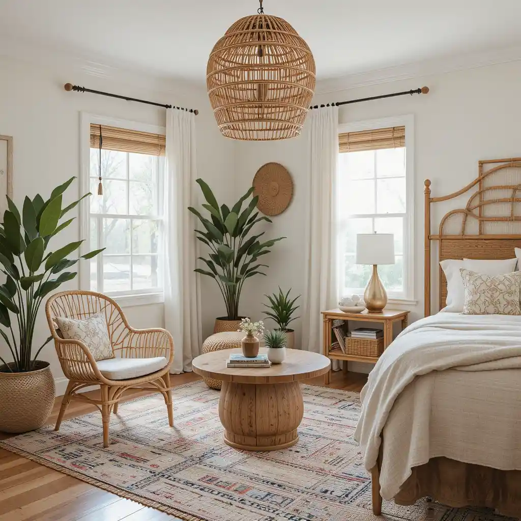
A rattan headboard or chair brings genuine texture and warmth, but a room with too many rattan pieces at once starts to look more like a patio furniture showroom than a bedroom. One or two rattan pieces, a headboard or an accent chair, not both plus a mirror frame plus a lamp, usually gives the look without tipping into overload. Rattan also shows wear differently than solid wood, so it’s worth checking joints and weave condition carefully if you’re buying secondhand, since a damaged rattan piece is harder to repair than a scratched wood one.
5. Plant Variety Matters More Than Plant Quantity
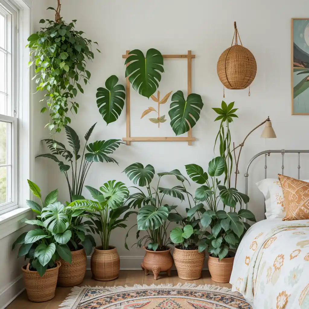
A single large monstera makes more visual impact than five small plants scattered around the room, and it’s also easier to keep alive since you’re only managing one set of light and water needs instead of several. If you do want multiple plants, vary the pot material, a woven basket planter next to a plain clay pot, rather than buying a matching set, since the mismatch is part of what makes it look collected rather than purchased as a kit. Low-light varieties like pothos or snake plants are the more realistic choice for a bedroom that doesn’t get strong direct sun for most of the day.
6. Vintage Mirrors Add Depth When the Frames Actually Differ
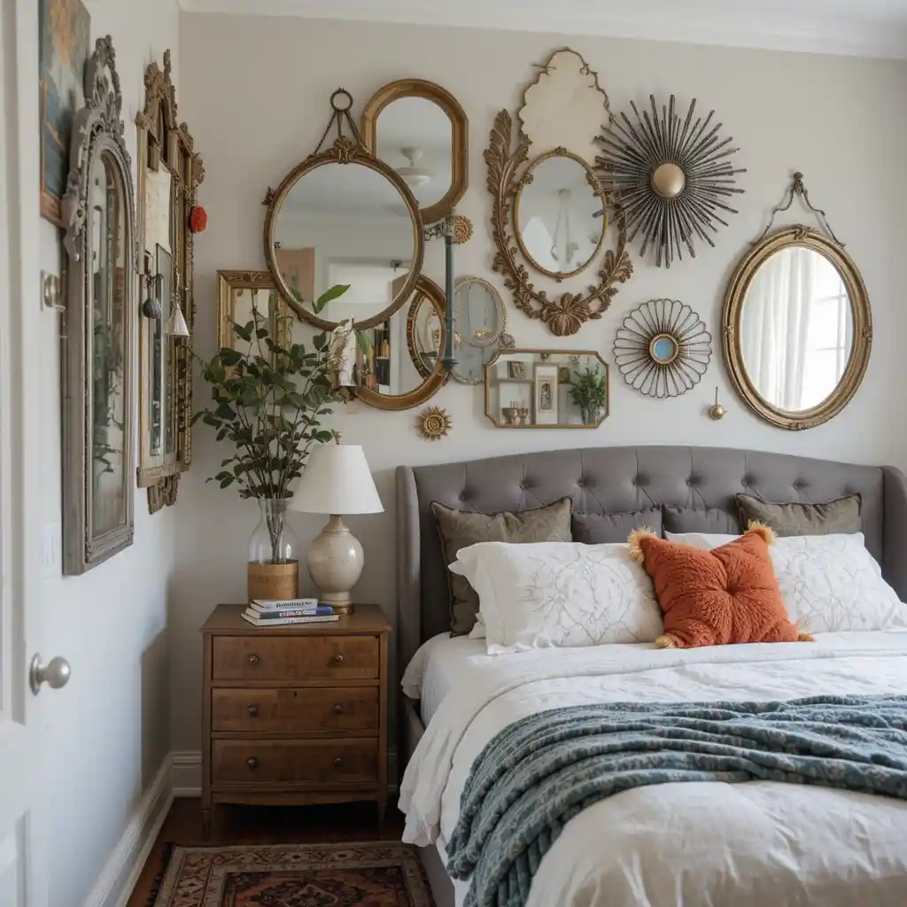
A single ornate mirror does more for a boho room than several similar ones, mainly because the point of mixing vintage pieces is contrast: a sunburst mirror next to a plain oval one tells more of a story than two mirrors that are nearly identical. Beyond the style benefit, an angled mirror genuinely bounces light around a room that might not get much direct sun, which matters practically in a lot of older apartments. Secondhand shops and estate sales tend to have far more character in this category than anything bought new, and the imperfect, slightly tarnished frames often look more at home in a boho space than a pristine new mirror would.
7. Patterned Rugs Should Anchor the Room, Not Just Decorate the Floor
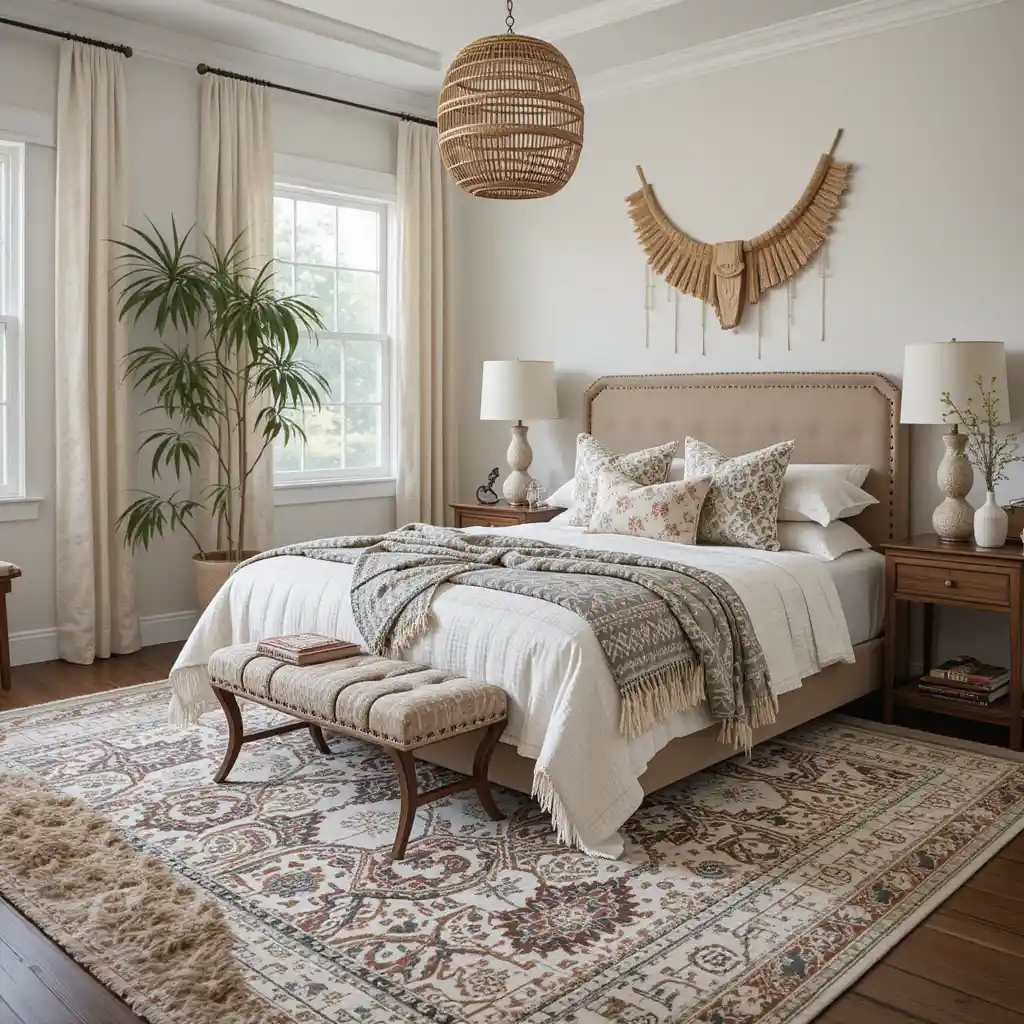
A tribal or ikat-print rug works best as a base layer that the rest of the room’s colors pull from, rather than an isolated decorative choice that doesn’t relate to anything else in the space. Layering a smaller, more colorful rug over a larger neutral one is a genuinely practical trick, since it lets you introduce a bold pattern in a contained area without having to commit to it across the entire floor. Make sure the rug is actually large enough to sit under at least the front legs of the bed, since a too-small rug is one of the most common reasons a room ends up looking unfinished rather than intentional.
8. Mixing Pillow Materials Matters More Than Mixing Patterns
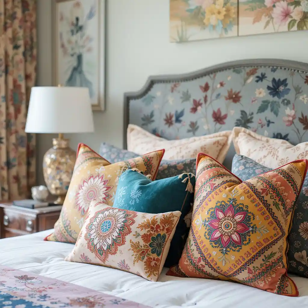
It’s tempting to grab every colorful patterned pillow available, but a bed with five different prints and no repeated material starts to look chaotic rather than eclectic. Mixing textures, velvet next to embroidered cotton next to a woven pillow, while keeping the color palette a bit tighter creates the same layered effect with more visual cohesion. An odd number of pillows, three or five rather than an even count, also tends to look more natural and less like a matched set from a store display.
9. Floating Shelves Work Best With Uneven Groupings
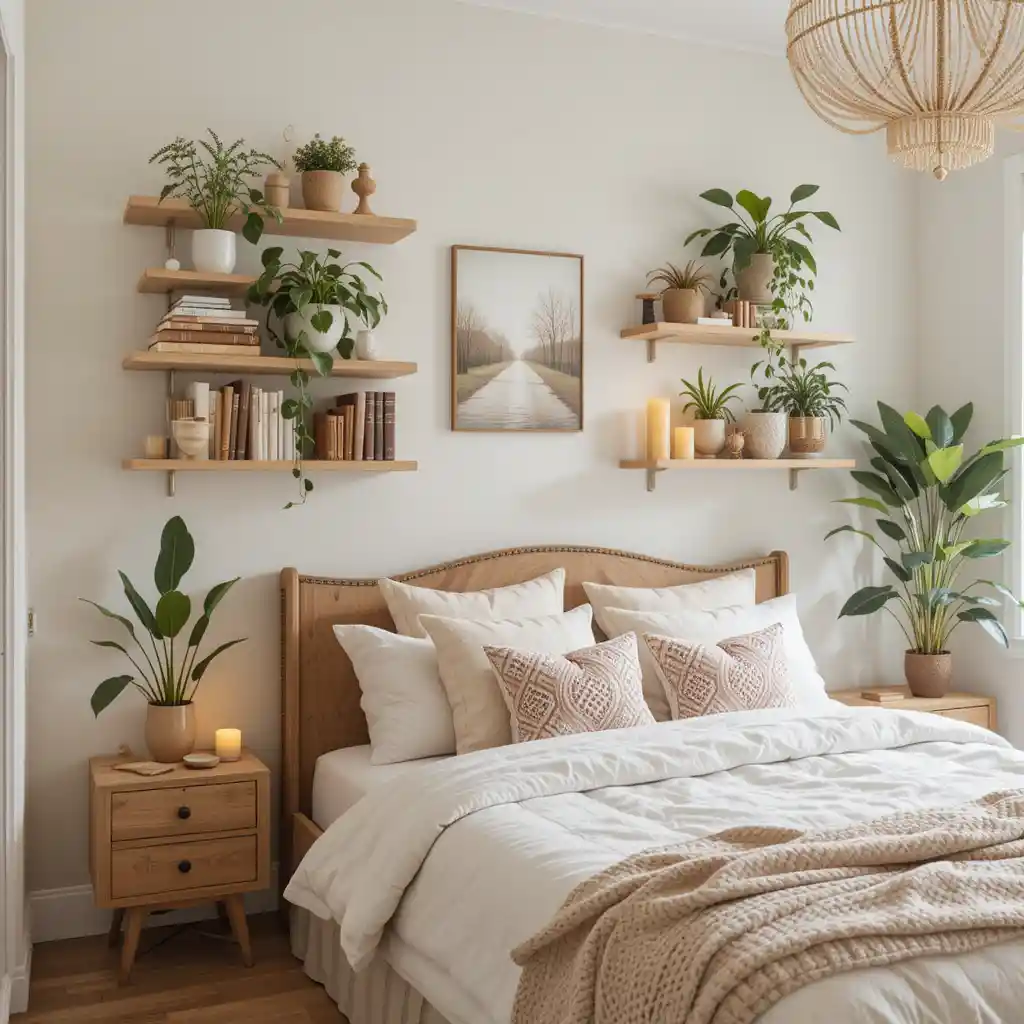
A shelf lined up with evenly spaced identical objects reads as staged, while a shelf with items of varying height, grouped in twos and threes with some negative space between groupings, looks more like it was collected over time. Mix categories, a couple of books stacked flat with a small plant on top, a candle, a single interesting object, rather than lining up the same type of item across the whole shelf. Light wood or blackened metal brackets both work in a boho room, but matching the shelf material to something else already in the room (a nightstand, a headboard) tends to look more coordinated than picking a completely unrelated finish.
10. Dreamcatchers Above Bed
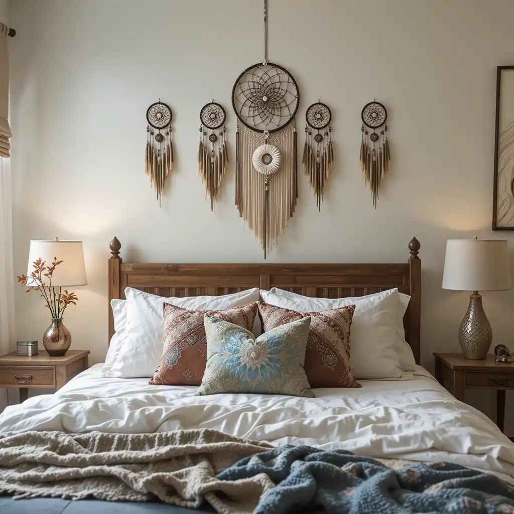
Dreamcatcher above the bed or in a window reads as a genuine personal or spiritual touch, but using the same motif in multiple spots around the room (dreamcatcher plus dreamcatcher-print pillow plus dreamcatcher wall art) starts to feel more like a themed party than a bedroom. If you want more of this feeling throughout the space, vary the symbol, feathers in one spot, a different woven piece in another, rather than repeating the exact same object. A dreamcatcher with natural, slightly irregular feathers and beading generally looks more authentic in a boho space than a uniform, factory-made version.
11. A Boho Canopy Needs Enough Fabric to Actually Look Airy
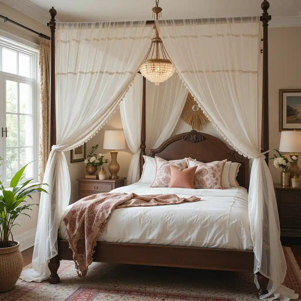
A thin, tightly pulled piece of fabric around a bed frame can end up looking more like a hospital curtain than a boho canopy: the fullness of the fabric matters as much as the fact that it’s there. Gauze or lightweight lace works best gathered generously rather than stretched flat, so it moves slightly and catches light instead of hanging stiff. A simple ceiling-mounted hoop above the headboard, rather than a full four-post frame, is usually the easier and more renter-friendly way to get this look in a standard bedroom.
12. Eclectic Wall Gallery
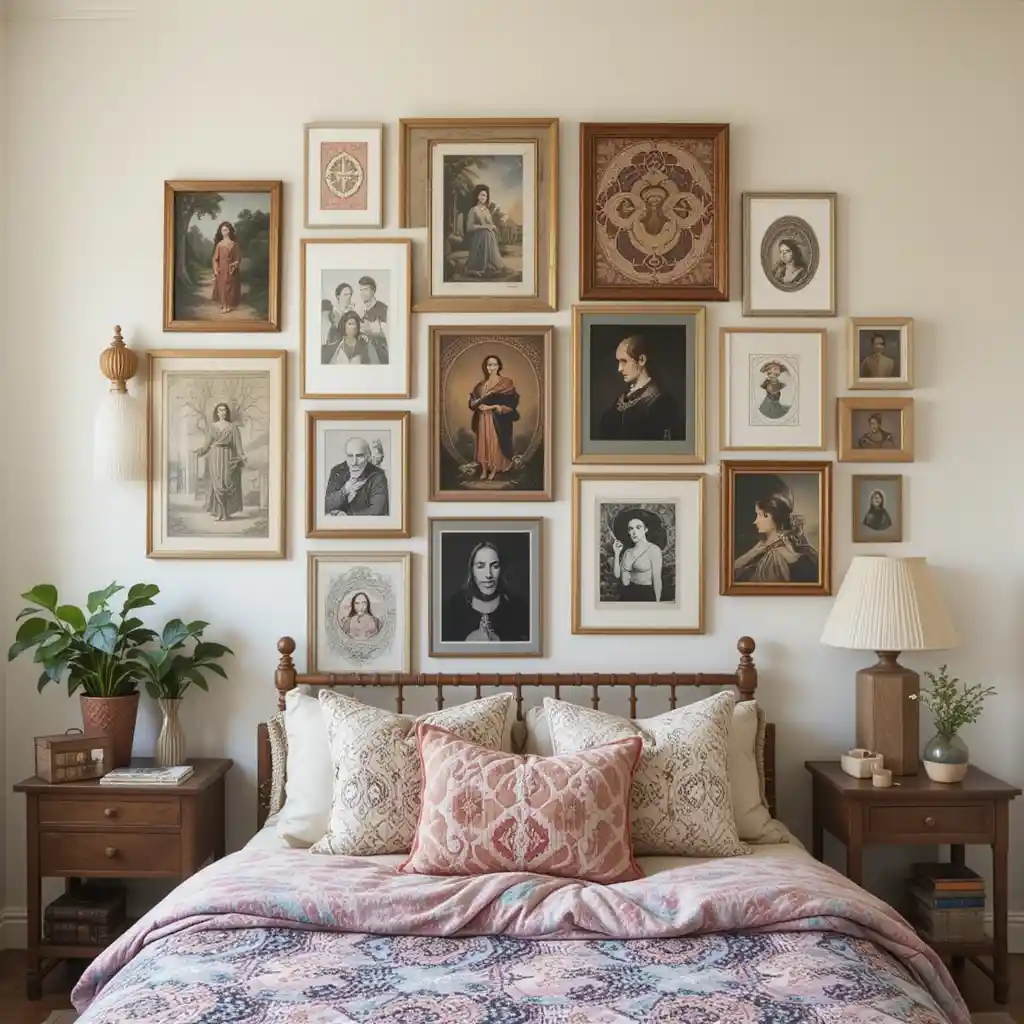
Mixing framed prints, tapestries, and photographs in mismatched frames is the whole point of a boho gallery wall, but it still needs one consistent element to keep it from looking random, since that’s usually a shared color palette across the pieces, even if the frame styles and subject matter vary widely. Planning the rough layout on the floor before hanging anything saves a lot of unnecessary nail holes, especially with an irregular, non-grid arrangement where spacing is harder to judge once pieces are already on the wall. Leaving slightly uneven gaps between pieces, rather than forcing perfectly equal spacing, actually reads as more natural and collected in this particular style.
13. Lamp Shades Change the Light More Than the Bulb Does
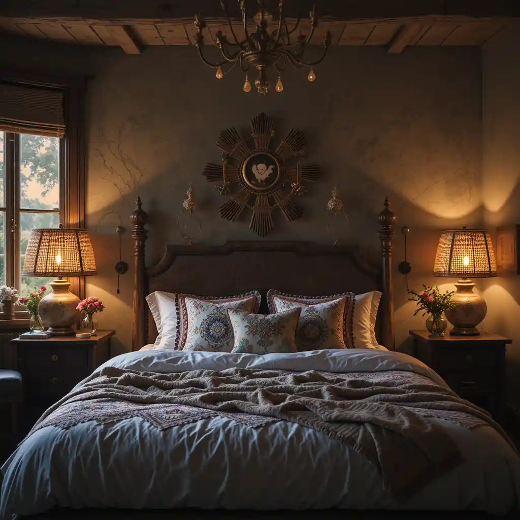
A warm bulb helps, but the shade material has a bigger effect on the overall glow than people expect: a woven rattan or fabric shade diffuses light into a soft, warm pool, while a colored glass shade throws colored light onto nearby walls and surfaces, which can look striking but changes the room’s whole color temperature. Test a lamp in the room at night before committing, since a shade that looks good in a bright store can throw an unexpectedly strong tint once it’s the only light source in a dim room. Table lamps at different heights around the room (a taller floor lamp, a shorter bedside lamp) create more visual interest than lamps that all sit at the same level.
14. Wood Nightstands Should Contrast With the Room’s Busiest Elements

An unfinished or lightly stained wood nightstand works as a visual resting point in a room that’s otherwise full of pattern and color: it’s one of the few places in this list where less detail is actually the goal. If the rest of the room leans heavily patterned, keep the nightstand simple in shape as well as finish, since an ornately carved piece competes with the textiles instead of grounding them. Mismatched nightstands on either side of the bed, as long as they’re a similar height and wood tone, actually fit the boho aesthetic better than a matched pair.
15. Boho Curtain Fabric Should Match the Room’s Actual Light Needs
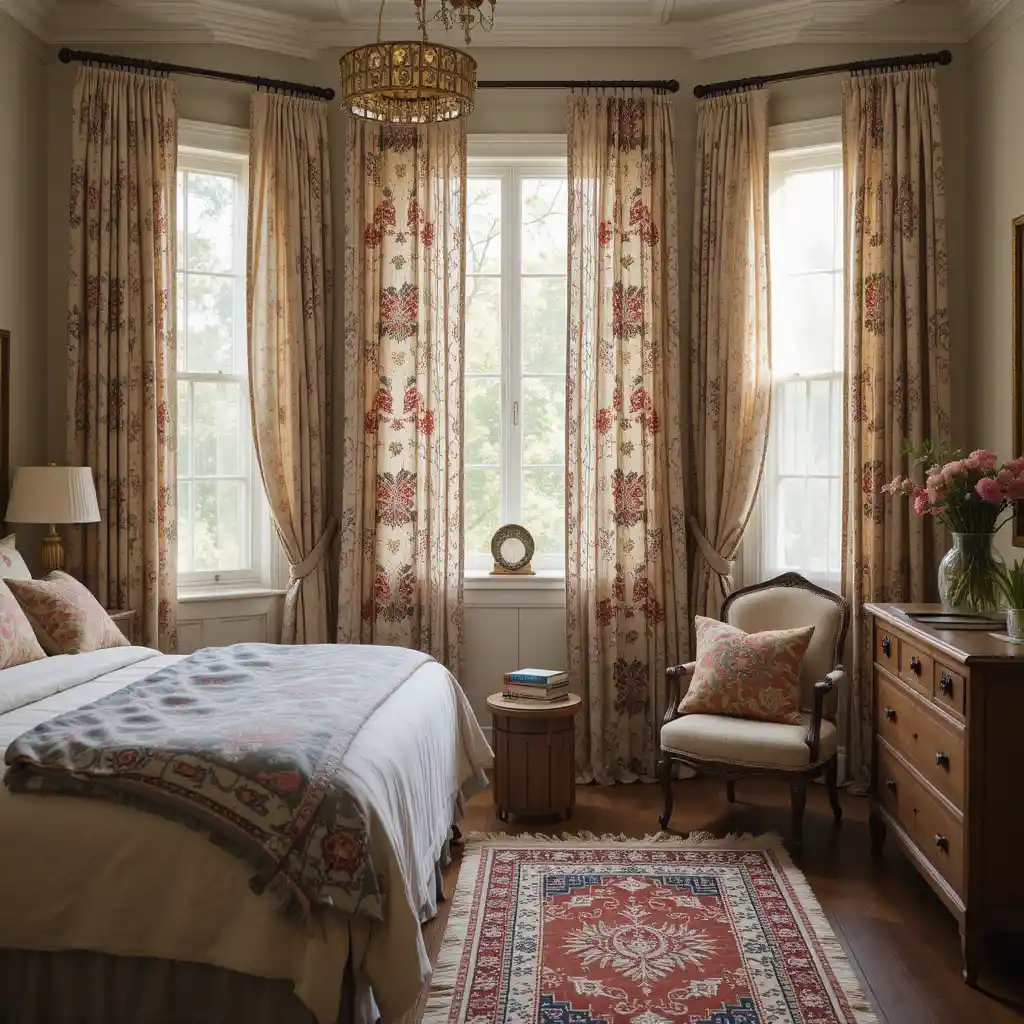
Patterned cotton, sheer linen, and embroidered curtains all read as boho, but they let very different amounts of light through, so the choice should depend on how much privacy and darkness the room actually needs rather than pattern alone. A room that needs real darkness for sleep is a poor match for sheer linen alone, even if it’s the most visually appealing option, and might need a plainer blackout layer underneath a decorative sheer panel instead. Hanging curtains from a rod mounted higher and wider than the window frame makes the window, and the room, look larger, which matters more in a smaller bedroom than the curtain pattern itself does.
16. Travel Trinkets Should Tell a Story You Can Actually Tell
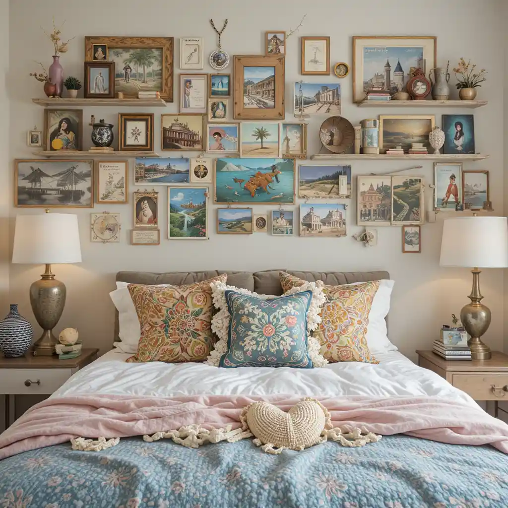
A shelf of souvenirs only reads as meaningful if there’s a real story behind the pieces: objects bought purely to look “travel-inspired” without any actual connection to a place you’ve been tend to blend into generic decor rather than feeling personal. Grouping a few real pieces together, with a little space around them rather than crowding a shelf, gives each one room to actually be noticed instead of disappearing into a cluttered display. If you don’t have travel pieces of your own yet, secondhand and vintage shops often have more genuinely interesting small objects than a home decor store’s “global-inspired” section.
17. Floor Seating Needs a Cushioned Rug Underneath to Actually Get Used
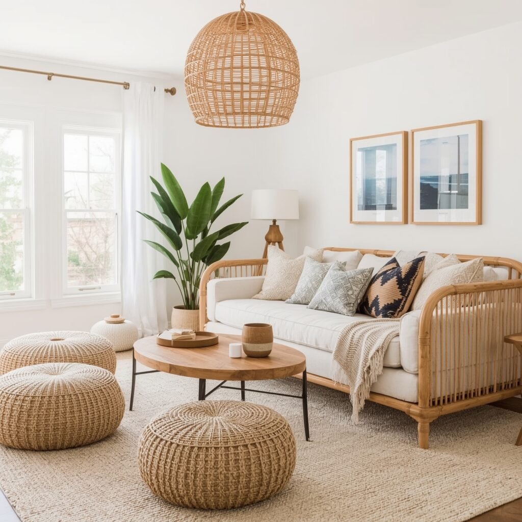
A floor pouf or cushion set directly on a hard floor rarely gets used for long, no matter how good it looks in photos, because sitting on the floor is only comfortable for a limited time without some cushioning underneath. Placing floor seating on top of a rug, ideally a slightly plush one rather than a flat-woven kilim, makes a real difference in whether people actually sit there or just look at it. A low side table nearby, even a small one, turns a floor seating area into a usable spot for tea or a book rather than just a decorative corner.
18. Woven Storage Baskets Should Be Sized for What’s Actually Going in Them
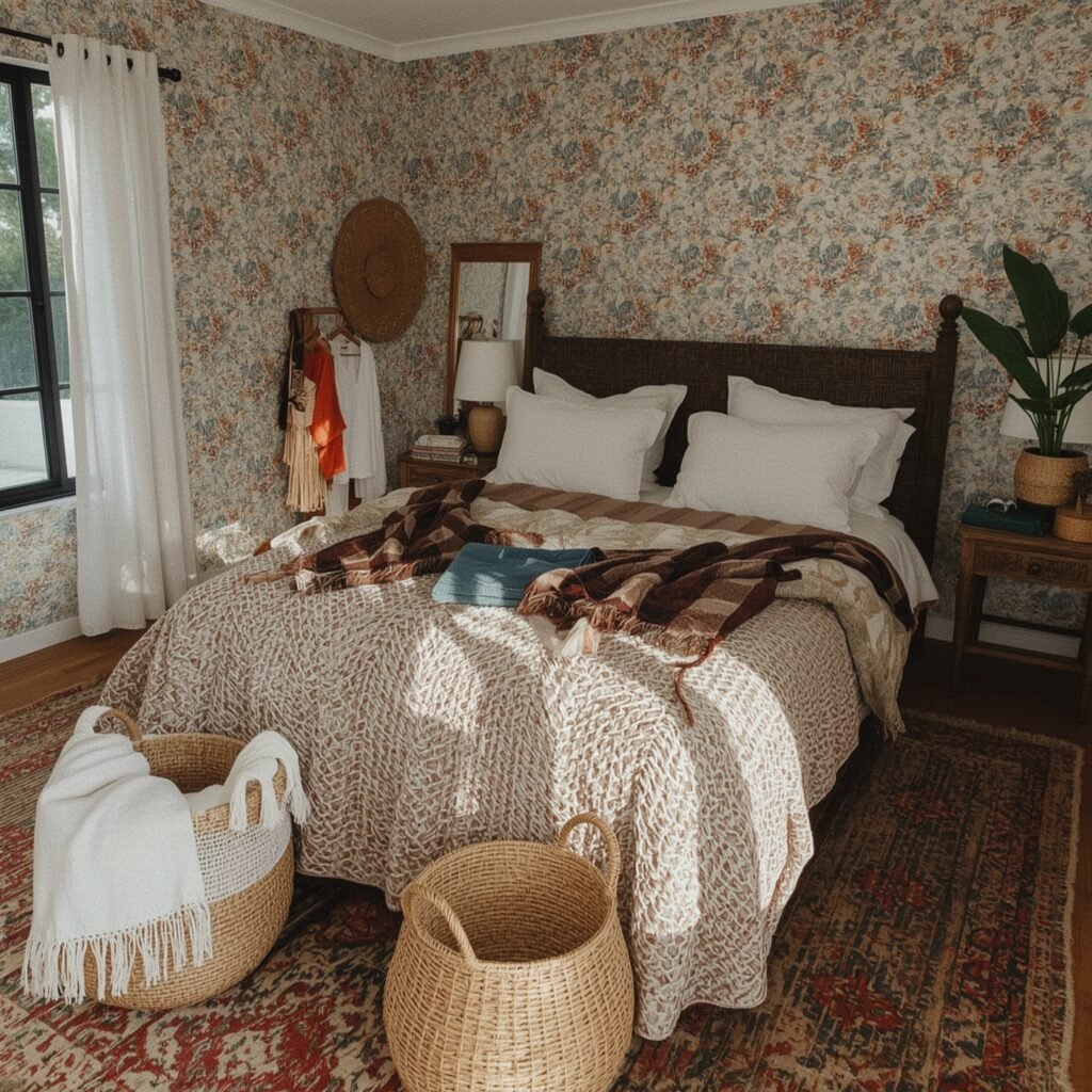
A basket that’s too small becomes overflow clutter instead of storage, so it’s worth measuring what you actually plan to store, since extra blankets need a much larger basket than folded clothes or accessories do. Grouping two or three different-sized baskets together, rather than buying a single matching set, tends to look more collected and also gives you flexibility for different types of items. Jute and seagrass hold their shape better over time than very loosely woven wicker, which matters if the basket is getting used daily rather than just sitting decoratively.
19. Fairy Lights Look Intentional When They Follow a Shape, Not Just Draped
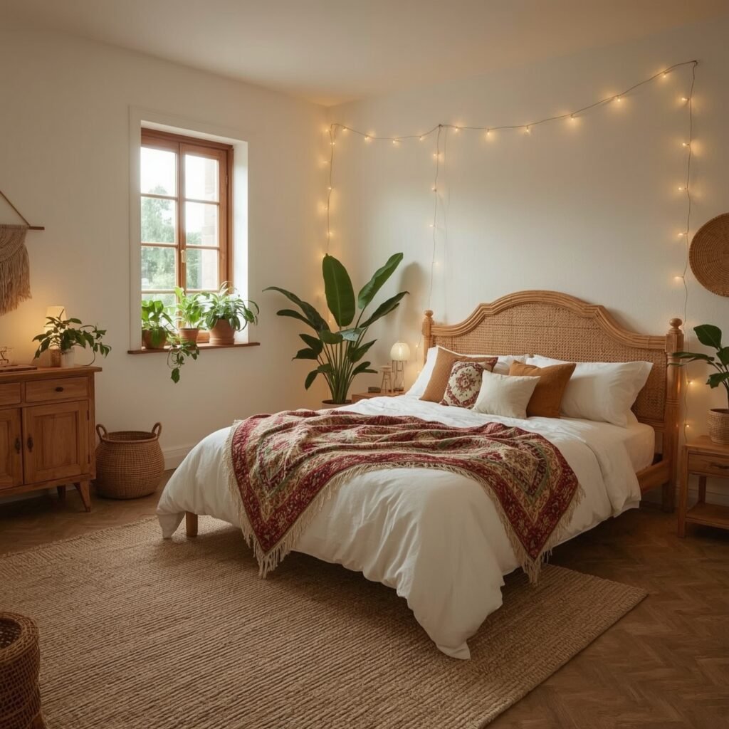
Fairy lights strung loosely with no real pattern can look more like leftover holiday decorations than a design choice. Following an actual line, along a headboard, framing a window, wrapped neatly around a piece of furniture, makes the same lights look considered rather than accidental. Warm white lights in the 2700K range read as cozy and boho-appropriate, while cooler white tones can feel closer to string lights left over from a dorm room than an intentional design element.
20. Mixed Metals Work Best With One Dominant Finish
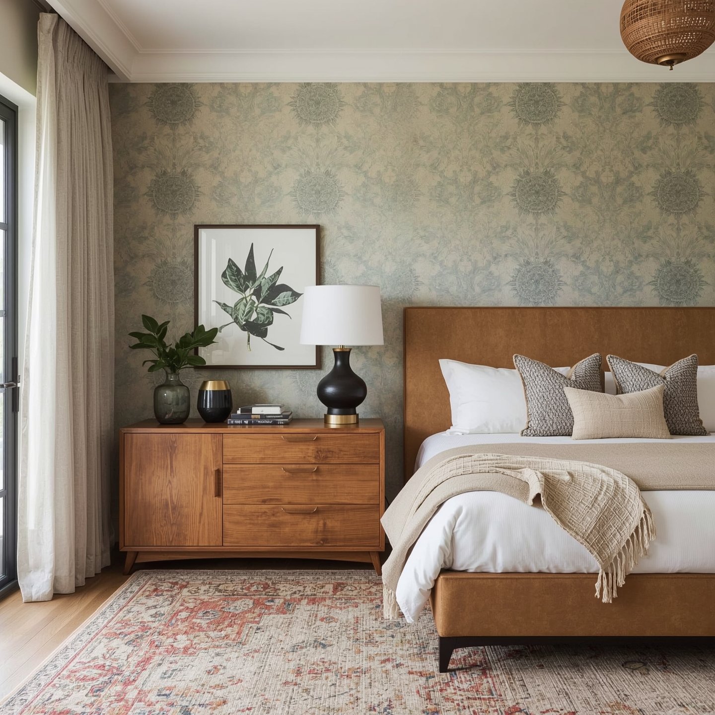
Combining brass, copper, and matte black across lamps, drawer pulls, and vases adds depth, but it looks more intentional when one metal clearly dominates and the others appear in smaller amounts, rather than all three showing up in roughly equal quantities. Brass as the primary finish with small copper or black accents, for example, reads as a coordinated choice rather than a random mix of whatever hardware happened to be on sale. Sticking to metals with a similar level of shine (all slightly brushed or all slightly polished) also helps them look chosen together instead of just coincidentally similar in color.
Frequently Asked Questions
How do I make a boho bedroom look curated instead of cluttered?
Limit your color palette to two or three tones and repeat them across textiles, and group decorative objects in uneven numbers with breathing room between them rather than lining everything up evenly. Clutter usually comes from too many colors or too much even spacing, not from having a lot of objects.
What colors are traditionally used in boho bedroom decor?
Warm, earthy tones, terracotta, rust, olive green, and mustard, paired with a neutral base like sand, cream, or warm white. Using one of the bold tones as a true accent, rather than several at full intensity, tends to look more balanced in a smaller room.
Can I get a boho look in a rental where I can’t paint or drill?
Yes. Textiles, plants, floor seating, and ceiling-hook canopies do most of the visual work in this style without requiring any permanent changes. Rugs, curtains, and bedding are usually enough to establish the earthy color palette even if the walls stay their original color.
Is boho decor expensive to put together?
Not necessarily. A lot of the character in boho spaces comes from secondhand and vintage pieces (mirrors, baskets, small trinkets), which tend to look more authentic and cost less than buying everything new from a single retailer.
Final thoughts
The boho rooms that look genuinely put-together, rather than assembled from a single shopping trip, are usually built slowly: a vintage mirror here, a rug that gets swapped for a better one later, a few travel pieces added over time. If you’re starting from scratch, prioritize the base layer first: a rug, curtains, and bedding in your chosen palette, then add texture and personal objects gradually rather than buying every item on this list at once. The imperfection and the sense that things were chosen rather than purchased as a set is the actual core of the style, more than any single item on this list.