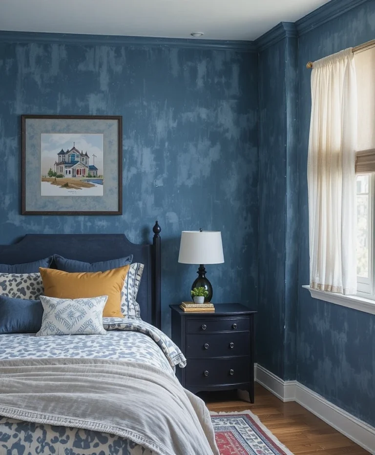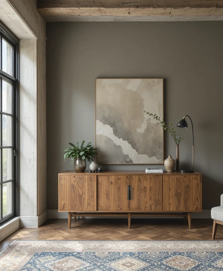

Have you ever picked a paint color from a store swatch, painted an entire wall, and wondered why it looked completely different from what you imagined? You are definitely not alone. Paint is a dynamic, light-reactive material—it responds continuously to architectural orientation, surrounding foliage, artificial light fixtures, and natural sunshine.
When a paint color fails in a room, it is rarely the fault of the paint quality itself. Instead, it is almost always a mismatch between two fundamental principles of color science: Light Reflectance Value (LRV) and undertones.
Once you master these two core concepts, you eliminate guesswork, save hundreds of dollars in wasted paint cans, and gain the ability to choose flawless paint colors for your home every single time.
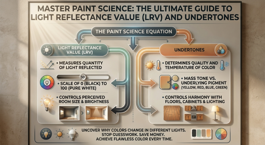
Quick Answer: Key Takeaways for LRV and Paintundertones
LRV Defined: Light Reflectance Value measures the percentage of light a paint reflects on a scale from 0 (pure black) to 100 (pure white).
The Magic Living Room Sweet Spot: Colors with an LRV between 60 and 70 provide the perfect balance—reflecting enough light to feel open and airy while maintaining enough depth to avoid looking sterile.
Mass Tone vs. Undertone: Mass tone is the main color you see immediately; undertone is the hidden base pigment (yellow, pink, green, blue, or gray) that emerges under specific lighting conditions.
Lighting Distorts Pigment: Cool light (north-facing windows, 4000K+ bulbs) brings out cool blue/violet undertones, while warm light (south-facing windows, 2700K bulbs) amplifies yellow/red undertones.
Isolation Testing Is Mandatory: Never paint samples directly onto existing colored walls. Always test using movable poster boards with a white border to prevent background color bleed.
The Physics of Paint: What Light Reflectance Value (LRV) Actually Means
To understand how paint behaves on a wall, you must first understand how light interacts with surface pigments. When sunlight or artificial light hits a painted drywall surface, two things happen simultaneously: part of the light energy is absorbed by the paint’s chemical colorants, and part of the light energy is reflected back into the room.
Light Reflectance Value (LRV) is the official standardized numerical scale used by major paint manufacturers—including Sherwin-Williams, Benjamin Moore, and Farrow & Ball—to quantify this exact optical relationship.
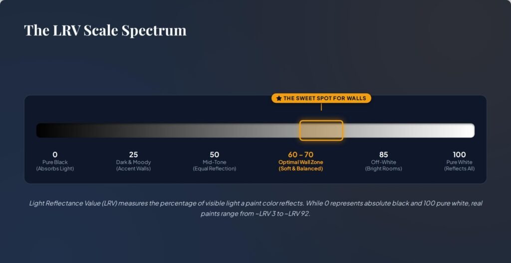
The 0 to 100 Numerical Scale Explained
LRV 0 (Absolute Black): An LRV of 0 represents a surface that absorbs 100% of incoming light energy, reflecting nothing back into the space. While true absolute black only exists in theoretical physics (such as Vantablack), dark paint shades can get as low as LRV 4 or 5.
LRV 100 (Pure Titanium White): An LRV of 100 represents a pure white surface that reflects 100% of all light energy back into the room. In practice, architectural paints top out around LRV 88 to 92 because raw paint binders and chalking pigments naturally absorb a tiny fraction of light.
Luminance vs. Reflectance: Why Color Swatches Deceive You
It is a common mistake to confuse color brightness with reflectance. Two paints can appear to have similar visual brightness under intense store lighting, yet possess completely different LRVs.
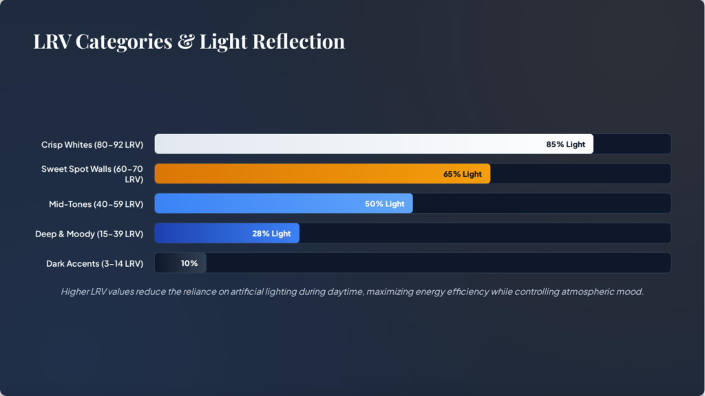
Luminance refers to how bright a color looks to the human eye in a given moment, whereas LRV measures how much light the color actually bounces around a room. A high-LRV color acts like an acoustic echo chamber for light waves: it bounces ambient light off the main walls onto the adjacent walls and ceiling, multiplying the total illumination in the room. A low-LRV color acts like an acoustic muffler: it traps light waves, softening shadows and drawing the walls inward.
Deciphering the LRV Spectrum: From Moody Darks to Radiant Whites
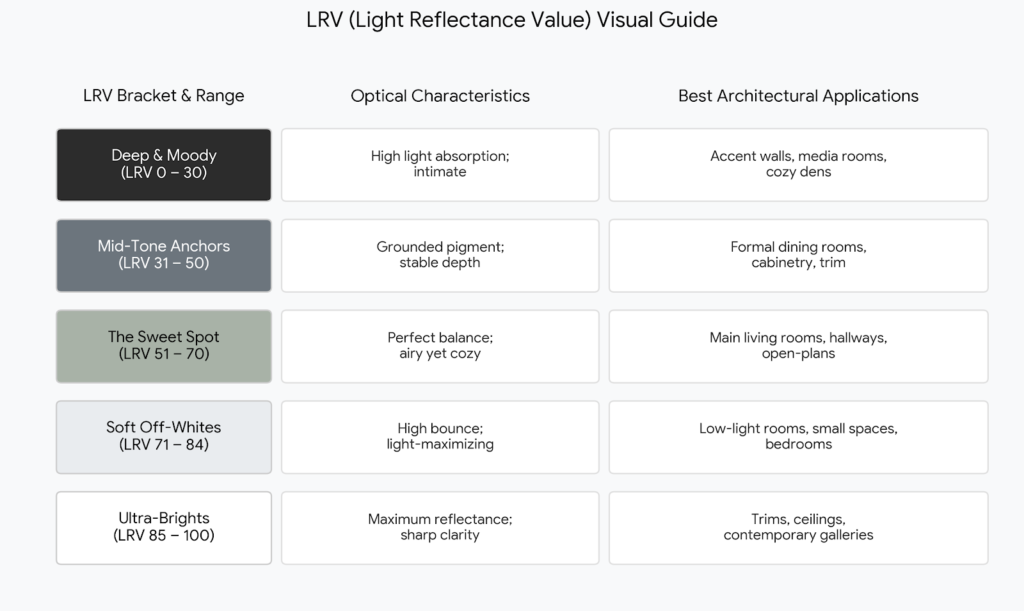
Every paint color falls into a specific LRV bracket. Understanding these categories allows you to predict exactly how a shade will perform before you ever open a paint can.
Deep & Moody Darks (LRV 0–30)
Paints in the 0 to 30 LRV range absorb far more light than they reflect. These colors do not expand a room visually; instead, they create a sense of intimacy, drama, and enclosure.
Design Reality: Using a dark color in a small room with zero natural light won’t magically make it feel brighter. Instead, it leans into the shadows, creating a rich, moody sanctuary.
Popular Examples: Deep charcoal grays, rich navy blues, forest greens, and dark espresso browns.
Mid-Tone Anchors (LRV 31–50)
Mid-tones sit below the optical midpoint of light reflection. They retain heavy pigment density regardless of how much sunshine hits the wall.
Design Reality: These colors rarely wash out under intense direct sunlight. They provide strong visual grounding and are ideal for furniture cabinetry, kitchen islands, and traditional dining spaces.
The Living Room “Sweet Spot” (LRV 51–70)
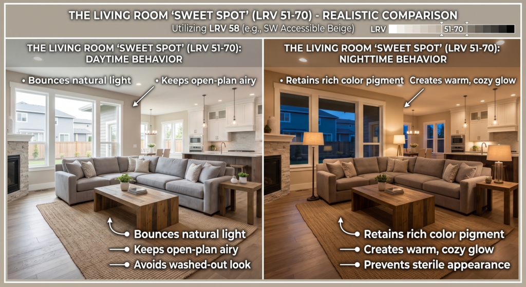
For primary living areas, open-concept spaces, and main family rooms, the 51 to 70 LRV range is universally recognized by color experts as the optimal target.
Design Reality: Colors in this range—such as SW Accessible Beige (LRV 58)—possess enough lightness to keep a room feeling expansive during the day, while carrying sufficient pigment density to prevent the walls from looking cold, flat, or sterile at night.
Soft Off-Whites & Creams (LRV 71–84)
Off-whites reflect between 70% and 80% of all ambient light. Shades like SW Alabaster (LRV 82) or SW Shoji White (LRV 74) fall squarely into this bracket.
Design Reality: These colors are ideal for low-light rooms or spaces with smaller windows where you want to maximize every ray of available sunshine without using stark, blinding white.
Ultra-Bright Whites (LRV 85+)
Ultra-bright whites reflect nearly all incoming light.
Design Reality: While exceptional for architectural trim, doors, and ceilings, coating all four walls of a residential living room in an LRV 85+ paint can cause eye fatigue under direct sunlight and look gloomy gray in dim shadows.
The Hidden Science of Paint Undertones: Warm, Cool, and Neutral Bases
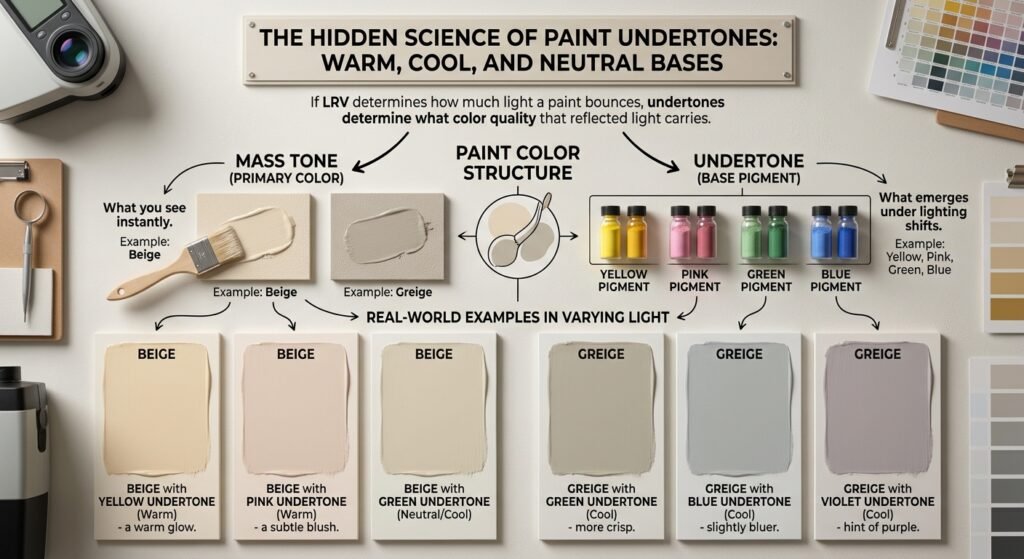
If LRV determines how much light a paint bounces, undertones determine what color quality that reflected light carries.
Every paint color is manufactured by combining a base liquid with precise formulas of synthetic and natural colorants (such as raw umber, yellow oxide, thalo green, or magenta). The dominant color you identify immediately is called the mass tone (or top tone). The secondary color pigment hidden beneath the surface is the undertone.
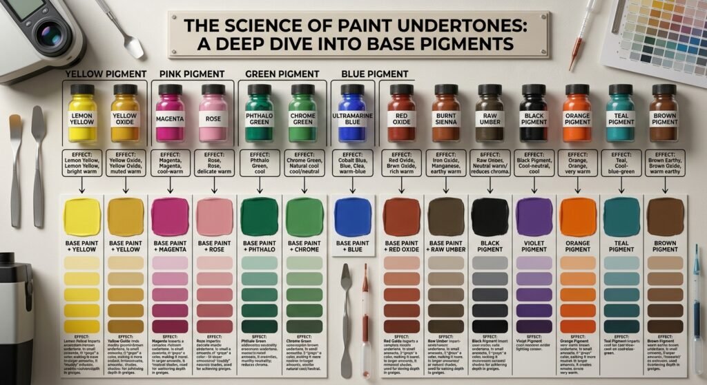
Mass Tone vs. Underlying Pigment: Why Colors Shift
Consider two paints that both look like “light gray” on a swatch card.
Paint A is mixed with a drop of cobalt blue pigment.
Paint B is mixed with a drop of yellow oxide and raw umber pigment.
In the paint store under neutral light, both appear to be identical light grays. However, once applied to your living room walls:
Paint A reflects cool blue wavelengths, making the room feel crisp, cool, or even chilly.
Paint B absorbs cool light and reflects a warm, soft greige glow.
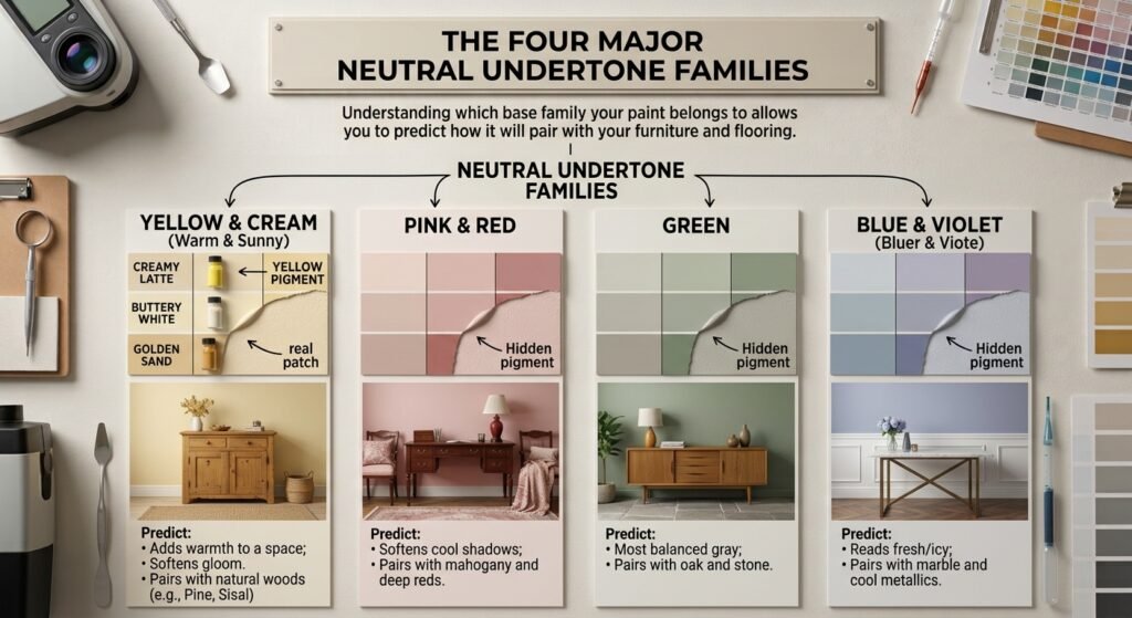
The Four Major Neutral Undertone Families
Understanding which base family your paint belongs to allows you to predict how it will pair with your furniture and flooring.
 NEUTRAL UNDERTONE FAMILIES
                                    │
    ┌──────────────────┬────────────┴─────────────┬──────────────────┐
    ▼                  ▼                          ▼                  ▼
YELLOW & CREAM      PINK & RED                 GREEN             BLUE & VIOLET
(Warm & Sunny)     (Warm & Soft)           (Cool Neutral)        (Cool & Crisp)
• Adds warmth      • Softens cool shadows  • Most balanced gray  • Reads fresh/icy
• Softens gloom    • Pairs with mahogany   • Pairs with oak      • Pairs with marble
1. Yellow & Cream Base Undertones (Warm)
Yellow and golden-cream bases infuse warmth and cheerfulness into a room. They simulate the optical effect of warm sunshine.
Best Uses: North-facing rooms, shadowy hallways, and spaces with cool blue natural light.
Watch Out For: In south-facing rooms with intense golden sunlight, heavy yellow bases can shift toward an unwanted neon-butter tone.
2. Pink, Red, & Peach Base Undertones (Warm)
Red and pink undertones create taupes and soft mauve-tinted grays. They provide a gentle, flattering warmth.
Best Uses: Rooms with dark wood furniture, traditional architecture, or spaces that need an inviting, subtle blush quality.
Watch Out For: If paired accidentally with yellow-oak floors, pink undertones can clash significantly, making the wall look purplish-pink.
3. Green Base Undertones (Cool Neutral)
Green is the secret weapon of color consultants. Grays with green undertones are often called “cool greiges.”
Best Uses: Green undertones act as a natural mediator. They complement both warm natural wood floors and cool stone surfaces without shifting overly warm or icy.
Watch Out For: Under low-quality LED light bulbs, green-based grays can occasionally take on an olive or murky cast.
4. Blue & Violet Base Undertones (Cool)
Blue and violet undertones form crisp, classic cool grays and icy whites.
Best Uses: Ultra-modern homes, south-facing rooms with abundant warm sunshine, and bathrooms featuring white marble tile.
Watch Out For: In north-facing rooms, blue undertones amplify cool blue daylight, making walls look sterile, chilly, or dull.
Comprehensive Comparison: LRV vs. Undertones (Which Matters More?)
When evaluating paint, homeowners frequently ask: Should I prioritize matching the Light Reflectance Value or matching the undertone? The short answer is that LRV controls room atmosphere and scale, while undertones control material harmony and color balance.
+------------------------+----------------────────────────────+----------------────────────────────+
| Feature / Characteristic| Light Reflectance Value (LRV)      | Paint Undertones                   |
+------------------------+----------------────────────────────+----------------────────────────────+
| Core Function          | Controls light bounce & room scale | Controls color warmth & harmony    |
| Primary Impact         | Perceived brightness & volume      | Visual match with fixed elements   |
| Influenced Most By     | Window orientation & lumen output  | Bulb color temp (K) & foliage      |
| Common Failure Result  | Room feels gloomy or blinding      | Room feels clashing or "off" tone  |
| Measurement Method     | Standardized numerical scale 0-100 | Visual comparison against pure white|
+------------------------+----------------────────────────────+----------------────────────────────+
How LRV and Undertones Interact Dynamically
To see how these two variables work together, look at how four distinct combinations of LRV and undertone alter the exact same living room:
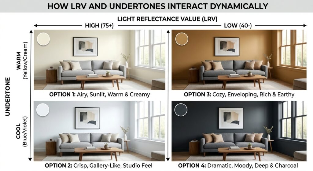
High LRV + Warm Undertone (e.g., SW Greek Villa - LRV 84, Warm Base): Creates an airy, sunlit room that feels physically open, soft, and comfortable—even under dim indirect daylight.
High LRV + Cool Undertone (e.g., SW Extra White – LRV 86, Cool Base): Yields a bright, gallery-like space with high visual contrast. Excellent for modern architecture, but can feel chilly in low-light environments.
Low LRV + Warm Undertone (e.g., SW Balanced Beige – LRV 46, Warm Base): Wraps the room in a rich, enveloping warmth. It shrinks the visual boundaries of large spaces to make them feel cozy and grounded.
Low LRV + Cool Undertone (e.g., SW Peppercorn – LRV 10, Cool Base): Delivers a dramatic, moody aesthetic. The cool base keeps the dark color looking crisp rather than muddy.
The Impact of Paint Sheens on LRV Perception
The finish (or sheen) you select physically alters how LRV is perceived by the human eye:
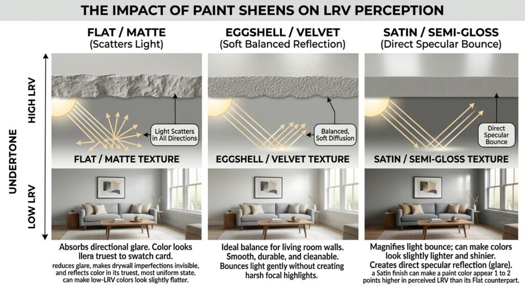
Flat / Matte Finish: Scatters light in every direction. This reduces glare, makes drywall imperfections invisible, and reflects color in its truest, most uniform state. However, it can make low-LRV colors look slightly flatter.
Eggshell / Velvet Finish: Provides a soft, low-sheen balance ideal for primary walls. It bounces light gently without creating harsh focal highlights.
Satin / Semi-Gloss Finish: Creates direct specular reflection (glare). Because it bounces light directly back at the viewer, a Satin finish can make a paint color appear 1 to 2 points higher in perceived LRV than its Flat counterpart.
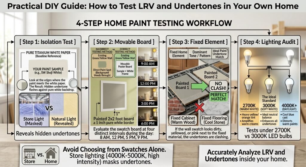
Practical DIY Guide: How to Test LRV and Undertones in Your Own Home
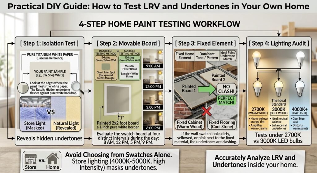
You should never choose a paint color based solely on how a tiny paper swatch looks under the fluorescent lighting of a home improvement store. Retail store lighting operates around 4000K to 5000K color temperatures with high artificial intensity, which completely masks hidden undertones.
Here are four practical, DIY methods you can use to accurately analyze LRV and undertones inside your own home.
Method 1: The White Paper Isolation Test (Uncovering Hidden Undertones)
When you look at a neutral paint swatch by itself, your brain automatically adjusts to the color, making it look like a pure, plain neutral. To uncover its hidden undertone, you must force your eyes to process a visual baseline.
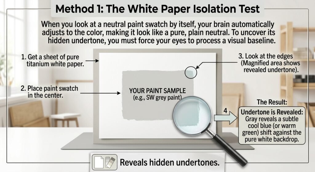
Get a sheet of bright, pure titanium white printer paper (or a pure white poster board).
Place your paint swatch directly in the center of the white paper.
Look at the edges where the paint meets the white paper.
The Result: The hidden undertone will immediately become visible. A gray swatch will instantly reveal its true identity—flashing subtle green, pink, yellow, or blue against the pure white backdrop.
Method 2: The Movable Sample Board (Testing Light Angles)
Painting test samples directly onto existing colored walls is a recipe for disaster. The existing background wall color will bleed into your visual field, corrupting your perception of the new sample.
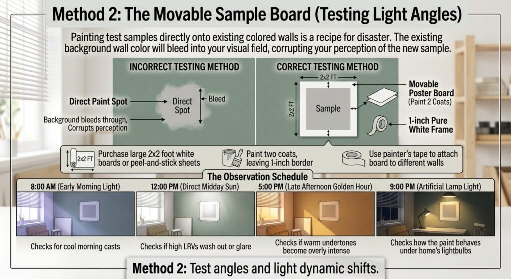
Purchase large 2×2 foot white poster boards or removable peel-and-stick sample sheets (like Samplize).
Paint two coats of your sample color onto the poster board, leaving a 1-inch pure white border around the outside edge. This white border acts as a visual buffer against your current wall color.
Use painter’s tape to attach the board to different walls in your living room.
The Observation Schedule: Evaluate the swatch board at four distinct intervals during the day:
8:00 AM (Early Morning Light): Checks for cool morning casts.
12:00 PM (Direct Midday Sun): Checks if high LRVs wash out or glare.
5:00 PM (Late Afternoon Golden Hour): Checks if warm undertones become overly intense.
9:00 PM (Artificial Lamp Light): Checks how the paint behaves under your home’s lightbulbs.
Method 3: The Fixed Element Comparison Matrix
Wall paint can easily be changed, but fixed architectural elements—such as hardwood floors, kitchen countertops, stone fireplaces, and tile—are permanent investments. Your paint undertones must harmonize with these fixed elements.
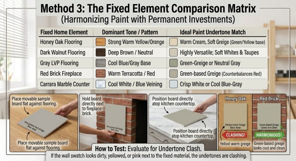
How to Test: Place your movable sample board flat against your flooring, directly next to your fireplace brick, or directly atop your kitchen countertop. If the wall swatch looks dirty, yellowed, or pink next to the fixed material, the undertones are clashing.
Method 4: The Artificial Light Bulb Audit (Kelvin Temperature Check)
The color temperature of your light bulbs—measured on the Kelvin (K) scale—directly controls how paint pigments appear after sunset.
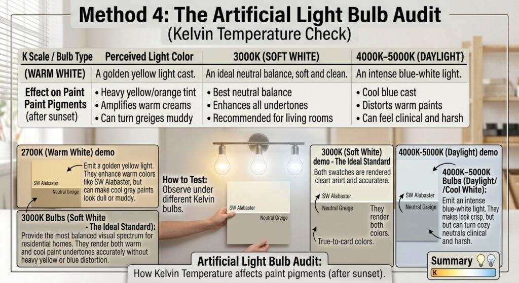
2700K Bulbs (Warm White): Emit a golden yellow light. They enhance warm colors like SW Alabaster, but can make cool gray paints look dull or muddy.
3000K Bulbs (Soft White – The Ideal Standard): Provide the most balanced visual spectrum for residential homes. They render both warm and cool paint undertones accurately without heavy yellow or blue distortion.
4000K–5000K Bulbs (Daylight/Cool White): Emit an intense blue-white light. They make colors look crisp, but can turn cozy warm neutrals clinical and harsh.
Room-by-Room Strategy: Selecting the Ideal LRV and Undertone Pairings
Every room in your home features a unique combination of natural light exposure and room proportions. Here is how to select the right LRV and undertone pairings based on room orientation.
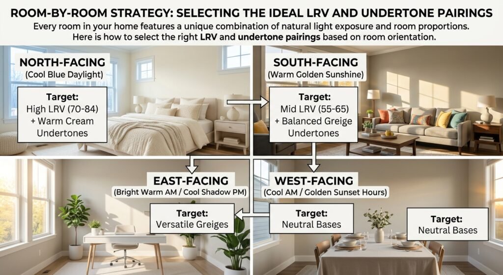
1. North-Facing Living Rooms (Handling Indirect Cool Shadows)
North-facing windows receive indirect daylight that carries a subtle blue-gray tint throughout the day. This cool light flattens paint colors and creates dim shadows in corners.
Target LRV: High (LRV 70 to 84).
Ideal Undertones: Warm yellow, gold, or soft cream bases.
Top Paint Picks: SW Greek Villa (LRV 84) or SW Alabaster (LRV 82).
Why It Works: The warm cream bases counteract the cool blue daylight, preventing the room from feeling shadowy or cold.
2. South-Facing Living Rooms (Managing Intense Warm Sunshine)
South-facing spaces receive intense, golden sunlight from morning through late afternoon.
Target LRV: Medium / Balanced (LRV 55 to 68).
Ideal Undertones: Balanced greiges with subtle green or neutral gray bases.
Top Paint Picks: SW Accessible Beige (LRV 58) or SW Shoji White (LRV 74).
Why It Works: The neutral gray/green undertone stabilizes the paint, preventing direct golden sunlight from turning the walls an overly vibrant yellow.
3. East-Facing Rooms (Morning Sunlight vs. Afternoon Shadow)
East-facing rooms enjoy warm, yellow sunrise light in the morning, followed by cooler, indirect shade in the afternoon.
Target Strategy: Select a versatile neutral with an LRV of 60 to 75 that balances both warm and cool lighting shifts.
Top Paint Pick: SW Shoji White (LRV 74).
4. West-Facing Rooms (Cool Mornings vs. Golden Sunset)
West-facing spaces start the day in cool morning shadow, then experience a flood of warm, golden light during late afternoon and sunset.
Target Strategy: Avoid heavy warm yellow bases, which can look fiery hot during golden hour. Opt instead for balanced greiges or soft warm taupes.
Top Paint Pick: SW Accessible Beige (LRV 58).
5. Windowless Basements and Hallways (Maximizing Artificial Light)
Windowless spaces rely 100% on artificial light fixtures.
Target LRV: High (LRV 75 to 85).
Ideal Strategy: Pair high-LRV paint with 3000K LED light fixtures. This setup maximizes light bounce around the space without relying on natural windows.
Troubleshooting Common Color Disasters: Quick DIY Solutions
If a paint color you recently applied looks wrong, use this troubleshooting guide to identify the underlying LRV or undertone mismatch and fix it quickly.
+------------------------------------+------------------------------------+------------------------------------+
| Observed Problem                   | Root Cause                         | Quick DIY Fix                      |
+------------------------------------+------------------------------------+------------------------------------+
| "My white walls look dull gray."   | High-LRV white used in dark room  | Drop LRV to 60-70 with a cozy greige|
| "My beige wall looks bright pink." | Clashing pink undertone vs floor   | Switch to green-based warm greige  |
| "My gray paint looks icy cold."    | Blue undertone in north daylight   | Switch to warm cream or warm greige|
| "My room feels small & enclosed."  | Low LRV without enough bulb lumens | Increase bulb wattage & raise LRV  |
+------------------------------------+------------------------------------+------------------------------------+
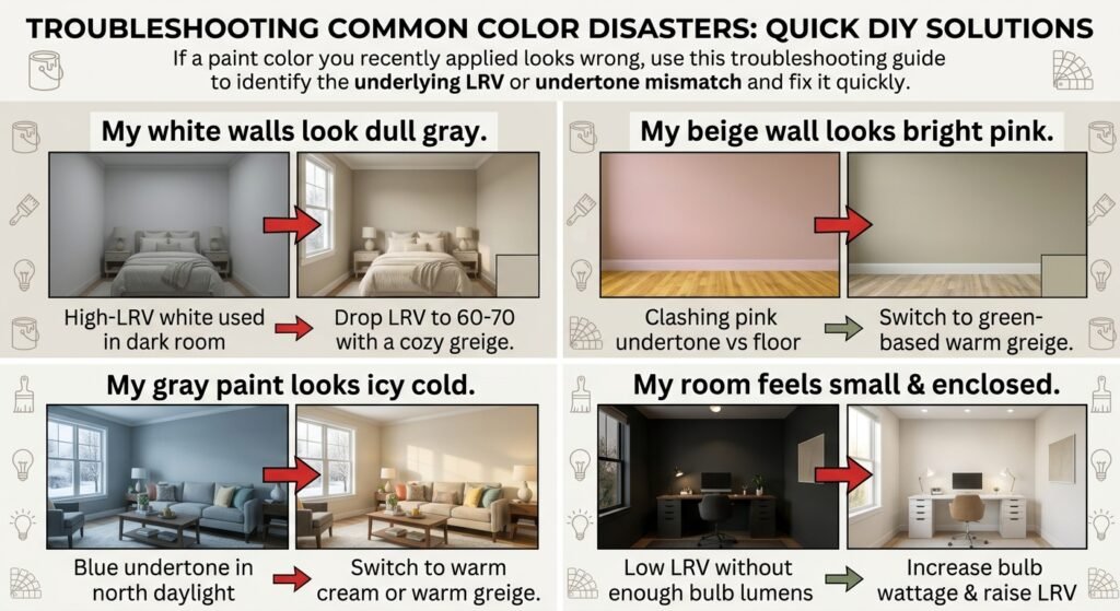
Problem 1: “I painted my small, dark room bright white, but it looks like a dingy gray cave.”
The Root Cause: High-LRV whites (LRV 85+) require abundant light to bounce. If there is no natural light coming into the room, there is nothing for the white paint to reflect. In shadow, high-white paint simply turns a flat, dingy gray.
The Quick Fix: Stop trying to force a dark room to look white. Instead, select a warm, rich greige in the 55 to 65 LRV range (like SW Accessible Beige). The deeper pigment gives the shadowy walls cozy structure and purpose.
Problem 2: “My neutral beige wall suddenly turned bright pink next to my hardwood floors.”
The Root Cause: The paint you chose carries hidden pink or violet undertones that are contrasting sharply against yellow or green wood floor undertones.
The Quick Fix: Repaint using a warm neutral that relies on a yellow or green undertone base (such as SW Shoji White or SW Accessible Beige). Green naturally neutralizes red/pink, eliminating the unwanted blush tone.
Problem 3: “My gray walls look icy blue and clinical.”
The Root Cause: You selected a cool-toned gray with blue/violet undertones in a north-facing room or under 4000K+ cold lightbulbs.
The Quick Fix: Swap your artificial lightbulbs to 3000K Soft White. If the blue tint remains during the daytime, repaint with a warm greige or cream shade.
Problem 4: “My white baseboard trim makes my beige walls look dirty.”
The Root Cause: Your trim paint is an ultra-stark, cool blue-white, while your wall paint is a warm, creamy beige. The stark contrast makes the warm wall look yellowed by comparison.
The Quick Fix: Repaint your trim in a versatile, softer white like SW Pure White (SW 7005). It provides a clean finish without cold blue undertones that clash with warm walls.
Frequently Asked Questions (FAQ) About LRV and Paint Science
Q: Where can I find the official LRV of a Sherwin-Williams paint color?
A: The official LRV is printed directly on the back of physical Sherwin-Williams paper color swatches. You can also find it on the official Sherwin-Williams website by looking under the “Details” or “Color Details” tab for any specific color code.
Q: Does painting a small living room with a high LRV color actually make it feel bigger?
A: Yes, but only if the room receives adequate natural light. High-LRV paints bounce light off surfaces, pushing wall boundaries outward visually. However, if the small room lacks natural light, a high-LRV white will simply look shadowy; in that scenario, a mid-tone color (LRV 50–60) is a better choice.
Q: Can two paints have the exact same LRV but look completely different?
A: Absolutely. LRV only measures the total quantity of reflected light, not the quality or color temperature of that light. Two paints can both have an LRV of 60, but if one has a yellow undertone and the other has a blue undertone, they will look completely different on your walls.
Q: How does paint sheen affect Light Reflectance Value?
A: Official manufacturer LRV numbers are measured using Flat/Matte paint formulations. As you increase sheen level—moving to Eggshell, Satin, or Semi-Gloss—the gloss finish reflects light more directly, making the perceived LRV roughly 1 to 2 points higher than its matte rating.
Q: What is the best lightbulb temperature for viewing true paint colors?
A: 3000K (Soft White) LED bulbs offer the most accurate color rendering for residential interiors. They provide a balanced spectrum that avoids the heavy yellow tint of 2700K bulbs and the harsh blue cast of 4000K daylight bulbs.
Q: How do I stop a warm off-white paint from looking neon yellow in southern light?
A: Switch from a yellow-based cream to a balanced greige with subtle gray or green undertones (such as SW Shoji White or SW Accessible Beige). The gray pigment absorbs excess yellow light waves, keeping the color looking balanced.
Q: What is the difference between a mass tone and an undertone?
A: The mass tone is the primary, dominant color you recognize instantly (e.g., beige, gray, or white). The undertone is the subtle underlying color pigment (yellow, pink, green, blue, or violet) created by the specific mixture of colorants added to the paint base.
Q: Is LRV important when choosing exterior paint colors?
A: Yes, LRV is extremely important for exteriors. Paints exposed to direct sunlight look significantly lighter outdoors than indoors—often appearing 10 to 15 LRV points higher. Additionally, many building materials (such as vinyl siding) have strict maximum LRV requirements to prevent heat warp and structural damage.
Master Your Home’s Paint Science Today
Selecting the perfect paint color does not have to feel like a gamble. By understanding how Light Reflectance Value (LRV) controls light bounce and how undertones dictate color harmony, you gain complete control over your home’s interior design.
Before buying your next gallon of paint, take a systematic approach:
Identify your room’s natural window exposure (North, South, East, or West).
Establish your target LRV range (aim for 51–70 for main living areas).
Test your top candidates using movable poster boards framed with a white border.
Audit your samples under morning light, late afternoon sun, and 3000K artificial lamp bulbs.
By testing methodically and honoring the physics of paint, you will create a beautifully balanced home filled with rich, cohesive color that looks incredible in every light!
Now that you understand LRV and undertones, it’s time to choose the perfect shade for your walls! Explore Our Ultimate Guide to Sherwin-Williams Neutral Paint Colors to find the best curated shades, expert tips, and quick solutions for a modern home.