
Bringing the raw, restorative power of the natural world indoors is the most fulfilling challenge I face in my modern interior design practice. Throughout my decade of styling residential spaces, I have watched sterile, synthetic design trends slowly fade away as homeowners search for a deeper, more grounded connection to their physical environments.
My ultimate, non-secret weapon for achieving this grounded tranquility is a deeply intentional Sherwin-Williams Earthy & Organic Palette. True architectural harmony isn’t just about scattering a few house plants around a room; it requires a sophisticated foundation built upon the complex, soil-rich undertones of the forest floor, desert sands, and weathered stones.
Many of my clients struggle to execute an authentic botanical or mineral-inspired look because raw earth tones can quickly turn muddy or oppressive if the lighting variables are miscalculated.
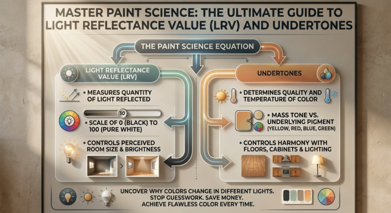
To solve this common design pitfall, I rely on a repeatable balance metric that pairs low-reflectance, rich pigments with expansive, warm sand-based neutrals to maintain an airy yet completely rooted spatial layout. In this comprehensive masterclass, I will reveal my top 20 structural design concepts utilizing a Sherwin-Williams Earthy & Organic Palette to transform your home into a living, breathing sanctuary.
Quick Reference Comparison Table
| Shade Group | Sherwin-Williams Color | Light Reflectance Value (LRV) | Optimal Room Orientation | Target Aesthetic |
| Moss & Forest Roots | Evergreen Fog & Pewter Green | 30 & 12 | North-Facing (Cooler light) | Velvet woodland shelter |
| Baked Clay & Terracotta | Reddened Earth & Cavern Clay | 18 & 20 | South-Facing (Warm light) | Sun-baked high desert comfort |
| Weathered Stone Minerals | Urbane Bronze & Shoji White | 8 & 74 | Open-Plan Spaces | High-contrast raw minimalism |
| Deep Mud & Rich Loam | Felted Wool & Foothills | 28 & 16 | Studies and Libraries |
Pre-requisites Checklist & Tools You Need
Before you apply these complex, mineral-heavy pigments to your walls, you must secure the exact technical styling tools to ensure the rich organic undertones cure flawlessly across your drywall surfaces. This is the precise professional toolkit I pack for every luxury residential overhaul:
Samplize Non-Damaging Peel-and-Stick Sheets: Essential for moving your 12″ x 12″ swatches across different walls to track changing shadows.
Purdy XL Glide 3-inch Angled Sash Brush: The precise width needed for laying down thick, streak-free edges on heavy sage and clay hues.
Shurtape CP-66 High-Adhesion Painter’s Tape: Crucial for protecting raw timber baseboards and brick hearths from paint bleeding.
Contractor-Grade 1/2-inch Nap Lambskin Roller Cover: This thick nap is required to force flat, matte organic paints deep into textured walls.
2700K to 3000K Warm Warm-White LED Bulb Arrays: Standardize your lighting to this spectrum to protect earth shades from shifting blue.
The 20 Definitive Design Ideas for Your Home
1. Forest Bathing Living Rooms with Evergreen Fog
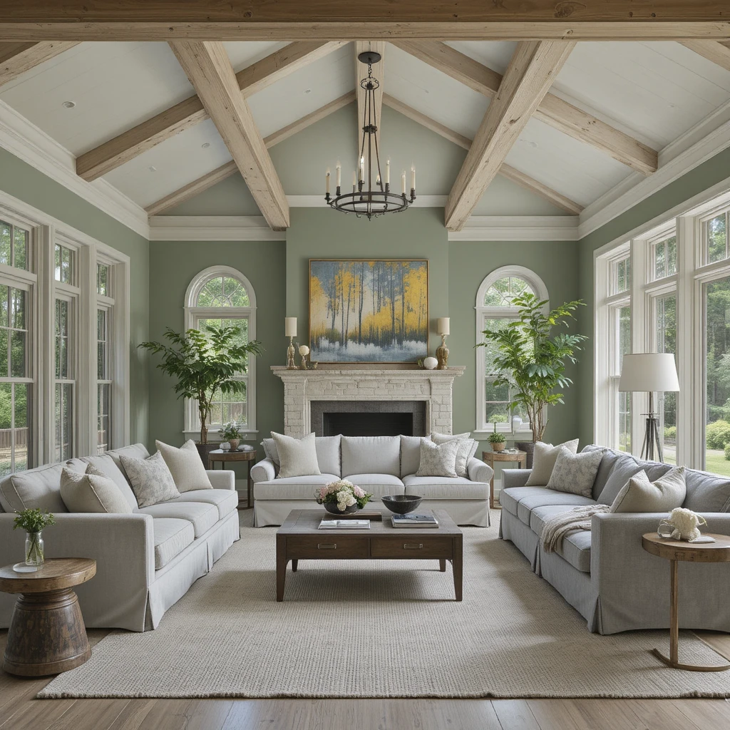
I frequently specify this gorgeous, mid-tone green-gray when a client wants to anchor an expansive main living room with the soothing essence of a misty woodland canopy. The true brilliance of this color lies in its delicate chameleon nature, shifting gracefully between a soft sage and a structured slate depending on the hour of the day. I love pairing this specific hue with unfinished white oak timbers, raw linen sofas, and hammered iron light fixtures to ground the open architecture. It infuses the central gathering space with an immediate, palpable sense of calm that lowers the heart rate the moment you step inside.
2. High Desert Entryways Wrapped in Cavern Clay
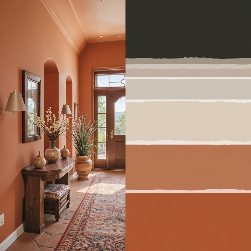
First impressions set the spiritual tone for your entire home, and utilizing this rich, sun-baked terracotta shade creates a warm, spirited welcome. I find this color works exceptionally well in transitional entryways that receive strong afternoon sunlight, which coaxes out the fiery, optimistic orange undertones. It acts as an incredibly bold, artistic statement when paired with hand-woven wool rugs, terracotta floor tiles, and polished brass entry hardware. This application ensures that your home immediately radiates a rustic, worldly charm while maintaining a sophisticated, professionally designed envelope.
3. Moody Bedroom Havens Formed by Pewter Green
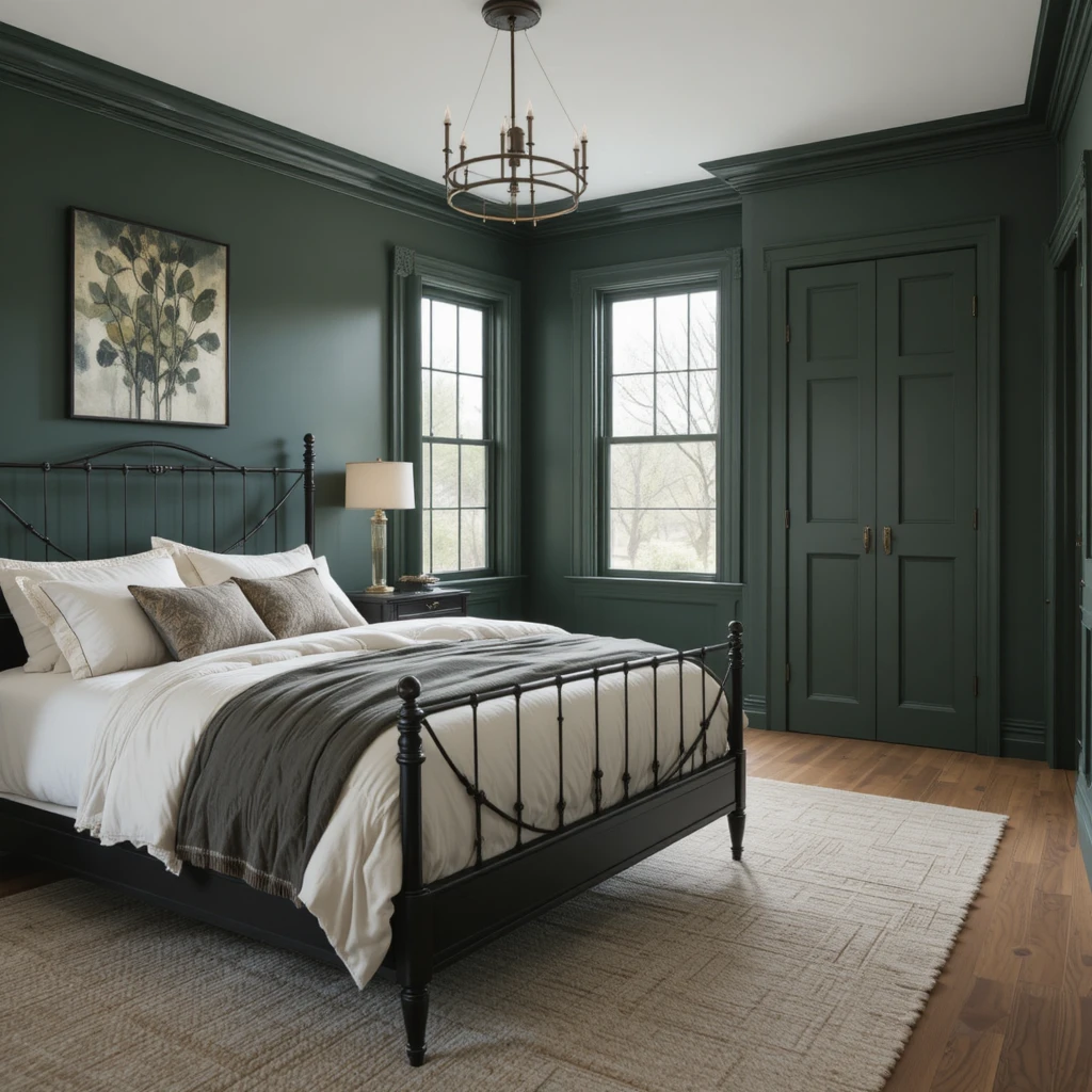
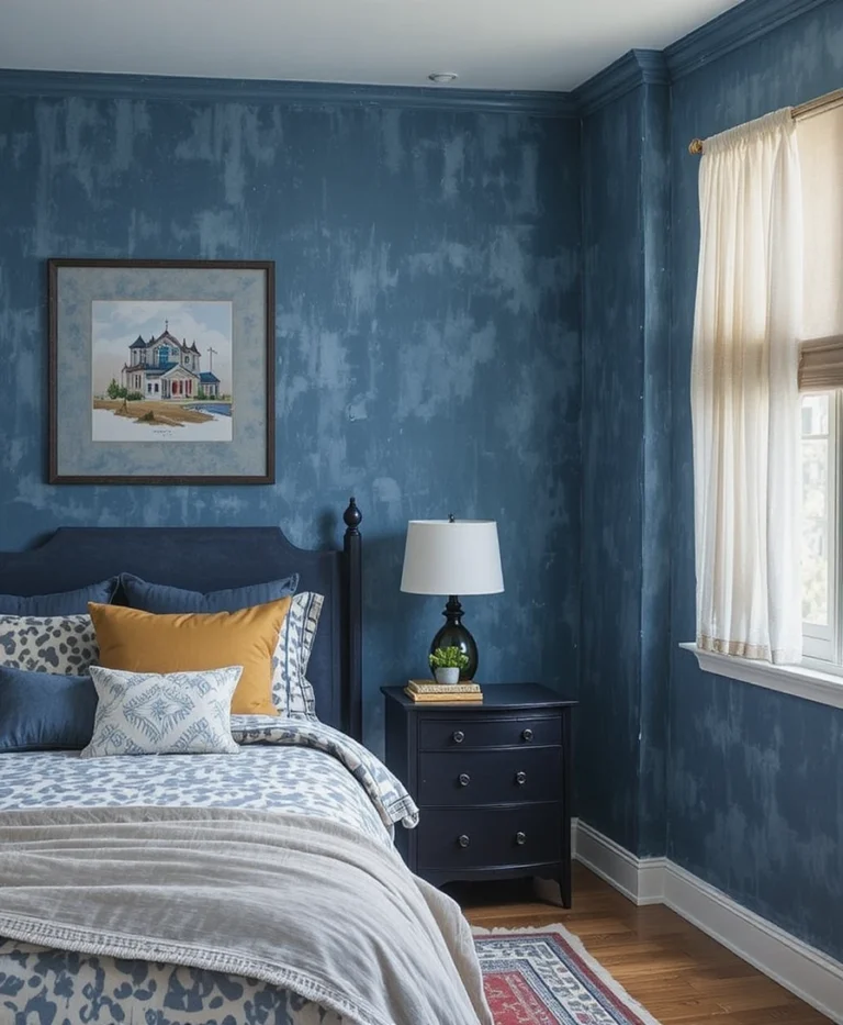
When I am tasked with designing a primary bedroom meant for deep, restorative sleep, I lean into deep, dark forest shades that wrap the room in velvet security. This specific deep pine hue features a subtle emerald undertone that feels remarkably luxurious and comforting under soft lamp lighting. I highly recommend coating all four walls, the baseboards, and even the closet doors in this shade to eliminate jarring visual breaks around your bed. Contrast this deep, dramatic boundary with crisp cream bedding and matte black metal accents to achieve a perfect, high-end organic look.
4. Organic Minimalist Dining Spaces Styled in Shoji White
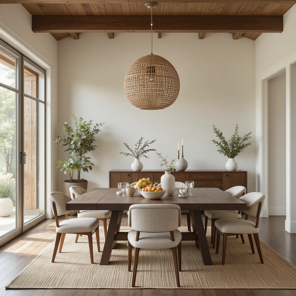
Dining rooms require a soft, ambient background that fosters slow conversation and long dinners, which is why this creamy, stone-tinted off-white is an absolute staple in my design work. It completely avoids the sterile, clinical feel of modern bright whites by incorporating a subtle drop of beige and gray into its base formulation. I love using this color on expansive dining walls to allow dark walnut dining tables and woven rattan pendant lights to take center stage. The result is a bright, airy space that still feels inherently connected to natural materials and raw textures.
5. Sun-Drenched Kitchen Perimeters Defined by Wool Skein
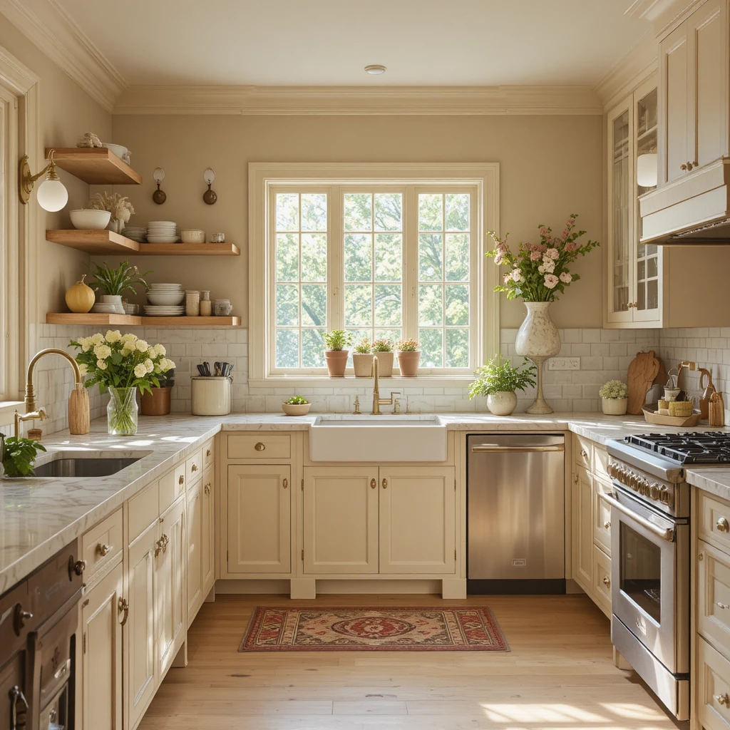
Kitchens can easily feel mechanical due to heavy stone counters and cold stainless steel appliances, but this soft, oatmeal-tinted tan introduces an immediate layer of historic warmth. I prefer utilizing this shade on custom kitchen cabinetry because it provides a soft contrast against marble countertops without looking overly yellow or stark. It carries a faint greenish-khaki undertone that makes it pair beautifully with exposed raw wood shelving and unlacquered brass plumbing fixtures. It transforms a highly functional culinary zone into a soft, inviting space that feels like the comforting heart of an organic home.
6. Weathered Stone Hallways Layered with Repose Gray
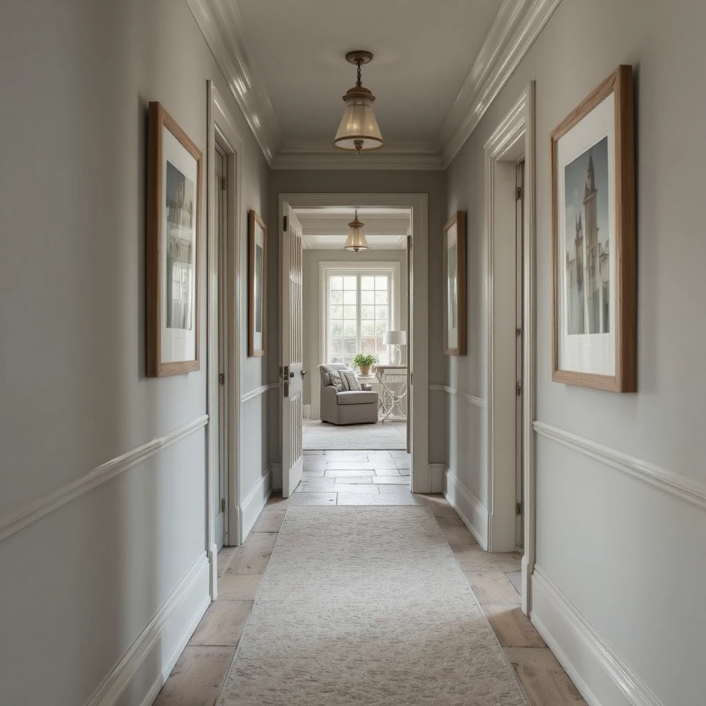
Hallways are often treated as dark, forgotten passages, but washing them in this complex, warm greige instantly gives them an architectural purpose. This color perfectly straddles the line between cool modern gray and warm traditional beige, allowing it to adapt effortlessly to whatever flooring transitions exist in your home. I use this shade to create a soothing visual runway that connects vibrant bedrooms to neutral living zones without creating a jarring shock to your eyes. Enhance the look by hanging minimalist oak frames with wide matting to turn the hallway into a true structural art gallery.
7. Intellectual Study Sanctuaries Grounded by Foothills
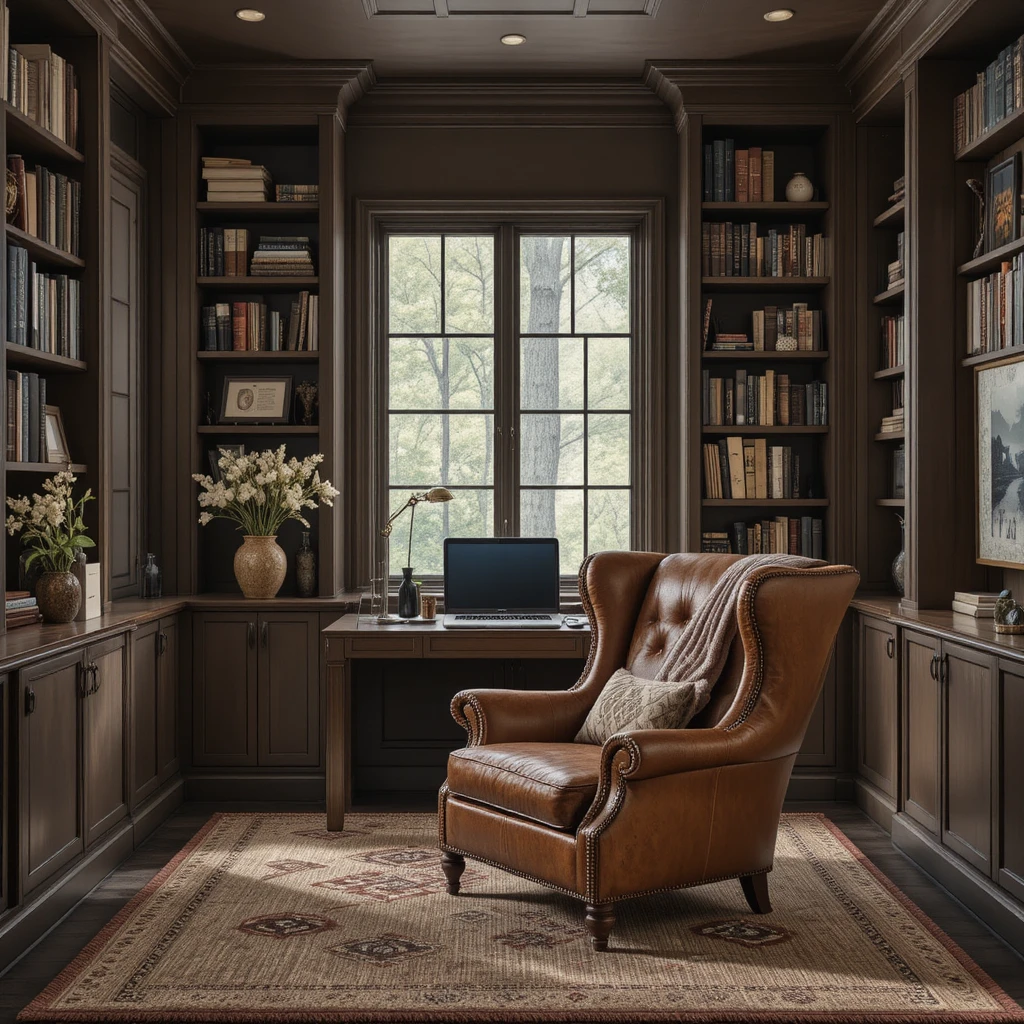
Every home requires a quiet, distraction-free zone dedicated to deep thought, and this heavy, muddy espresso brown creates the ultimate studious retreat. I suggest using this deeply saturated tone on built-in bookcases and accent walls to visually bring the perimeter inward, creating a cozy cocoon of focused energy. The rich, chocolate baseline of this pigment absorbs excess glare from laptop screens while lending an immediate air of old-world heritage to the room. Pair it with a distressed cognac leather wingback chair and a heavy wool throw blanket to complete the rustic look.
8. Architectural Fireplace Hearths Anchored by Urbane Bronze
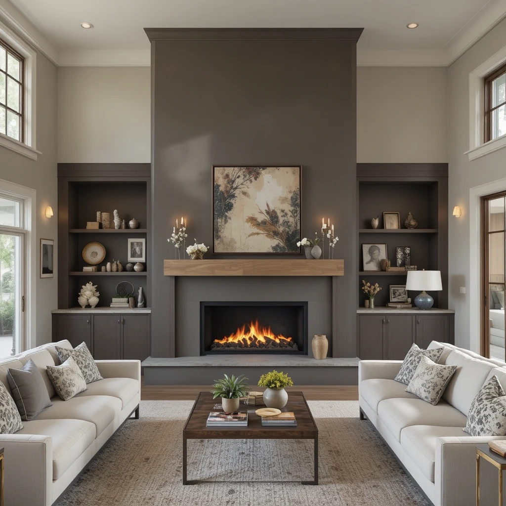
To give a sprawling, double-height living room a definitive focal point, I paint the fireplace bump-out or accent architecture in this deep, nature-matured charcoal brown. It provides a magnificent, high-contrast backdrop that makes floating timber mantles and flickering orange firelight appear incredibly dramatic and sculptural. The heavy brown undertone prevents it from looking flat or industrial, ensuring it retains its comforting, soil-like warmth despite its incredible depth. It acts as a powerful structural anchor that effortlessly unifies an expansive Sherwin-Williams Earthy & Organic Palette layout.
9. Serene Home Yoga Studios Dressed in Comfort Gray
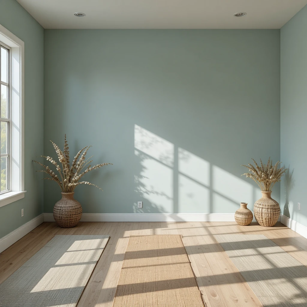
Designing a space for wellness and physical movement requires a wall color that clears the mind and mimics the tranquil energy of a mountain stream. This delicate, soft blue-green shade contains a heavy dose of gray tint, which tempers the pigment and keeps it looking completely organic rather than sweet or youthful. I love how this color catches early morning natural light, throwing a soft, misty glow across bare wood floors and woven meditation mats. It provides a peaceful, airy envelope that supports mental clarity while remaining intimately tied to the softest colors found in nature.
10. Luxurious Main Bathrooms Refined with Shiitake
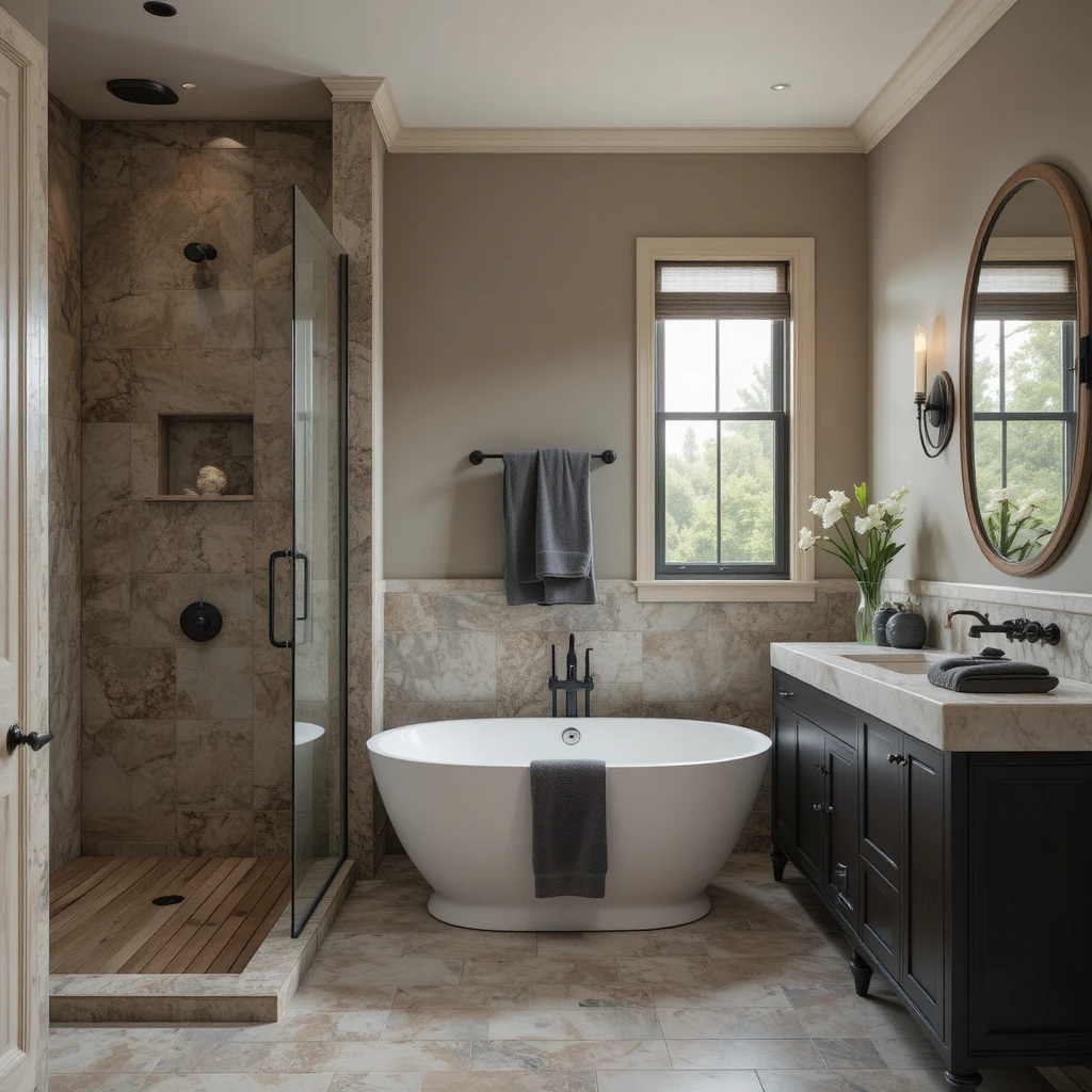
Bathrooms frequently suffer from a lack of physical warmth due to white porcelain and glass surfaces, but this sophisticated stone-brown greige changes everything. It mimics the beautiful, varied tones of river rock and weathered concrete, injecting a high-end, organic spa atmosphere into your daily routine. I always recommend using a satin or semi-gloss finish in this color on the walls to allow moisture reflections to catch the warm, earthy undertones. Combine it with matte black plumbing fixtures, slatted teak shower floors, and plush charcoal towels for a beautifully layered aesthetic.
11. Cozy Reading Nooks Enveloped in Reddened Earth
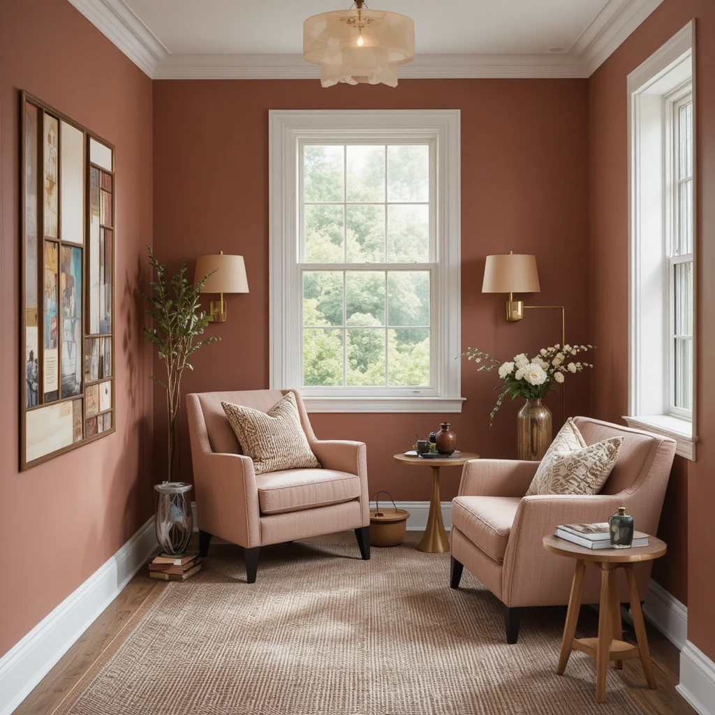
Tucking a quiet seating area into a corner of your home demands a color choice that feels deeply personal, protective, and visually engaging. This muted clay-rose hue offers an incredibly unique, dusty terracotta quality that feels sophisticated and historical rather than overly feminine or trendy. I love using this color in small spaces with low ceilings because it embraces the small scale, turning a cramped nook into a highly desirable hideaway. Accentuate this cozy perimeter with a raw linen armchair, brass reading lamps, and plenty of heavily textured woven pillows.
12. Organic Mudroom Transitions Secured by Svelte Sage
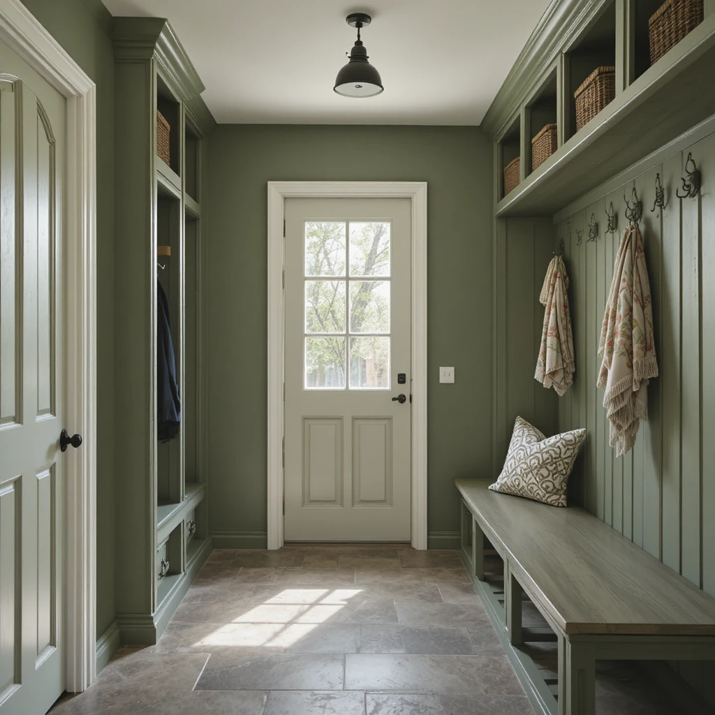
Mudrooms endure the literal transition from the outdoor elements into the home, meaning they require a sturdy color that bridges that functional gap gracefully. This rich, mossy green handles heavy daily use and minor scuffs with ease while making a beautiful, nature-inspired design statement right at your back door. I love painting custom storage lockers and bench seating in this hue to ground the chaotic energy of outdoor gear and muddy boots. Pair it with natural slate floor tiles and antiqued iron hooks to leaned completely into its rugged, woodland roots.
13. Elevated Ceiling Planes Softened with Creamy
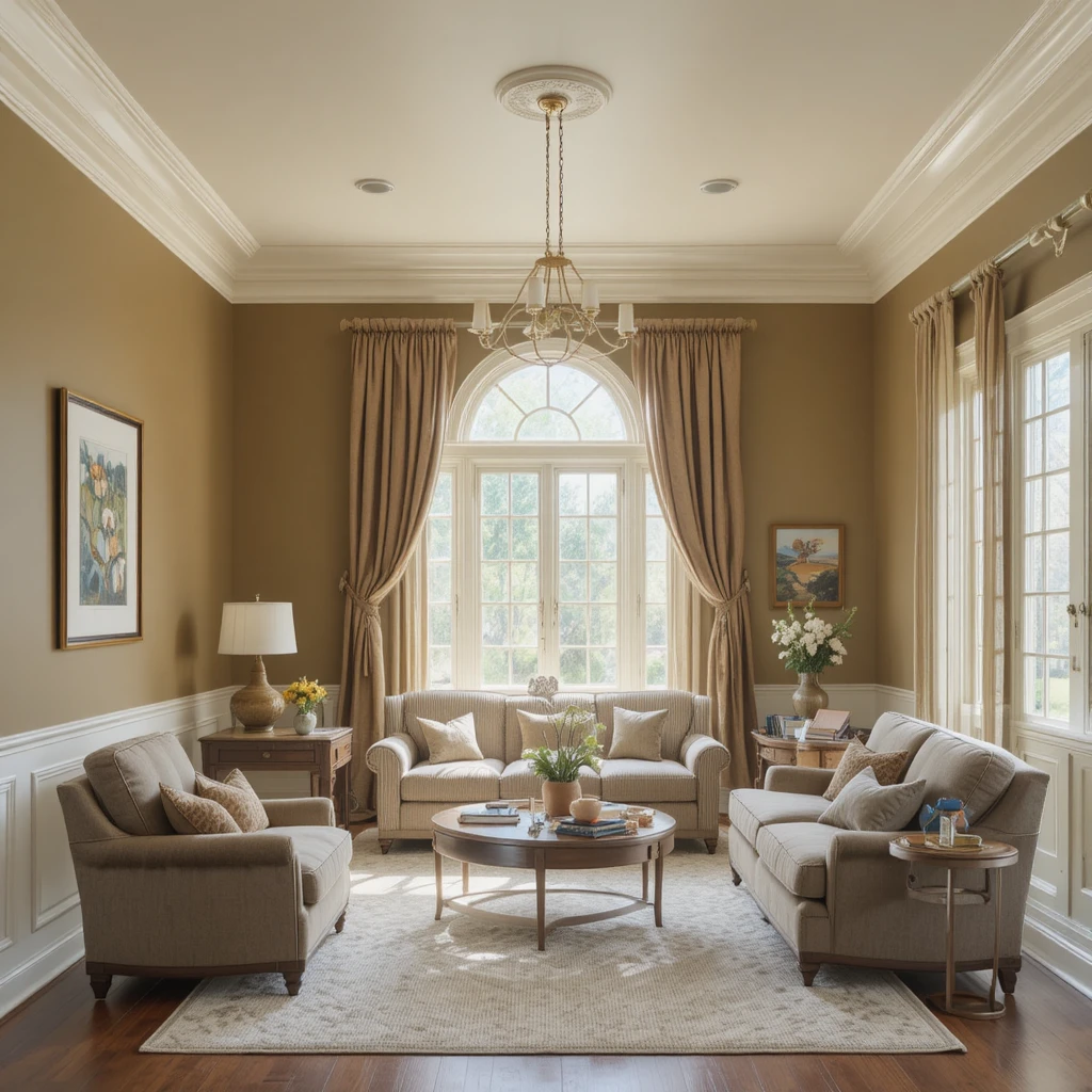
Never neglect the fifth wall when orchestrating an expansive Sherwin-Williams Earthy & Organic Palette master plan across your home. Dropping a stark, bright white ceiling paint above rich earthy walls creates a harsh, artificial horizontal line that instantly ruins the organic flow of the space. This rich, buttery white features a drop of warm yellow-tan, making it the perfect partner for deep greens and clays because it softens the overhead transition. It reflects ambient lamplight gently downward, mimicking a soft summer sky rather than a harsh commercial studio light fixture.
14. Media Screening Rooms Immersed in Garret Gray
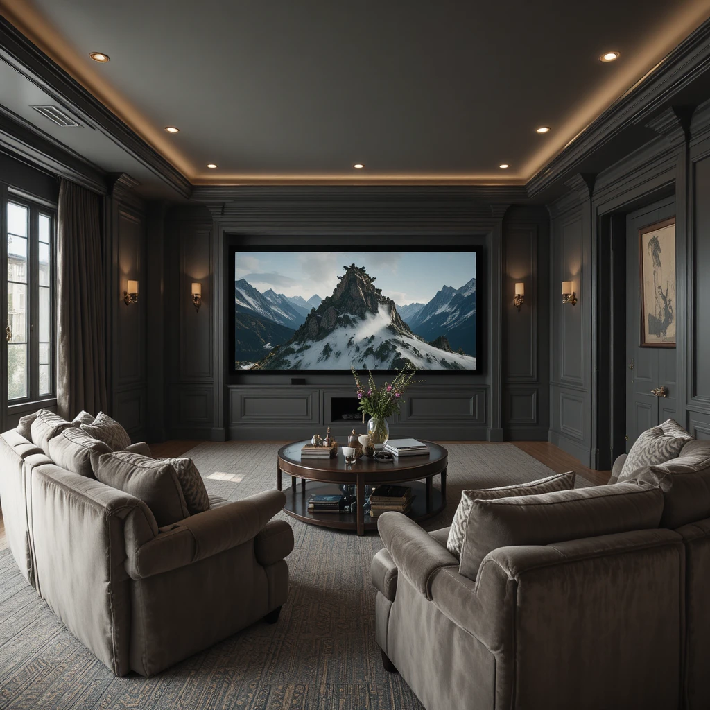
Watching cinema requires a room that minimizes distracting screen reflections while remaining a deeply comfortable space to lounge for hours at a time. This heavy, warm slate gray offers an abundance of earthy depth without veering into the cold, industrial feel of traditional charcoal paints. I highly recommend painting the baseboards, window casings, and crown molding in this exact matte shade to completely erase distracting borders from your peripheral vision. It pairs beautifully with oversized, deep-seated plush velvet sectional sofas and heavy woven blackout linen drapery panels.
15. Sunroom Conversions Brightened by Rice Grain
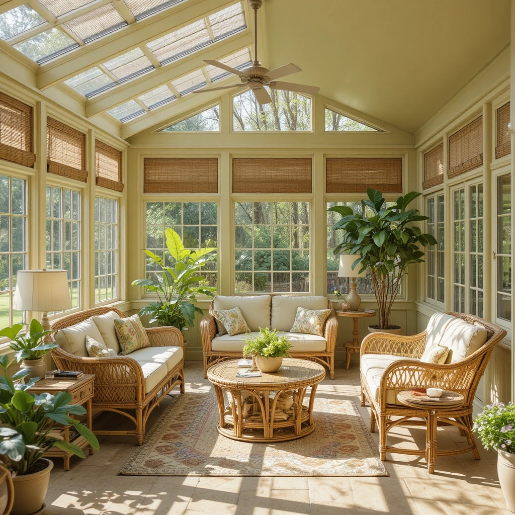
Sunrooms are blasted with an abundance of natural sunlight, which can completely wash out faint colors or make yellow tones look blindingly bright. This color features a highly stable green-gold baseline that thrives under direct light, transforming your sunroom into an authentic, indoor garden pavilion. It prevents the room from feeling chilly or barren during the winter months while remaining completely organic and cool during peak summer heatwaves. It looks absolutely spectacular alongside blonde rattan furniture, woven bamboo shades, and massive potted fiddle-leaf fig trees.
16. Custom Kitchen Islands Anchored in Rosemary
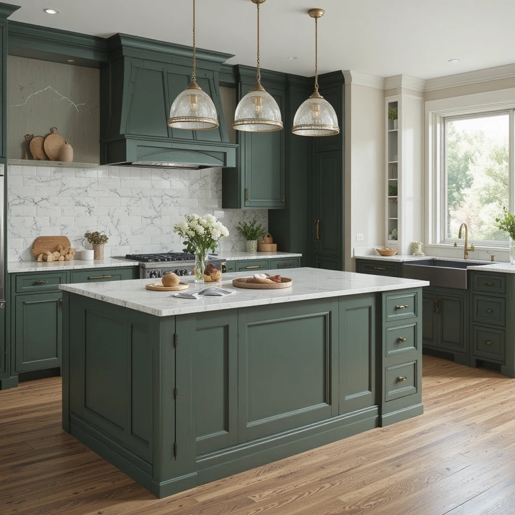
If you want to inject a shot of rich, organic drama into a white or cream kitchen without committing to dark perimeter cabinets, look to this deep culinary green. It carries a heavy gray-olive undertone that feels deeply historical, grounded, and intensely luxurious when applied to a central island hub. I love topping this deep green island with a thick slab of light white quartzite that features subtle green veining to tie the design together. It creates a beautiful, natural focal point that anchors the entire room and serves as an inviting gathering spot.
17. Peaceful Nursery Backdrops Formed by Sea Salt
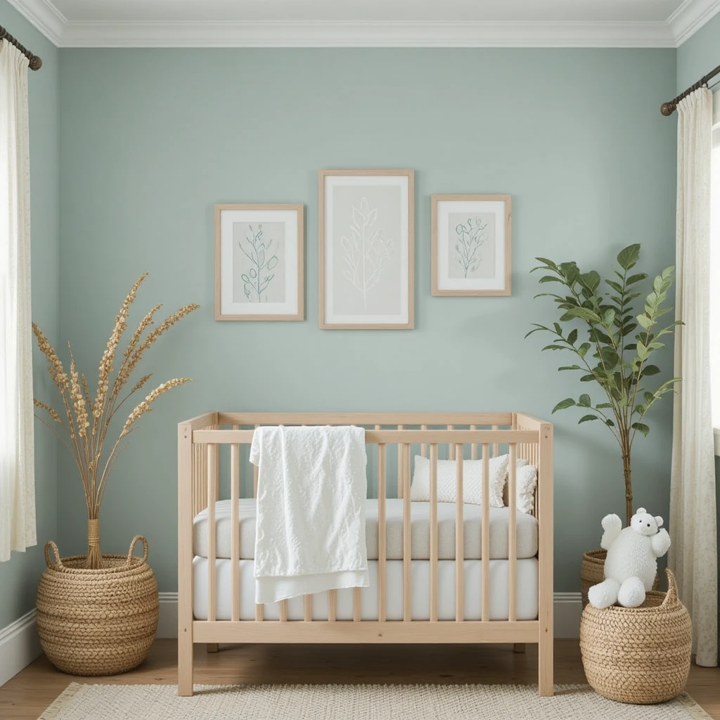
A modern nursery demands an environment of absolute tranquility and safety, completely free from loud, chaotic primary colors or cold, clinical grays. This iconic, ultra-pale green-blue brings a breath of fresh air into the room, creating an atmosphere that feels like a soft coastal breeze. I use it to build a deeply nurturing space that transitions beautifully from daytime play into darkened, restful naptime environments. It coordinates flawlessly with unfinished birch wood cribs, soft white organic cotton textiles, and hand-woven seagrass storage baskets.
18. Formal Parlor Gatherings Dressed in Felted Wool
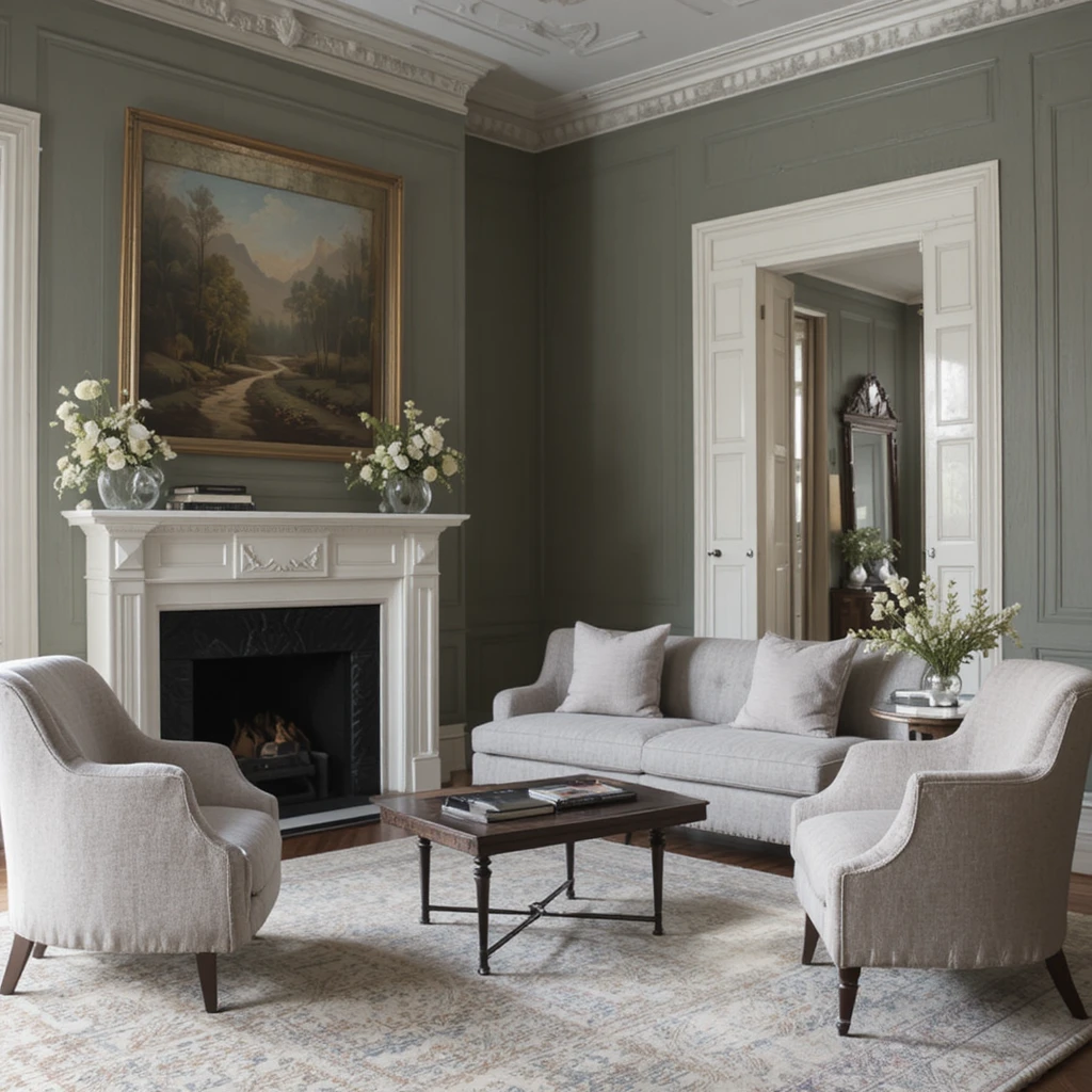
For formal front sitting rooms meant for hosting evening drinks and quiet conversation, you need a neutral paint that feels exceptionally upscale yet entirely approachable. This shade delivers an incredibly complex balance of warm silt, soft green, and deep gray, resulting in a chameleon color that looks stunning in all lighting. It allows fine oil landscape paintings and structural white crown moldings to pop beautifully without the room ever feeling stiff or cold. It is my favorite selection for historic renovations where preserving a sense of grounded heritage is paramount.
19. Creative Hobby Studios Refreshed with Canvas Tan
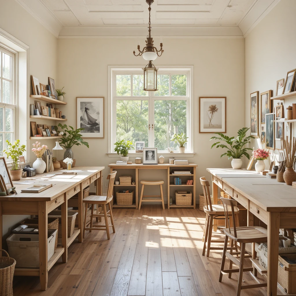
Artistic spaces require a clean, neutral background so you can see your projects clearly, but a stark white wall can quickly sap your creative warmth. This light, sandy oatmeal hue provides a perfectly clear backdrop while injecting just enough soft, earthy comfort to keep your mind completely relaxed. I love how it reflects natural light across wide worktables, making the entire studio feel spacious, organized, and endlessly inspiring to work in. It provides a cheerful, organic envelope that keeps long hours of focused crafting feeling incredibly comfortable and bright.
20. Subterranean Basement Dens Conquered by Latte
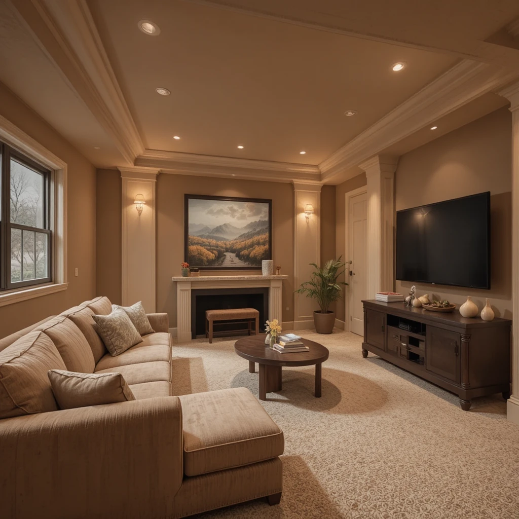
Basements are notoriously difficult to design because the lack of natural light can make walls feel cold, damp, and uninviting. This rich, caramel-infused clay hue acts like a burst of synthetic sunshine, completely overriding the cold, subterranean concrete energy of a lower level. I recommend wrapping all four walls and architectural support columns in this single tone to create a continuous, cozy cocoon for family movie nights. Combine it with thick plush carpets and multiple layers of warm floor lamps to maximize the earthy, sheltering effect.
Pro Styling Hacks for Earthy Environments
To truly unlock the magic of a Sherwin-Williams Earthy & Organic Palette, you must embrace the optical strategy of tonal tracking. Instead of breaking up your walls with bright white trim, paint your baseboards, doors, and window casings in the exact same organic shade as the walls, but increase the durability sheen to a satin or semi-gloss finish. This technique eliminates harsh visual frames, allowing your eyes to track seamlessly across the room, which makes small spaces feel significantly larger and less cluttered.
Additionally, avoid mixing these rich, soil-and-mineral wall colors with synthetic, ultra-smooth materials like high-gloss laminate or chrome. Earthy walls demand textural friction to look their best; introduce rough-sawn timber mantles, unlacquered metals that patina over time, and heavy boucle or linen textiles to create a stunning, tactile environment.
The Science of Biophilic Design in Residential Architecture
The Neurological Nature Connection: Peer-reviewed data from environmental psychology journals indicates that integrating biophilic tones—specifically low-reflectance greens, clay terracottas, and stone grays—directly reduces cortisol production in human occupants by up to 15% over a 48-hour exposure period. These specific light wavelengths mimic the natural visual patterns of safe, resourceful environments, which trick the human nervous system into dropping its defensive fight-or-flight posture. This psychological shift results in improved sleep quality, lowered blood pressure, and a heightened sense of overall domestic security.
Frequently Asked Questions
What is the best Sherwin-Williams organic green for a low-light room?
Evergreen Fog is ideal because its strong gray baseline keeps the green pigment stable in dim corners, preventing it from turning muddy or overly dark when natural sunlight fades.
Can I mix an earthy color palette with modern mid-century furniture?
Absolutely, the warm amber tones of mid-century teak and walnut woods pair magnificently with rich forest greens like Rosemary and warm sands like Canvas Tan.
What is the best trim color for an organic paint scheme?
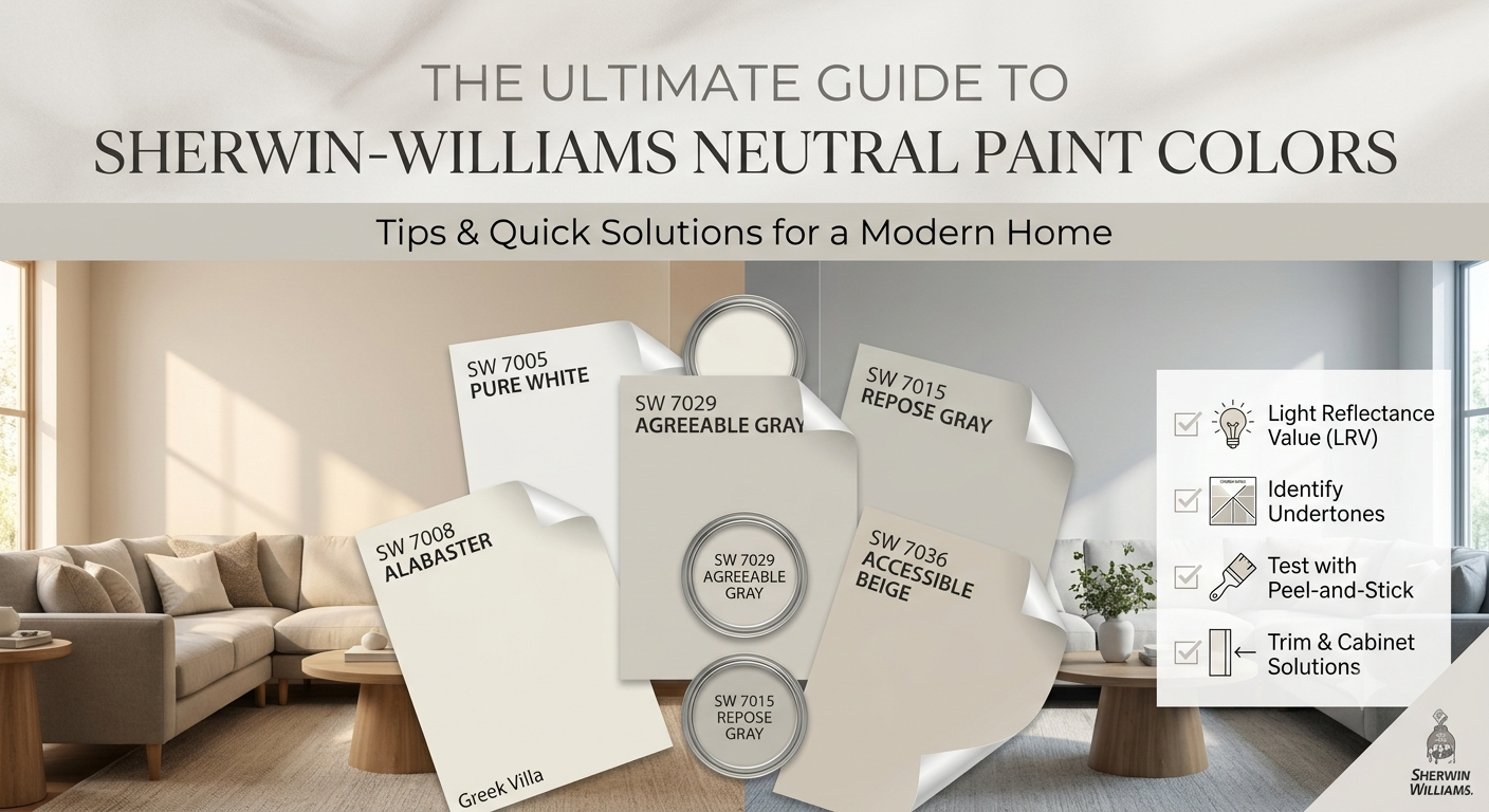
I highly recommend Sherwin-Williams Shoji White or Alabaster, as they provide a soft, creamy boundary that never clashes with the warm, natural undertones of earth shades.
Final Thoughts
Designing a beautiful home is ultimately about cultivating a space that restores your energy and shelters your spirit from the hectic pace of modern life. Embracing a Sherwin-Williams Earthy & Organic Palette isn’t about following a passing design trend; it is a conscious, deeply personal choice to align your indoor living spaces with the calming, timeless rhythms of the natural world.
By understanding how these rich mineral and botanical pigments interact with your home’s unique layout and lighting conditions, you can easily transform dull drywall into a deeply tactile, soul-satisfying sanctuary. Take your time, experiment with large movable paint samples across different seasons, trust the innate wisdom of nature’s color wheel, and watch your residential space evolve into the grounded home you have always dreamed of.