
Most “fall living room” lists boil down to the same five moves in different order: a throw blanket, some candles, a few mini pumpkins on the coffee table. Those aren’t wrong, but decorating for fall is really about changing how the room feels, not just what it looks like in a photo, since a living room in October gets used differently than one in July: more evenings on the couch, more low-light hours, more time spent actually sitting in the space rather than passing through it. This list goes deeper into why each idea works, what tends to go wrong when people try it, and which changes matter most if you’re working with a smaller budget or a small space this season.
Whether you’re redoing the whole room or just want a handful of changes that make it feel different from summer, the ideas below are organized around comfort first and decoration second.
1. Chunky Knit Throws Work Best With a Real Weight to Them

A thin knit blanket draped over the sofa looks the part in photos but doesn’t do much once someone actually pulls it over their legs on a cold evening. Look for a genuinely heavy, dense knit rather than an open, loose weave, since the thicker material is what makes it functional and not just decorative. Burnt orange, oatmeal, and forest green are the classic fall colors for a reason: they read warm without looking like a Halloween display, which is easy to overshoot if you go too bright or too orange.
2. Candle Scent Strength Should Match the Room Size

Scented candles are an easy way to bring in seasonal warmth, but a strong cinnamon or spiced pumpkin scent that’s pleasant in a large open room can be overwhelming in a smaller apartment living room, especially with more than one candle burning at once. Starting with a single candle and judging the strength before adding more avoids the common mistake of a room that smells more like a candle store than a home. Soy or beeswax candles also tend to burn cleaner and less harshly scented than cheaper paraffin ones, which matters if you’re burning them regularly through the whole season.
3. Swap Out Pillows with Fall Hues

Swapping in mustard, burgundy, and copper pillow covers all at once can look busy if none of the colors clearly leads. Picking one of the three as the dominant tone across most of the pillows, with the other two as smaller accents, reads as more intentional than an even three-way split. Mixing in one plaid or leaf-print cover among solid-colored ones adds pattern without tipping the whole set into looking themed rather than simply seasonal.
4. A Fall Area Rug Should Change the Room’s Texture, Not Just Its Color

An area rug in earthy tones helps with the seasonal color palette, but the bigger impact for comfort actually comes from texture: a plush, higher-pile rug feels warmer underfoot than a flat woven one, which matters more once bare feet stop being an option and socks or slippers take over. Make sure the rug is genuinely large enough to sit under the front legs of the main seating, since a too-small rug is one of the most common reasons a living room looks unfinished no matter how good the color is.
5. Wood Accents Should Contrast With Existing Wood Tones

Adding a reclaimed wood coffee table or tray brings real rustic texture into the room, but if it’s a completely different tone than existing wood furniture, like flooring or a media console, it can look mismatched rather than intentional. A slightly different, complementary wood tone usually reads better than trying to match exactly, since natural wood grain and color rarely match perfectly between pieces from different sources anyway. If the existing furniture is a lighter wood, a darker reclaimed piece adds contrast that looks deliberate rather than accidental.
6. Mini Pumpkins Work Better in Uneven Groupings Than Scattered Singles

A single pumpkin placed on the mantel and another on the coffee table can look like leftover decorations rather than a styled choice. Grouping three or five together, in a range of sizes, on one surface reads as more intentional than spreading them individually around the room. Real pumpkins typically last four to eight weeks indoors before softening, so if you’re decorating early in the season, faux versions in a matching color range hold up for the whole stretch without needing to be replaced partway through.
7. Style with Fall-Themed Wall Art

Fall-themed prints of leaves or landscapes only look cohesive if the framing matches or complements whatever else is already on the walls in the room. A single new frame style dropped into a room full of a different finish can look like an afterthought rather than a seasonal update. If existing frames are black or dark wood, matching that finish for new fall art keeps the addition looking planned rather than separate from the rest of the room.
8. Use Lanterns with Soft Lights

Lanterns with fairy lights or candles create a genuinely warm, glowing effect, but only if they’re placed somewhere the light is actually visible and adds to the room’s ambiance, like a coffee table, a mantel, or a windowsill, rather than tucked onto a shelf where the light gets blocked by other objects. Battery-powered flickering LED candles inside lanterns are a safer option than real flame if the lantern will be near a walkway or somewhere it could get bumped, and most now flicker convincingly enough that the difference isn’t obvious from across the room.
9. A Flannel Throw Needs a Spot Where It’ll Actually Get Used

A flannel blanket looks classic draped over the back of the sofa, but it only earns its place in the room if it’s somewhere someone will actually reach for it, like folded at the end of the couch within arm’s reach rather than styled perfectly out of the way. Buying flannel with some weight to it, not the thinnest available option, makes a real functional difference on the coldest evenings rather than just adding a seasonal color to the room.
10. Velvet Accents Read as Luxe Only in Small Doses

A velvet pillow or ottoman adds a genuine sense of warmth and richness, but a room with velvet on every surface can start to feel heavy rather than cozy. One or two velvet pieces, paired with simpler materials like cotton or linen elsewhere in the room, lets the velvet actually stand out instead of blending into an all-plush room. Maroon, goldenrod, and olive green are classic fall velvet tones, but a single deep color used consistently tends to look more considered than mixing all three in one small room.
11. Woven Storage Baskets Should Be Sized for What’s Actually Going Inside

A basket that’s too small for the blankets or throws you’re trying to store becomes overflow clutter instead of a storage solution, so it’s worth measuring what needs to fit before buying. Grouping two differently sized baskets, one for blankets and a smaller one for magazines or remotes, tends to work better functionally than one basket trying to hold everything. Tightly woven baskets also hold their shape better over a season of daily use than very loose or delicate weaves.
12. Mantel Garland Should Vary in Height, Not Just Lie Flat

A garland draped in a single even line across the mantel can look flat compared to one that’s allowed to dip and rise slightly, with a few taller elements like candles or a small vase breaking up the horizontal line. Adding pinecones or small twinkle lights woven into faux leaf garland gives it more depth and texture than the garland alone. If using real eucalyptus instead of faux, keep in mind it dries out and changes color over a few weeks, which can actually be a nice transition through the season rather than something to avoid.
13. Choose Earth-Toned Curtains

Swapping to heavier, earth-toned curtains does more than complete the color palette: a thicker fabric actually helps retain heat near windows, which matters in older homes or drafty windows once temperatures drop. Terracotta and mocha tones work well for the seasonal look, but the fabric weight is worth paying as much attention to as the color if the goal is a genuinely warmer-feeling room, not just a differently colored one.
14. Add a Touch of Plaid

Plaid instantly reads as fall and cabin-like, but using it across throws, pillows, and a pouf all in the same room can tip from cozy into overly themed. Picking one item, usually the throw blanket or a single accent pillow, as the plaid piece and keeping the rest of the room in solid colors that pull from the plaid’s palette usually looks more intentional than plaid appearing everywhere at once.
15. A Diffuser Needs Fewer Drops Than the Bottle Suggests for a Living Room

Essential oil diffusers with autumn blends like clove, Essential oil diffusers are a genuinely useful alternative to candles for scent without an open flame, but living rooms are often larger and more open than the bedrooms diffuser instructions are usually written for, so starting with fewer drops than recommended and adjusting up avoids an overpowering result. Clove and cinnamon blends are strong even in small amounts, while orange-based blends tend to be lighter and easier to get wrong in the other direction, too faint to notice at all.
16. Introduce Moody Lighting

Swapping bright white bulbs for warm amber ones is one of the cheapest changes on this entire list and often has more visual impact than an actual new lamp or light fixture. Look for a bulb around 2700K, which reads as warm and cozy without tipping into the orange-tinted look of very low color temperatures. This change alone, done across every light source in the room rather than just one lamp, noticeably shifts the whole feel of the space for the cost of a few light bulbs.
17. Use Copper or Brass Accents

Copper and brass both read as warm, autumn-appropriate metals, but mixing a shiny polished brass frame with a matte copper tray in the same small area can look accidental rather than coordinated. Picking one finish level, either all slightly brushed or all more polished, and sticking with it across trays, frames, and candleholders in the same grouping reads as more deliberate. These metals also tarnish over time, which some people like for the vintage look and others prefer to keep polished, so it’s worth deciding that preference before buying pieces that are hard to strip and refinish later.
18. Set Up a Cozy Reading Corner

A cozy armchair and throw blanket set the mood, but an ambient lamp alone often isn’t bright enough to actually read by once evenings get darker earlier in the fall. A dedicated reading lamp positioned to shine down onto a book, rather than just glowing warmly across the room, makes the corner genuinely usable rather than just decorative. A small side table within reach for a book, a mug, and glasses if needed rounds out a corner that people will actually sit in regularly, not just admire.
19. Coffee Table Books Should Be Stacked With the Best Cover Facing Out

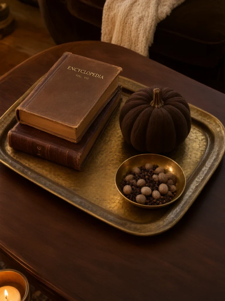
A stack of seasonal coffee table books adds instant styling, but the effect depends on which book ends up on top and facing the room. Choosing the book with the most visually interesting cover for the top of the stack, and varying book sizes rather than stacking identical dimensions, makes the arrangement look considered rather than just piled there. Three books is usually enough for a coffee table stack; much more than that starts to look like storage rather than styling.
20. Dried Florals Last the Whole Season If Kept Out of Direct Sun

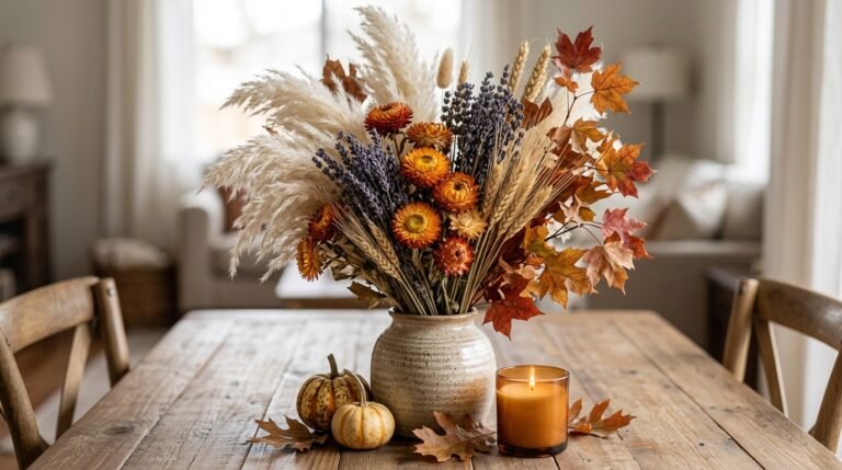
Pampas grass, wheat stalks, and preserved eucalyptus genuinely hold up for months without wilting, but direct sunlight will fade their color faster than expected, so placing arrangements away from a sun-facing window keeps them looking richer for longer. A single larger arrangement in one vase tends to have more visual impact than several small ones spread around the room, especially with materials like pampas grass that already have a lot of visual texture on their own.
Check these 5 recommended methods to keep dried florals stay beautiful throughout the fall season.
21. Faux Fur Works Best as a Single Statement Piece

A faux fur accent, whether it’s a stool, a pillow, or a small rug, adds real softness and warmth, but more than one piece in the same small room can start to feel like overkill rather than a luxurious layer. Choosing the single spot where it’ll be touched most often, like a stool people actually put their feet on or a pillow on the main seating spot, gets more functional use out of it than a purely decorative placement elsewhere in the room.
22. Seasonal Shelf Art Should Rotate With What’s Already There

Small framed prints of fall quotes or woodland animals work best mixed into existing bookshelf styling rather than replacing everything on the shelf at once. Swapping out just two or three pieces for the season, while leaving books and other permanent decor in place, keeps the shelf from looking like a completely different room every few months. This approach also makes the seasonal transition back in winter or spring much easier, since most of the shelf styling doesn’t need to change at all.
Frequently Asked Questions
What’s the cheapest way to make a living room feel like fall?
Swapping regular light bulbs for warm-toned ones, around 2700K, is one of the lowest-cost changes with the biggest visual impact, since it changes the entire feel of the room for the price of a few bulbs. Adding a throw blanket and a few pillow covers in seasonal colors is the next cheapest layer.
How many fall decor items are too many for a living room?
There’s no fixed number, but a good check is whether every surface has something seasonal on it. Leaving some surfaces bare, or with just one item, keeps the room feeling like a home that shifted with the season rather than a store display set up for fall.
Do real or faux pumpkins look better for living room decor?
Real pumpkins typically hold up well for four to eight weeks indoors, which works fine for late-season decorating. If decorating in early September for a display that needs to last through November, faux pumpkins in a matching color range avoid the softening and mold issues real ones eventually develop.
Is it worth changing curtains just for fall?
If the current curtains are lightweight and the windows are older or drafty, heavier earth-toned curtains genuinely help with warmth, not just appearance. If the room is already warm and well-insulated, this is a lower priority than changes like lighting or textiles that cost less and have a bigger visual effect.
Final Thoughts
If the budget or time only allows for a few of these changes, start with the ones that affect the whole room at once, warm light bulbs and a rug or throw in fall tones, before moving to smaller styling details like shelf art or mantel garland. Those bigger changes shift how the room feels every time it’s used, while the smaller styling touches matter more for how it looks in the moment someone walks in. Layering in the rest gradually, rather than doing all 22 changes in a single weekend, tends to result in a room that still feels like your own space with fall touches, not a seasonal display that has to be fully undone come winter.